Discover your best home palette by starting with mood and light. Define a calm, energizing, or cozy vibe, then translate it into 2–3 core hues plus an accent, guided by color psychology and cultural cues. Assess how natural and artificial light shifts tones, test swatches in real rooms, and map color from floor to ceiling. Choose a strategy—neutral base, bold accents, or balanced mix—and test with samples before finalizing. If you keep exploring, you’ll uncover deeper steps to refine the look.
Identify Your Home’s Mood and Palette Goals
To set the tone for your space, start by naming the mood you want to feel—calm, energizing, cozy, or sophisticated—and then translate that into a practical palette. You’ll map feelings to colors, letting color psychology guide your choices while keeping function in mind.
Identify your palette goals, then choose two or three core hues and one accent to maintain balance. Consider Cultural influences: traditions, regional tones, and memories that shape how you perceive color.
Decide on hues that support daily activities, lighting, and room purpose, drafting swatches to compare side by side. Document your decisions with rationale: why a shade supports calm evenings or vibrant mornings.
This clarity prevents drift later, ensuring a cohesive scheme aligned with your mood and lifestyle.
Assess Light, Space, and How Color Behaves
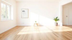
Light changes how colors look, so you’ll notice shifts as daylight moves and lamps switch on.
Your space’s size, lighting, and surfaces influence how hue reads, creating apparent depth or flatness.
Start with simple swaps and observe: what feels brighter, warmer, or more expansive in real life?
Light Reactions In Color
What happens when color meets light, and space then shapes perception? You observe how hue shifts with illumination and how walls, floors, and ceilings reflect, absorb, or scatter.
In practice, color psychology guides intent: cooler tones recede, warmer tones advance, while midtones balance focus. You’ll note light reflection, not just brightness; soft daylight reveals true undertones, while artificial light can mute or amplify them.
Space itself alters effect: a narrow corridor can feel taller when you choose high-contrast trim, and a low ceiling gains presence with a saturated shade at eye level. Test swatches at different times to verify consistency, then design around your preferred mood.
Your goal is coherent harmony that responds to light without sacrificing function.
- Test in real lighting situations to reveal true color responses
- Use light reflection to modulate perceived depth and warmth
- Align color psychology with room purpose and activity
- Balance contrasts for clarity and comfort
Space Perception And Hue
Ever wondered how color behaves when space itself bends perception? You’ll notice light makes rooms feel either bigger or cozier, depending on hue and value. Lighter hues reflect more, widening constraints of a small area; darker shades absorb, shrinking the sense of space.
Warm hues (higher hue temperature) energize walls, while cool tones calm distances and push back glare. In open layouts, mid-range hues create balance, preventing overwhelming contrasts.
Consider color psychology: you’ll use tints to brighten a nook without over-stimulating, and saturated accents to draw focus without clutter. Your goal is perceptual clarity, not flash.
Test swatches under real lighting, observe how ceilings and corners recede or advance, and adapt. Space perception with hue guides practical decorating, yielding rooms that feel intentional, spacious, and harmonious.
Choose Your Color Strategy: Neutral Base, Bold Accents, or Balanced Mix
Choosing your color strategy starts with a clear decision: will you build a neutral base, spotlight bold accents, or blend both for balance? You’ll shape rooms that feel intentional, not chaotic, by matching mood with method.
Neutral bases calm, bold accents energize, and a balanced mix offers adaptability. Consider color psychology and cultural influences as you plan, so meaning matches function.
- Neutral base: sets serenity and longevity
- Bold accents: creates focal moments with purpose
- Balanced mix: flexibility for evolving tastes
- Context cues: lighting, art, and textiles guide harmony
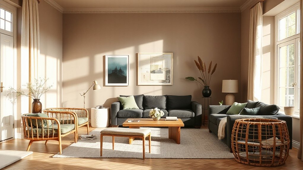
Build a Floor-to-Ceiling Color Map for Each Room
You’ll map each room from floor to ceiling, anchoring the color story with a clear rhythm from base to crown. Consider Floor-to-Ceiling Harmony, so every vertical zone reads as one cohesive map rather than a jumble of swatches.
This Room Color Mapping emphasizes Vertical Color Coordination, guiding choices that feel intentional and easy to apply.
Floor-to-Ceiling Harmony
- Create a gradient from wall to ceiling that stays within a single family.
- Use a slightly lighter ceiling to enlarge the room.
- Introduce texture through paint sheen and subtle shadows.
- Tie features, furniture, and accents to the core palette.
Room Color Mapping
Ever wondered how a room’s palette travels from floor to ceiling? You map color from baseboard to crown molding by anchoring with a neutral base, then layering with a chosen hue. Use the Color wheel to spot relationships at a glance: pick a dominant wall color, then assign an accent for trim or a feature wall.
For balance, test lightness steps: paint swatches from floor to ceiling and compare in different lighting. Build your floor-to-ceiling map around a cohesive scheme—start with complementary schemes to add contrast without chaos, or use analogous hues for serenity.
Note how textiles, furniture, and artwork repeat key tones. Finalize by documenting exact shades, finish choices, and where each color appears to maintain clarity and harmony.
Vertical Color Coordination
If you want your room to read as a cohesive whole, start with a vertical color map that travels from floor to ceiling. Build a floor-to-ceiling sequence that anchors the mood, then layer harmonies up the wall to the ceiling.
Use color symbolism to assign roles: grounding at the base, energy mid-wall, and a clarifying tint near the top. Consider cultural influences to refine choices, ensuring the palette feels intentional rather than incidental.
Keep contrasts deliberate, not chaotic, so the space remains legible at a glance.
- Grounding base colors that echo natural elements
- Mid-wall hues to energize without overwhelming
- Ceiling accents that draw upward and unify
- Cultural cues and color symbolism guiding shifts
Pick the Primary Color You’ll See Everywhere
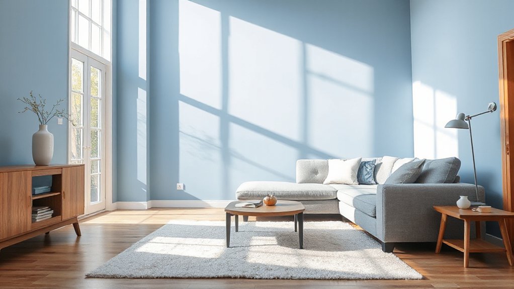
Choosing a primary color isn’t about chasing trends; it’s about anchoring every design decision. You’ll see this color everywhere—from walls to furniture—so pick one with purpose.
Consider color psychology: calming blues for bedrooms, energizing yellows for kitchens, or grounding neutrals in living spaces. Your choice sets mood, influences perceived space, and guides accent decisions.
Test paint finishes in real light; matte hides wall texture, satin adds subtle sheen, and eggshell balances durability with warmth.
Think about longevity: will you tire of it in five years, or will you still love it as seasons change?
Once you settle, carry the hue through key elements—doors, trim, and fabrics—so the scheme reads as cohesive, not fussy.
Finalise confidently, then refine with measured accents.
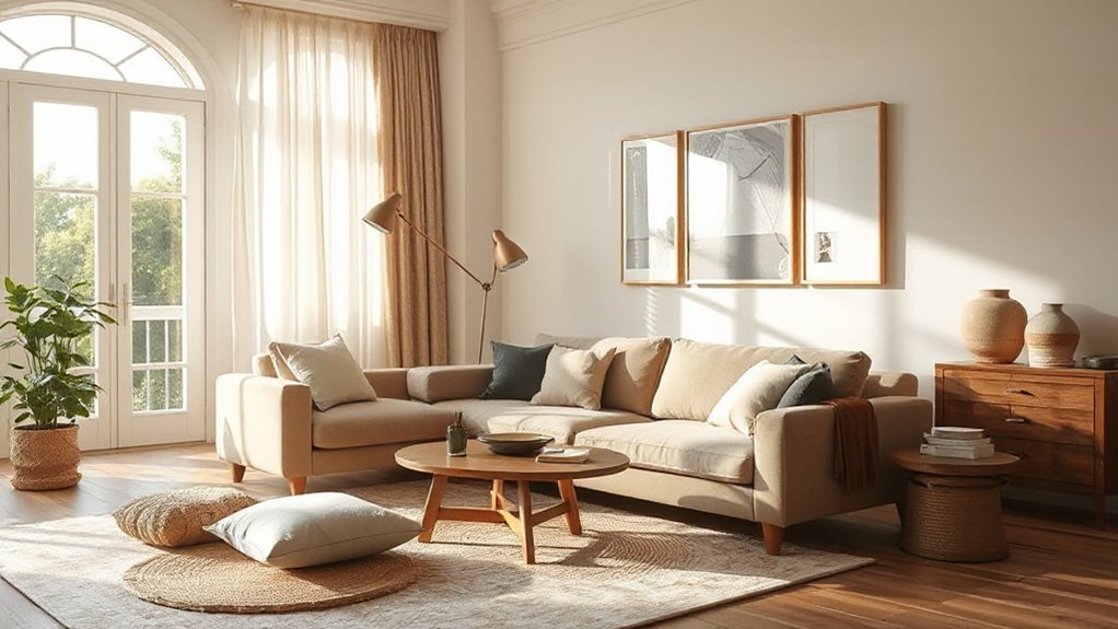
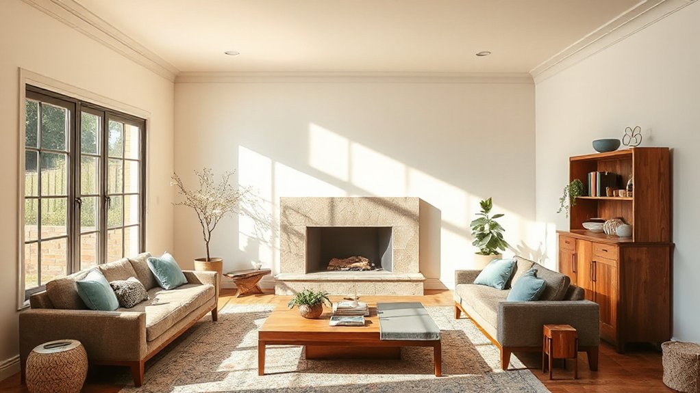
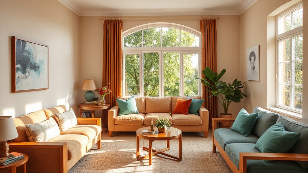
Select Supporting Colors That Complement, Not Compete
Now that you’ve anchored a primary color, pick supporting hues that enhance rather than compete. Choose tones that echo or gently contrast the main shade, creating cohesion through shared undertones. Aim for a balanced palette where each color serves a purpose—accent, backdrop, or connective tissue.
Mind color blending so gradations feel seamless, not jarring, and let palette harmony guide your choices rather than impulse. Consider lightness and saturation to keep rooms visually calm and inviting. Use a restrained number of supporting colors to maintain focus and avoid clutter.
In this approach, you’ll craft spaces that feel intentional and refined.
- Build depth with tonal variations that share a common undertone
- Use one dominant supporting color to anchor accents
- Integrate neutrals to unify bold hues
- Test gradations for smooth color blending and harmony
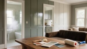
Test With Real Swatches: Paint Sample Panels Like a Pro
Real-world swatches bridge the gap between idea and outcome: you’ll see how the colors actually behave in your space. Start by painting full 8×10 panels in your top contenders, not just chips. Label each panel with room, lighting, and time of day.
Observe under natural light, then under incandescent and LED, noting shifts in hue and warmth. Compare at dawn, noon, and dusk to reveal true undertones. When you test, include two paint finishes per color—flat for walls, satin or eggshell for trim—to gauge texture impact.
Record impressions, then revisit your color theory decisions with fresh data. This method keeps results practical and aligned with how you live. Avoid over-saturation; refine until the palette proves balanced across conditions.
Read Your Space: How Architecture and Furnishings Guide Color
Space shapes color as you move through rooms, guiding your eye and mood with every doorway. Your furnishings pull hues toward or away from the walls, tuning contrast and comfort in practical ways. Architecture sets the tone, so let spatial rhythm and built forms spotlight the colors you choose.
Space Shapes Color
How you shape a room isn’t just about what colors you choose, but where those shapes live and breathe. Space geometry defines how light travels, how walls frame you, and how furniture routes your gaze.
When you respect shape significance, you’ll see color respond to edges, curves, and planes, not just coexist with them. A bold accent can ground a long corridor; a soft wash can expand a compact nook.
You shape perception by balancing volume, proportion, and rhythm, letting color follow the architecture rather than compete with it.
- Space geometry guides color decisions, not the other way around
- Shape significance influences focal points and flow
- Proportions decide how bold or muted hues feel
- Rhythm creates cohesive, intentional environments
Furnishings Influence Hue
Ever notice how the furniture you choose isn’t just décor but a color guide? Your furnishings influence hue by setting the room’s baseline. A bold sofa can pull you toward saturated walls; a pale sofa invites softer accents.
Think in tiers: dominant pieces establish mood, secondary pieces echo it, and decorative accents finish the palette with texture and contrast. Focus on undertones in wood, upholstery, and metal finishes—these subtle shifts steer color choices without shouting.
Use cushions, throws, and rugs to test the vibe before repainting. When selecting decorative accents, aim for harmony: repeat a hue from the largest item, vary saturation, and balance warm and cool tones.
This approach keeps color coherent, purposeful, and adaptable to changing tastes.
Architecture Sets Tone
Architecture frames your color story before you even pick a paint swatch. Your space sets tone through shape, scale, and sequence, guiding how you perceive color from the first step inside.
- Architectural details influence mood as much as hue, giving you a built-in palette.
- Exterior finishes interact with daylight, shifting color perception at different times.
- Proportion and rhythm dictate whether a single accent reads bold or refined.
- Material contrasts reveal how colors read across surfaces, from brick to plaster.
When you read your space, you’re reading its architecture: let lines, textures, and progression guide your selections, not just your favorite shade. This approach guarantees harmony between interior choices and the outer shell, creating a cohesive, lasting scheme.
Create Cohesion Across Rooms With a Unifying Element
To create cohesion across rooms, pick a unifying element you can repeat in different ways—color, texture, or a motif—that ties the spaces together without feeling forced. You’ll establish rhythm by echoing this element in trims, fabrics, and furniture placement, not by matching every item.
Use color symbolism to give each room a related mood, then connect those moods with a shared accent hue or material. Consider cultural influences that resonate with your home’s story: a woven textile, a carved wood detail, or a regional print can surface again in pillows, curtains, and art, creating continuity.
Keep scale and proportion in check so the repeated element feels deliberate rather than decorative. This approach delivers harmony while preserving individual room personalities.
Plan for Seasonal, Light-Driven Updates
Seasonal updates are a natural extension of the unifying element you’ve already established, and light plays a starring role in how those updates feel. You’ll leverage shifting daylight and artificial set lighting to refresh the space without a full overhaul, focusing on color contrast and texture variation to keep depth alive.
- Swap accessories that catch or reflect light to sharpen contrast and add immediacy
- Layer textiles in varying textures to alter tactile perception as seasons change
- Introduce accent hues sparingly, aligning with existing neutrals for coherent shifts
- Use window treatments to modulate brightness and reveal new color accents
Use Color Psychology to Shape Mood and Use
Color psychology isn’t just about hue choices; it’s a practical toolkit for shaping how a space feels the moment you enter. You’ll steer mood by aligning color to function: calming blues in bedrooms, energizing yellows in kitchens, and grounding neutrals in living areas.
Use color symbolism to cue desired responses—green for growth, earth tones for stability, soft pink for warmth—without overpowering the room. Consider cultural associations that influence perception; what feels serene in one culture might feel assertive in another, so tailor palettes to your household.
Test with swatches at different times of day, observe how lighting shifts tone, and adjust accordingly. Document choices to maintain coherence across furnishings. This intentional approach keeps spaces inviting, purposeful, and visually balanced.
Avoid Common Pitfalls in Contrast, Saturation, and Flow
Mixing too many contrasts can jolt a room; keep it simple, then layer in nuance. You’ll avoid clash by testing a dominant hue with 1–2 accents, letting saturation breathe. Consider color psychology to gauge mood, but respect cultural influences that shape perception of tones.
If you notice eyes tiring, dial back high contrast and let midtones lead. Flow matters: hues should travel naturally from room to room, not jumprooms. Balance warm and cool without overcorrecting, and mind lighting—it changes how saturation reads throughout the day.
- Choose a governing color and sprinkle measured accents
- Align saturation with natural light and room function
- Observe how cultural influences alter perceived warmth
- Test shifts before committing to full walls
Finalize Your Palette: A Quick Checklist Before You Paint
Before you grab a brush, run a quick final-palette check: confirm you’ve chosen a governing color and mapped two to three measured accents, then verify they play well under your lighting at different times of day.
This is where color theory meets daily life: assure contrast supports function without glare, and that accents harmonize rather than compete.
Lock in paint finishes suited to each space—matte for walls to soften reflections, satin for trim for durability, and eggshell in high-traffic halls for easy cleaning.
Test swatches on large samples to view under morning and evening light, not just showroom lighting.
Document your palette with hex or RGB codes and a brief rationale.
With clarity, your scheme stays cohesive, intentional, and ready for effortless, confident application.
Frequently Asked Questions
How Can I Choose Colors for a Rental With Strict Rules?
Yes—you can, with careful choices. For temporary rentals, stick to neutral tones and removable accents; check Lease restrictions, then propose washable paints, peel-and-stick wallpaper, and non-permanent fixtures that satisfy rules while easing your style.
Can I Mix Metallics Without Clashing With Neutrals?
Studies show 60% feel more cohesive when metallic accents spark contrast. You can mix metallics with neutrals, just vary finishes and keep neutrals dominant. Emphasize metallic accents, pair them with a calm neutral pairing for balance.
What’s the Best Way to Test Color in Small Rooms?
To test color in small rooms, use Color psychology insights and paint swatches on multiple walls, not just the sample corner, so you see mood shifts in different light throughout the day. Compare how tones feel with varied furniture.
How Do Environmental Factors Affect Color Perception?
Color perception shifts with lighting conditions and color temperature, so you’ll notice differences as daylight fades and bulbs glow. You may sigh at ambers, grin at cool whites, and adjust surfaces accordingly to keep true hues intact.
Do I Need to Repaint When Lighting Changes Seasonally?
Yes, you don’t have to repaint, but you should adjust lighting and finish textures. Maintain lighting consistency, then plan Seasonal adjustments with cooler bulbs in winter and warmer ones in summer to preserve true colors.
Conclusion
Color theory isn’t magic, it’s a toolkit you can test. When you trace how a hue behaves in your space and watch how daylight shifts it, you’ll see truth: some combos calm, others lift, some clash. Question the idea that neutrals must read dull and that bolds forever shout. Try, tweak, and measure responses—then trust the palette that consistently feels right in your rooms. Your home reveals your choices; let them prove what works.