In 2026, you’ll anchor UK interiors on durable near-neutrals, layering warmth with earthy terracotta and sage greens to create calm, long-lasting schemes. Expect deep neutrals like greige and charcoal to anchor walls, with natural textures—oak, cork, linen—adding tactility without distraction. Apps lean into low-VOC, durable paints and modular palettes that adapt to family life and remote work. Exterior tones stay earthy with restrained greens and charcoals, while lighting frames colour accuracy. Keep exploring to see how these ideas unfold.
Define Your 2026 UK Home Colour Palette
As you shape your 2026 UK home palette, start with a clear, restrained foundation: a versatile base of near-neutrals that won’t fight conversation with trends. You’ll layer color strategically, prioritizing cohesion over novelty.
Begin by mapping rooms to functions; choose calm undertones for living spaces and washable neutrals for kitchens and baths. Color psychology guides you toward mood-forward choices: soft greens for balance, muted blues for calm, warm beiges for comfort.
Incorporate accent hues sparingly, ensuring they echo architectural details and textiles. Consider historical influences to temper bold moves with longevity; era-inspired hues can anchor modern schemes without feeling dated.
Document a palette brief, testing swatches in natural light, and adjust with furniture selections. Your defined palette becomes a future-proof framework, adaptable as trends evolve.
What 2026 Means for UK Home Colour
2026 reshapes UK home colour by centering usability and longevity alongside bolder, site-responsive accents. You’ll notice palettes tightening around durable finishes, where longevity drives choice and repaint cycles become less frequent.
Cultural influences shape consumer expectations more profoundly, guiding how spaces feel culturally resonant without shouting trend. You’ll also see shifting preferences toward flexible, multi-use schemes that adapt to family life and remote work, keeping walls visually calm yet subtly expressive.
Technological innovations enable smarter paints, coatings, and application methods that resist wear, grime, and climate variation, extending life without sacrificing depth.
As you plan, prioritize collaborative schemes that reflect local context while permitting easy updates through modular accents. In practice, this means calibrated contrasts, careful saturation, and a materials-first approach to colour decisions.
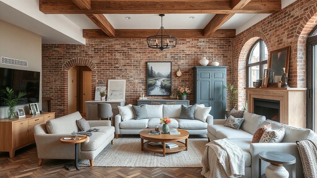
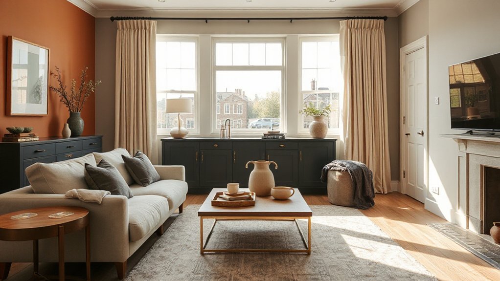
Make Earthy Terracotta Your Timeless Accent
Earthy terracotta serves as a timeless accent that anchors space without overpowering it. You’ll see it pair best with natural materials and warm neutrals, creating a cohesive, versatile aesthetic that ages well.
This approach emphasizes practical durability and adaptable tones as core trend drivers for 2026.
Earthy Terracotta Aesthetic
Earthy terracotta is edging into UK homes as a timeless accent, blending warmth with versatile sophistication. You’ll notice it grounding spaces with earthy warmth while remaining adaptable to different palettes, textures, and lighting.
The trend is less about bold statements and more about layered warmth that anchors modern neutrals and natural materials. Use terracotta as an architectural accent, kitchen backsplash, or fabric palette to create cohesion between indoor and outdoor living.
In practice, it pairs surprisingly well with greens, ochres, and charcoal, elevating spaces without overpowering them. Sustainably sourced terracotta tones support eco-conscious design, aligning with mindful consumption.
Consider Sustainable gardening and Urban rooftop gardens as complementary themes to reinforce the natural, resilient appeal of this aesthetic.
Timeless Accent Tones
- Layer texture and tone for nuanced depth
- Use terracotta as a unifying accent across panels, cushions, and art
- Couple with cool neutrals to temper intensity
- Align with expressive, purposeful artwork and lighting
Natural Materials Pairings
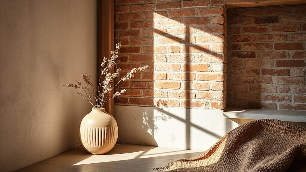
Natural materials pair beautifully with terracotta to create a grounded, timeless palette. You’ll see this pairing anchor rooms with warmth while letting natural textures lead. Think oak, cork, and rattan alongside matte terracotta walls or tiles for a cohesive, tactile feel.
The trend leans into eco-friendly finishes that soften sheen and highlight grain, enhancing longevity rather than quick replacement. A restrained palette built from earthy neutrals lets the terracotta act as a focal anchor without shouting.
Pairings with stone and linen fabrics deepen the mood, supporting a Vintage inspired palettes vibe that feels collected, not curated. Expect durable, low-maintenance surfaces that age gracefully, aligning sustainability with sophistication and practical daily living.
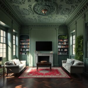
Choose Sage Greens for Calm Living Spaces
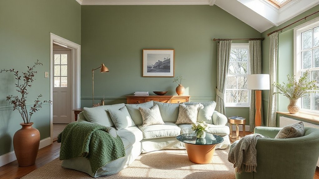
Sage greens offer a balanced, calming backdrop for UK homes this year, delivering a subdued vibrancy that supports focused living and mindful spaces. You’ll notice how these calming hues translate across rooms, from kitchens to work corners, enabling clearer decision-making and reduced visual noise.
1) Pair with warm neutrals to maintain softness while elevating architectural details.
2) Use matte finishes to preserve depth and prevent glare, especially in natural light.
3) Layer with natural textures—linen, wool, wood—for tactile calm and cohesion.
4) Introduce accent plants to reinforce earthy, restorative vibes without overpowering the palette.
Sage greens work best when kept coherent; small shifts in shade create subtle, purposeful contrast. You’ll gain versatility: calm living spaces that still feel modern, breathable, and ready for daily focus.
Depth and Drama: Charcoal and Deep Neutrals
Depth and drama emerge when charcoal and deep neutrals anchor a space, grounding brighter accents and elevating architectural detail. You’ll notice rooms where charcoal acts as a backbone, creating contrast that makes lighting and textures feel sharper, more intentional.
Deep neutrals—greiges, taupes, and obsidians—offer versatility, allowing you to switch mood with finishes and textiles rather than repaint. This approach emphasizes Charcoal sophistication: it’s not about overpowering a room, but controlling visual weight to highlight form, line, and scale.
Pair with metallics, natural wood, or matte black fixtures to amplify a refined, modern edge. In practice, you’ll use charcoal on larger surfaces and reserve warmer neutrals for complementary zones, ensuring depth without heaviness.
Deep neutrals maintain warmth while preserving clarity and cohesion throughout your scheme.
Nature-Inspired Neutrals for Everyday Calm
Nature-inspired neutrals anchor calm rooms by pairing Quiet Earth Tones with breathable textures. Think Soft Linen Textures as the tactile counterpoint to these hues, sharpening everyday practicality without sacrificing warmth.
Across Forest-Inspired Palettes, you’ll see how subtle shifts in tone support a calmer, more focused living environment.
Quiet Earth Tones
1) Earthy textures define depth, from woven fabrics to stone-like surfaces.
2) Natural pigments bolster warmth while preserving a modern edge.
3) Contrasting accents stay restrained, maintaining calm through balance.
4) Lighting shifts reveal subtle undertones, guiding evolving palettes.
Soft Linen Textures
The trend leans into soft fabric finishes that invite touch, aligning with a calmer, less glossy aesthetic. Expect layers of matte sheens, subtle ribbing, and breathable textiles that perform well under UK lighting shifts.
This approach supports versatile palettes, where warm beiges mingle with cool stone hues to create adaptable backdrops. Practically, you’ll choose durability and tactile appeal over bold saturation, using these textures to foster calm without compromising modernity or polish.
Linen textures sustain longevity in daily spaces, enhancing perceived quality.
Forest-Inspired Palettes
- You embrace muted greens and earthy browns as anchors, projecting a grounded mood that supports focus and relaxation.
- You combine warm grays with mossy hues to evoke understory calm while maintaining modern clarity.
- You layer textures—linen, jute, and matte ceramics—for depth without distraction.
- You connect interiors to broader efforts, aligning color choices with Wildlife conservation and Forest conservation efforts to reinforce sustainable storytelling.
Warm Whites With Subtle Undertones
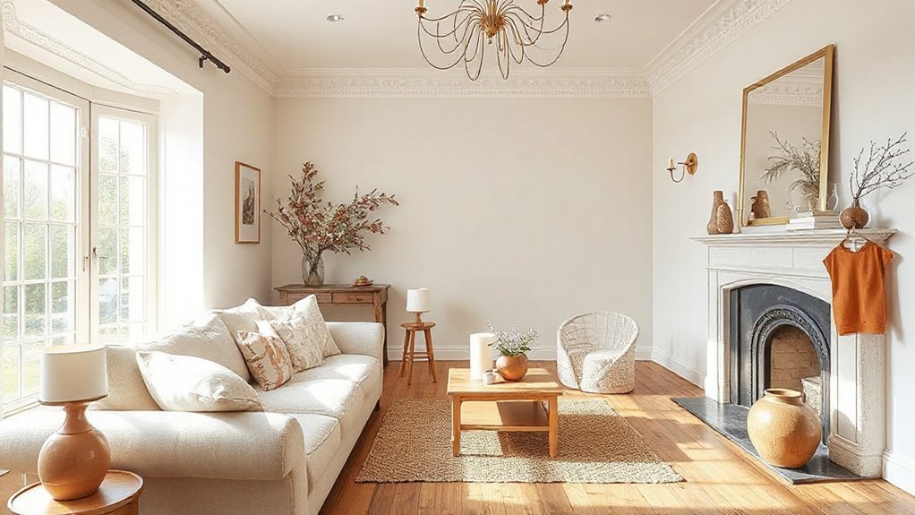
The trend hinges on undertones—cream, biscuit, and pale stone—that prevent clinical sterility while maintaining brightness. In practice, you pair them with restrained palettes to enhance cohesion rather than clash.
Lighting fixtures become pivotal, with warm LEDs and soft, amber pendants elevating the inviting feel without skewing color.
Furniture styles lean toward streamlined silhouettes and natural finishes, ensuring the whites remain the focal point rather than a distraction. The result is a timeless, gallery-like space that supports seasonal accents and texture-driven depth.
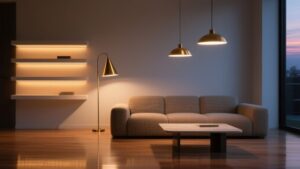
Moody Blues for Cozy, Modern Rooms
Moody blues are shaping a deeper, more cohesive mood in contemporary UK interiors, balancing warmth with crisp, modern lines.
This palette fosters a cozy ambience by layering indigo hues for depth, while preserving clarity and brightness in active spaces.
Expect a trend toward harmony, where daring blues reinforce focused zones without overpowering the room.
Moody Blues Harmony
Dark, moody blues anchor modern interiors by grounding bright accents and natural textures, creating a calm yet contemporary mood that feels both intimate and polished. You’ll notice Moody Blues Harmony curating spaces that balance depth with warmth, using pigment shifts to enhance architectural form.
Deep blue remains the anchor, while lighter tints and textured finishes add dimension. Mood lighting plays a pivotal role, sculpting mood without overpowering clean lines.
1) Pair deep blue walls with warm woods to create contrast and depth.
2) Layer textiles in navy, slate, and charcoal for tactile richness.
3) Integrate soft, amber lighting to emphasize warmth and mood.
4) Use metallic accents sparingly to keep a modern, refined edge.
Cozy Modern Ambience
This look leverages clean lines and tactile textures to keep rooms breathable while delivering mood. In practice, you pair moody walls with warm timber, soft upholstery, and strategic lighting to preserve daylight quality.
Fireplace decor becomes a focal point, yet remains simple—think recessed surrounds and low-profile mantels that don’t overpower sightlines. Window treatments should read as refined rather than heavy; opt for layered sheers with minimal hardware to maintain an airy feel.
The result is a contemporary, cozy environment that remains functional for daily living and entertaining alike.
Depth Through Indigo
Indigo hues deepen the Cozy Modern look by anchoring light materials with a calm, saturated base that remains inviting. You’ll notice how depth emerges from restrained tonality, where navy to mid-indigo layers create contrast without overpowering spaces.
In practice, Indigo symbolism informs mood cues—serenity meets intelligence—while Indigo in art guides display choices that echo a thoughtful, curated atmosphere.
- Use a single indigo feature wall to ground furniture silhouettes without overpowering natural light.
- Pair deep blues with warm neutrals to preserve coziness and introduce subtle contrast.
- Introduce textured textiles (linen, wool) to translate color into tactile depth.
- Balance saturated tones with metallic or timber accents to keep the look modern and refined.
Soft Pastels for Gentle Contrast
Soft pastels are gaining traction as a gentle counterpoint to bolder accents, offering a calm backdrop that’s easy to layer with textures and natural light. You’ll find these hues soften architectural lines while preserving modern edge, enabling flexible palettes that adapt across rooms and lighting conditions.
In practice, pastel tones act as a neutralized stage, letting furniture silhouettes and artwork take center stage without competition. Color psychology suggests these shades reduce visual noise, promoting perceived space and calm, which aligns with contemporary UK living patterns that favor subtle, long-term comfort.
Historical influences reappear in restrained palettes drawn from mid-century design and traditional interiors, reinterpreted with cleaner undertones for today’s homes. The trend favors adaptable combos, balanced by occasional saturated accents to maintain contrast and focus.
Textured Finishes That Elevate Colour
Textured finishes are amplifying colour by adding depth, warmth, and perceptual richness to walls and surfaces. You’ll notice how tactile layers transform light, creating nuanced shifts in Elevating colours across spaces.
- Subtle stucco and venetian plasters introduce depth without overpowering the palette.
- Textured wallpapers and fabric-backed surfaces add dimension while preserving colour fidelity.
- Layered matt and satin sheens control glare, enhancing perceived warmth.
- Sculpted plaster, tiles, and micro-patterns create focal points that anchor colour schemes.
In practice, you blend textures to modulate brightness, contrast, and mood, rather than relying on pigment alone. Textured finishes become a strategic tool for palette evolution, letting you push boundaries without saturation.
Elevating colours emerges through controlled texture interplay, guiding room feel toward curated sophistication. Avoid loud patterns; choose textures that amplify, not clash with, your chosen hues.
Layer Color With Light: the Execution Guide
Layer color with light by mapping how luminance, direction, and contrast shift perception of hue. You’ll plan a precise execution—define luminance layers first, then calibrate light direction to reveal subtle undertones.
Use contrast tactically: high contrast for moments you want to read as sharp, low contrast to soften transitions. Frame walls and furnishings as a single color system rather than isolated swatches, so the eye travels smoothly through space.
Implement controlled lighting zones: ambient, task, and accent, ensuring each tier complements the others without creating glare. Test scenes at different times of day to confirm hue stability, not just initial impressions.
Document outcomes with small adjustments to brightness and angle, then apply consistently across rooms for cohesive rhythm. Layer color, Light execution, and you align mood with function.
How to Pair Colors That Help Spaces Grow
Pairing colors that help spaces grow means choosing combinations that expand perception and support functionality. You’ll leverage color psychology to cue mood and flow, while considering paint durability for long-term performance. Subtle contrasts can widen rooms; saturated accents raise energy without crowding. Balance warm and cool tones to delineate zones without walls, and align hues with lighting to preserve true color over time.
- Pair cool neutrals with warm accents to create depth without narrowing sightlines.
- Use high-contrast trims to emphasize architectural features while maintaining harmony.
- Test samples under different daylight conditions to gauge perceived space and mood.
- Prioritize durable, scrubbable finishes in high-traffic areas to sustain color integrity.
Entryways: First Impressions With Colour
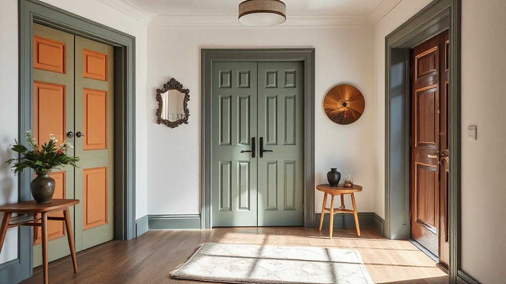
Entryways set the tone for your home, so color choices here should signal both style and practicality as you step inside. In 2026, UK entrances lean on restrained palettes with bold accents, leveraging colour psychology to guide mood shifts from threshold to living space.
You’ll see warm neutrals that nurture approachability and calm, paired with grounded greens or deep charcoals to anchor the area without overwhelming it. Entrance decor emphasizes durable finishes and easy maintenance, ensuring first impressions endure daily traffic.
Consider a single statement door or wall panel in a saturated shade to create focal interest, then balance with lighter trims and tactile textures. Consistency across adjoining zones reinforces cohesion and perceived space, while subtle lighting enhances colour accuracy and perceived warmth.
Kitchens & Bathrooms: Practical Palettes That Work
In kitchens and bathrooms, practical palettes hinge on durable hue combinations that stand up to daily wear while staying timeless. You’ll see pairing logic shift toward resilient neutrals with expressive accents that age well, balancing practicality with subtle personality.
This discussion starts by mapping practical palette pairings to real-life materials and finishes, highlighting trends that blend function with style.
Practical Palette Pairings
If you’re aiming for durable Kitchen and Bathroom palettes, start with neutrals as the anchor and layer in accent shades that stay fresh without shouting. In practice, pairing neutrals with calm, low-sheen finishes supports longevity and easy cleaning, while color psychology guides mood without overwhelming space. Consider balanced contrasts that read sophisticated rather than clinical, and test swatches under natural light to confirm perception.
- Use warm neutrals with cool accent hues to create a breathable, modern vibe.
- Mix matte walls with satin cabinetry for depth and minimal maintenance.
- Pair muted greens or blues with crisp white trims for refreshing calm.
- Apply subtle tonal shifts across fixtures to avoid jarring transitions.
Color psychology and paint finish options shape perception; choose thoughtfully and document lighting effects.
Durable Hue Combinations
Think matte finishes on cabinetry, with resilient ceramics and stainless fixtures that echo the palette without showing every speck. In practice, color psychology guides you to calm, high-contrast pairings that aid focus and hygiene perception, while colour psychology tips emphasize warmth to counter sterner lighting.
Use restrained contrasts (eggshells with charcoal accents or warm beige and navy) to preserve space and resale value. The trend favors palettes that evolve with evolving needs, not trends.
Sleeping Quarters: Restful Hues That Perform
Restful sleep hinges on more than lullabies and blackout blinds; the right hues subtly regulate mood and cadence. In your sleeping quarters, choose tones that promote calm, balance, and sensory clarity, enabling deeper recharge. You’ll notice how subtle shifts influence perception of space, texture, and time of night, guiding restorative routines with intention.
- Soft sage and muted slate palettes pair with warm accent woods to foster serenity without visual fatigue.
- Dusty rose or pale blush ceilings reduce contrast fatigue, supporting gradual sleep onset.
- Deep indigo or charcoal features anchor calm, while avoiding overstimulation.
- Warm neutrals with cool undertones harmonize Artistic expression and Cultural symbolism through shared, culturally resonant hues.
Home Office Colour That Boosts Focus
You’ll notice focus-boosting hues that sharpen attention without overwhelming the senses. Calm yet bright tones pair with concentration-friendly neutrals to keep desks feeling purposeful, not clinical.
This trend blends psychological clarity with versatile palettes, guiding you to choose moods that sustain productivity across long work sessions.
Focus-Enhancing Hues
1) Vibrant contrasts used sparingly to define zones without loud disruption.
2) Accent wall ideas that anchor productivity without dominating light and air.
3) Temperature-aware greens and blues aligned with natural circadian cues.
4) Neutrals layered to preserve clarity, reduce glare, and encourage steadiness.
These choices integrate focus science with design pragmatism, guiding your work zones toward consistent performance.
Calm Yet Bright Tones
In practice, this means choosing soft, desaturated colors with clean undertones that pair well with higher-saturation accents. Color psychology suggests that cool bases with warm highlights can sustain attention without fatigue, making long work sessions feel more tolerable.
To maximize results, align wall tones with furniture coordination—desk, storage, and seating in complementary finishes to create coherent flow. Your mood and productivity hinge on thoughtful contrasts, not loud statements; this approach favors clarity, focus, and a cohesive work environment.
Concentration-Friendly Neutrals
Could neutrals ever be more than just backdrop in a focused home office? Yes, when they lean into concentration-friendly tones that balance calm with alertness. You’ll notice subtle shifts in mood and performance as color psychology informs your setup, steering you toward hues that suppress distraction and elevate clarity.
Pick options with proven paint durability for high-traffic walls and frequent touch-ups, ensuring your workspace stays refined over time.
- Cool stone and greige blends for balanced focus
- Low-saturation taupe with a matte finish to reduce glare
- Soft charcoal undertones that sharpen edges without feeling harsh
- warm-leaning grays that retain warmth while boosting concentration
Exterior Colour Trends for UK Homes in 2026
As 2026 approaches, homeowners are prioritizing exterior palettes that balance curb appeal with resilience. They are gravitating toward earthy neutrals, restrained greens, and charcoal-backed tones that read modern but timeless.
You’ll notice demand for palettes that endure weathering while staying feeling contemporary, with mid-tone charcoals anchoring homes against varied skies.
Historical influence informs choices, guiding how classic hues mix with S50s and modern primers for depth without shyness.
Cultural symbolism surfaces in community projects and architectural guidelines, nudging you toward tones that echo local heritage while staying adaptable across styles.
Expect restrained greens to soften brick and render, creating cohesive streetscapes.
Utility and charm align as you opt for durable finishes, low maintenance, and subtle contrasts that retain elegance beyond trends.
Sustainable and Low-VOC Palettes
- Eco friendly pigments expand shade versatility while maintaining saturation.
- VOC free finishes reduce volatile emissions without sacrificing sheen or washability.
- Water-based systems increasingly replace solvent methods for safer handling.
- UV-resistant chemistries extend color life in exposed UK conditions.
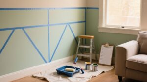
DIY vs Professional: When Repainting Moves the Needle
DIY painting projects have matured from a casual weekend task into a strategic decision: choosing between DIY and hiring a pro can considerably impact time, finish quality, and long-term cost in UK homes.
You weigh speed against accuracy, equipment, and risk exposure. Trends show that DIY pitfalls grow when walls require careful prep, multiple coats, or complex finishes; mistakes compound, delaying projects and increasing total spend.
Conversely, professional costs may appear higher upfront, but pros deliver consistent coverage, faster timelines, and durable results that align with evolving finishes popular in 2026 palettes.
In small spaces, specialists often optimize scoping and masking, reducing reworks. If your aim is resale value or a flawless satin or matte sheens, a pro-led approach often delivers the needle-moving payoff you seek.
Frequently Asked Questions
How Will Lighting Affect 2026 Color Choices at Home?
Lighting shapes 2026 color choices: you’ll favor calmer tones when lighting ambiance is soft, and brighter hues where natural light influence is strong; you’ll adapt palettes to maximize depth, contrast, and mood across rooms.
Are Trendy Colors Practical for Long-Term Use?
Color durability suggests trendy hues can endure, but you’ll trade novelty for longevity. You weigh paint maintenance and tone behavior, using symbolism of resilience; you decide whether boldness or classics serve you best for lasting, practical impact.
Can Color Trends Influence Property Resale Value?
Yes, color trends can influence resale value. Color psychology guides buyer perceptions, while market appeal hinges on cohesive palettes. You’ll attract more interest when you align finishes with current trends, boosting perceived quality and potential resale upside.
Which Finishes Best Support Bold Color Choices?
A practical finish that supports bold colors is matte or eggshell on walls, with semi-gloss trim. Statistically, spaces with durable finishes sell faster; color psychology improves mood, while paint durability guarantees long-lasting impact for bold schemes.
How to Test Colors Before Full Room Painting?
Yes, you test colors with color swatch testing, then compare outcomes in a sample room painting before committing. You’ll track lighting, fabric, and mood shifts to validate trends, ensuring durable, cohesive choices across spaces.
Conclusion
You’ve tracked the threads shaping 2026’s UK interiors: earthy terracotta anchors, sage greens for calm, and charcoal’s depth lending drama. Exterior palettes lean sustainable and low-VOC, while home offices crave focus-driven hues. It’s a shift toward timeless, adaptable color ecosystems—where DIY repainting can punch above its weight but sometimes needs a pro touch. In short, trend-ready palettes meet everyday practicality, stitching warmth, focus, and responsibility into every room’s story.