
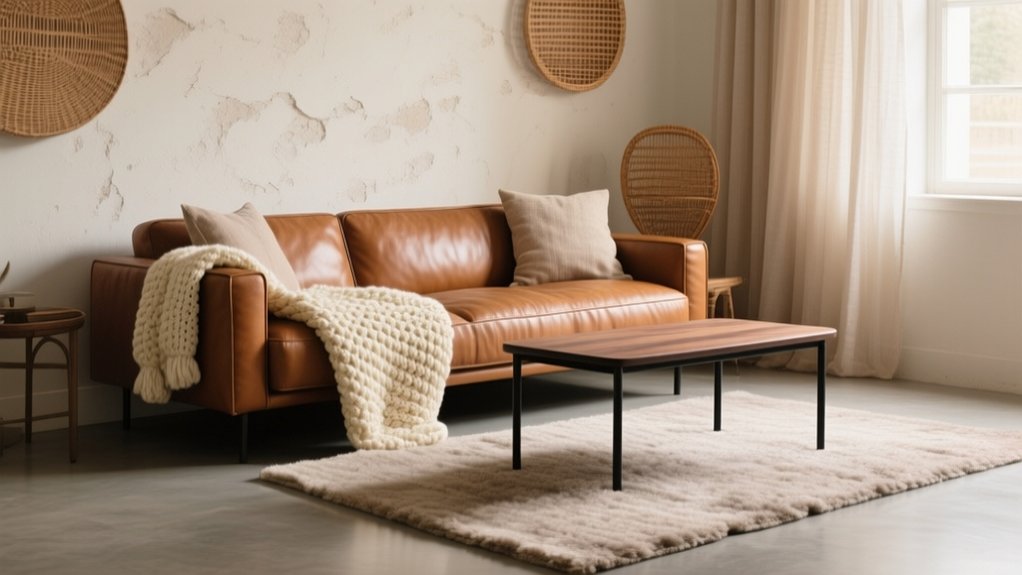
Start by choosing one anchor texture on a big surface—like a wool rug, limewashed wall, or upholstered sofa—then build around it with a disciplined rough‑and‑smooth mix. Map finishes early (matte, satin, gloss) so UK light doesn’t fall flat: keep matte on large planes and add gloss on details like taps or lamps. Aim for 5–7 textures, repeat key ones three times, and use tone‑on‑tone pattern as “quiet” texture. Keep going for easy fixes and room-by-room ideas.
What “Texture” Means (and What It Isn’t)
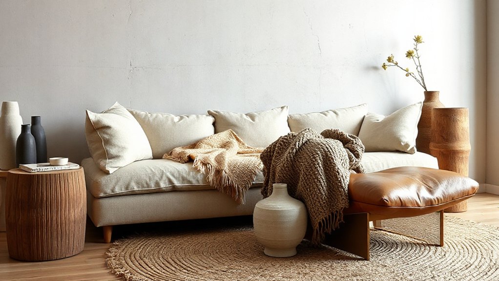
Although people often use the word “texture” as a catch‑all for anything tactile, in interior design it has a more specific meaning: it’s the surface quality of a material and the way that surface reads both to the touch and to the eye. You’re judging nap, grain, pile, sheen, and relief—think brushed oak, honed limestone, bouclé, or ribbed glass—rather than the item’s colour or style.
Texture isn’t pattern (a printed motif), it isn’t tone (light/dark value), and it isn’t scale (how big shapes feel). In UK homes, where light can be flat, texture gives depth without repainting.
Aim for Tactile diversity so rooms don’t feel one-note, and prioritise Sensory engagement by mixing smooth, matte, and nubby surfaces that perform daily.
Pick One Texture Anchor to Lead the Room
When you start a room with one clear texture “anchor,” you stop everything from competing and you make layering far easier. Choose one dominant surface that feels intentional at first glance: a wool loop carpet, a limewashed wall, veined marble, or a chunky linen sofa.
In UK homes, your anchor often sits on the biggest plane—floor, main wall, or the largest upholstered piece—so it reads from the doorway.
Then build a simple material hierarchy around it. Keep two supporting textures quieter in scale and sheen, and let any accents stay small and repeatable. This creates reliable texture focal points without turning the room into a sample board.
If you’re stuck, pick the anchor you’re least likely to swap out, then match everything else to it.
Mix Textures With Contrast: Rough + Smooth
If your room’s textures feel flat or fussy, add contrast by pairing one rough surface with one smooth one. This simple move creates instant depth without changing your colour scheme or layout.
Start with Contrasting materials you already own: a nubby wool throw on a sleek leather sofa, or a reclaimed oak side table beside a polished stone lamp base. In UK homes, try plaster walls against brushed brass, or a chunky boucle cushion on a neat cotton bedspread.
Keep the pairing tight: one hero rough texture, one clean smooth counterpoint, then repeat the duo once more across the room to feel intentional. You’ll build tactile diversity while keeping the space calm.
Aim for touchpoints at hand level—arms, cushions, tabletops—so the contrast reads every day.
Balance Matte and Glossy Finishes Early
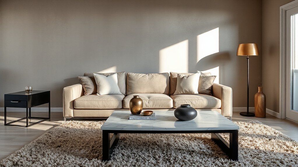
Before you choose fabrics or surfaces, map sheen levels across the room so you can control how light behaves in typical UK conditions.
Pair matte with gloss on purpose—think flat wall paint against lacquered cabinetry or polished taps—to keep the scheme crisp without glare.
Then repeat those finishes consistently from space to space, so your textures read as intentional rather than patchy.
Map Sheen Levels First
Although it’s tempting to choose colours and fabrics first, you’ll get a more polished result by mapping sheen levels at the start—deciding exactly where matte, satin, and gloss finishes will sit across your scheme. Treat it like a floorplan: note paint (walls, woodwork, ceiling), metals, tiles, worktops, and key furniture surfaces, then assign finishes for each.
This Sheen level mapping stops a room feeling flat in our often-grey UK light and helps you control where the eye lands. It also sharpens Texture perception: a linen sofa reads richer against low-sheen walls, while satin on skirting can tidy edges without shouting.
Test with real samples under day and lamplight, and record product names for consistent touch-ups later.
Pair Matte With Gloss
Because most UK rooms live under soft, sideways light, you’ll get a sharper, more intentional look by pairing matte and gloss early—using matte to calm large planes (walls, ceilings, big cabinetry fronts) and gloss to add crisp highlights on smaller, hard-edged details (woodwork, taps, tiles, hardware).
Start by choosing your “quiet” base: matte finishes on emulsion walls, flat-painted ceilings, or super-matt joinery stop glare and hide minor plaster wobble. Then place gloss surfaces where you want definition and easy wipe-downs—skirting, architraves, a tiled splashback, or chrome fittings.
Keep the contrast measured: if your room’s north-facing, push gloss slightly higher to catch light; in bright south-facing spaces, lean more matte to avoid sparkle overload.
Repeat Finishes Consistently
Once you’ve set your matte “quiet base” and chosen where gloss will do the hard work, repeat those finishes consistently so the room reads as deliberate rather than bitty. Pick two to three gloss touchpoints and stick to them: taps, a glazed pendant, and a framed mirror work well in most UK homes.
Then keep the rest mainly matte—walls in durable matt emulsion, cabinetry in eggshell, and textiles in brushed cotton or wool—for reliable texture consistency. Use pattern repetition to reinforce the plan: echo a subtle stripe in cushions with a tiled splashback grid, or repeat black metal in curtain poles and table legs.
If you introduce a new sheen, match it elsewhere at least once, or it’ll look accidental.
How Many Textures Does a Room Need?
You don’t need endless textures for a room to feel layered—aim for around five to seven distinct textures to keep it intentional.
Mix one or two dominant surfaces (like painted plaster and oak) with a handful of supporting notes (linen, wool, metal, glass) so the scheme stays cohesive.
If it starts to feel busy, repeat a key texture across soft furnishings and finishes to bring it back into balance.
Ideal Texture Count
- You’ll feel calmer when rough and smooth alternate.
- You’ll feel cosier when soft textiles sit near hard finishes.
- You’ll feel confident when each added texture has a clear purpose.
Balancing Variety And Cohesion
Although a room can technically handle plenty of different surfaces, it only feels “designed” when variety sits inside a clear framework. Aim for five to seven textures per space: one dominant (sofa upholstery), two supporting (rug and curtains), and the rest as accents (metal, timber, ceramics, greenery).
Keep them cohesive by repeating each texture at least twice—e.g., brass on a lamp and picture frame—so nothing looks like a one-off purchase from the high street.
Use texture psychology to steer mood: boucle and wool read cosy, linen and rattan feel breezy, polished stone feels formal.
Practise tactile layering by mixing soft, mid, and hard finishes in every sightline. Edit ruthlessly if contrast overwhelms.
Build a Texture Palette Before You Buy Anything
Before a single swatch goes in the basket, map out a simple texture palette that matches how the room needs to work day to day. Start with three texture “families” you’ll repeat: one smooth, one nubby, one natural. This keeps choices tight when you’re browsing UK high street shops or scrolling local makers.
Use texture symbolism to reinforce mood—sleek for calm, rustic for grounded—and test tactile perception with your hands, not just your eyes. Write your palette as a short brief, then shop against it to avoid impulse clashes and costly returns.
- Comfort: a touchable surface that makes you linger with tea.
- Energy: a crisp, light-catching texture that lifts grey days.
- Safety: a durable, forgiving finish for busy homes and pets.
Set the Base With Floors, Walls, and Sofas
Once you’ve pinned down your texture palette, lock it in with the biggest, most-touched surfaces: flooring underfoot, wall finishes at eye level, and the sofa you’ll sit on daily.
Start with floors: in UK homes, engineered oak brings warmth, while polished concrete or large-format porcelain adds clean bite for Textural contrast. Keep skirting and thresholds consistent so the shift feels intentional, not patchy.
On walls, choose one main finish—matte paint for softness, limewash for movement, or subtle panelling for shadow—then repeat it across key sightlines.
For the sofa, prioritise touch and durability: tightly woven linen-mix, brushed cotton, or high-performance velvet. You’ll get Material diversity without visual noise by matching undertones and keeping silhouettes simple.
Layer Cozy Textiles: Rugs, Curtains, Pillows
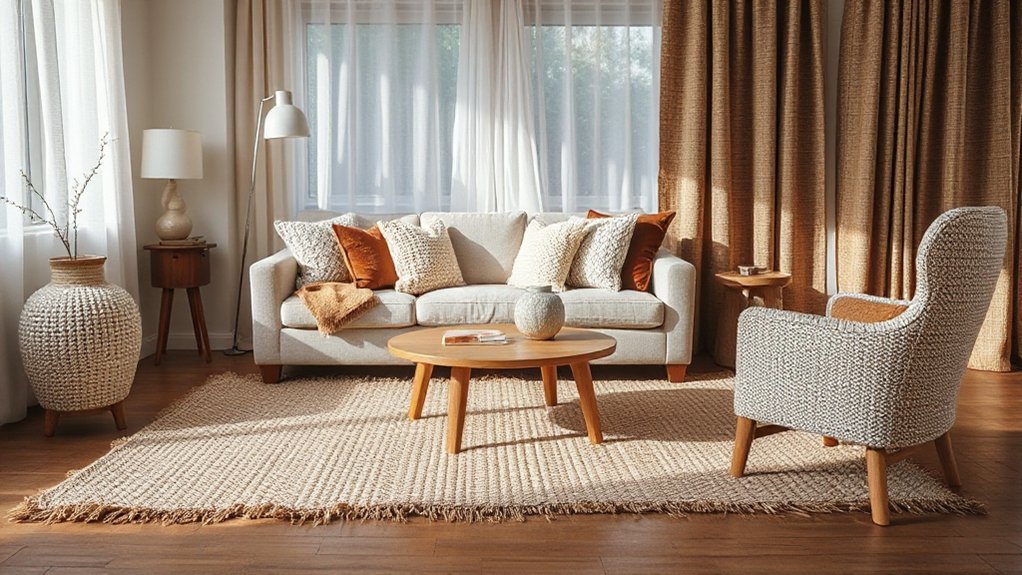
As you move from hard finishes to soft layers, use rugs, curtains, and cushions to control warmth, acoustics, and comfort without changing the bones of the room. Start Textile layering with a wool rug to soften footsteps and anchor seating; in UK homes, a dense pile helps in draughty flats.
Add curtains in linen, velvet, or a lined cotton to calm echo and frame daylight. Then build Texture contrast with cushions: mix bouclé, brushed cotton, and a touch of leather-look for depth, keeping colours tied to your base.
- Sink your toes into a rug that makes the room feel lived-in.
- Draw curtains and hear the space instantly hush.
- Stack cushions and watch the sofa turn into your favourite landing spot.
Add Structure With Hard Finishes and Edges
Although textiles bring the comfort, you’ll keep a room feeling intentional by adding structure with hard finishes and clean edges. Introduce stone-look porcelain, glass, lacquer, or metal to sharpen the silhouette and stop the scheme feeling too soft. Use squared-off coffee tables, crisp joinery lines, and framed artwork to give the eye clear boundaries—Texture psychology says contrast helps you read zones and feel organised.
Balance matte and gloss: pair a honed worktop with polished taps, or a satin-painted wall with a high-sheen lamp base. In UK homes, reflect light in smaller rooms with mirrors and glazed tiles, but avoid glare by keeping finishes in one tone.
For Texture maintenance, choose wipe-clean surfaces near kitchens and entryways, and protect edges with felt pads and trim seals.
Use Wood to Add Warmth and Grain
If your room feels a bit flat or cool, bring in wood to add instant warmth and a grain pattern that softens harder finishes without losing structure.
In UK homes, you’ll get the best balance by mixing one larger timber element with smaller accents, so the look stays calm, not cabin-like.
Choose oak, ash, or walnut tones that suit your light levels, and pick a matte oil or satin lacquer to keep the grain texture readable.
- Add a solid-wood sideboard to create grounding wood warmth you can feel as you enter.
- Layer slatted wall panels or a veneered headboard for quiet rhythm and visual comfort.
- Finish with wooden trays, frames, or a turned lamp base for a touchable, lived-in ease.
Use Stone to Add Weight and Coolness
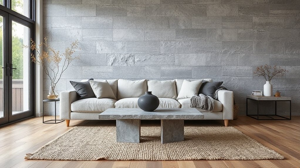
When you need a room to feel calmer and more anchored, stone delivers weight and coolness that visually steadies softer textiles and warm woods. In Texture psychology terms, it signals permanence and order, so use it where you want the eye to pause: a hearth surround, kitchen splashback, or a coffee-table top.
Choose honed limestone or matt slate for a quieter, UK-appropriate look; polished marble reads sharper and needs balancing with boucle, wool, or linen nearby. Bring tactile diversity by mixing scales: a large stone plane plus small, rough accents like a pebble tray or travertine coaster set.
Keep colours in a tight palette—greys, putty, and chalky creams—and repeat the tone in paint or ceramics so it feels intentional.
Use Metal for Shine (Without Going Cold)
You can bring in metal for a crisp shine, but you’ll keep it welcoming by pairing it with warm woods, textured fabrics, and softer lighting.
Layer finishes—think brushed brass with blackened steel or polished chrome—to add depth rather than a flat, showroom feel.
Use metal as an accent on taps, handles, lighting, and trim, so it lifts the scheme without turning the room cold.
Balance Metals With Warmth
How do you add that crisp metallic shine without tipping a room into chilly territory? Start by treating metal accents as punctuation, not the full sentence. In UK light, especially north-facing rooms, too much chrome can feel stark, so pair it with tactile, comforting materials and warmer colour notes. You’re aiming for warmth integration: the gleam stays, but the mood softens.
- Anchor shine with timber: oak, walnut, or even a stained pine shelf keeps the space grounded and homely.
- Bring in soft textiles: wool throws, bouclé cushions, and thick cotton curtains make metal feel inviting, not clinical.
- Add warm bulbs (2700K) and candles: you’ll get a cosy glow that flatters brass, nickel, and blackened steel.
Layer Finishes For Depth
Although a single finish can look tidy, it often reads flat in UK homes where daylight shifts quickly, so layer finishes to build depth while letting metal deliver a clean hit of shine without cooling the room. Start with a matte base on big planes—walls, sofa, rug—so reflections don’t dominate on bright mornings.
Then add mid-sheen elements like eggshell paint, oiled timber, or glazed ceramics to create Surface layering that feels natural in both north- and south-facing rooms. Keep metal present but moderated: choose brushed or satin over mirror-polished, and sit it beside tactile materials—bouclé, linen, cane, wool—for reliable Textural contrast.
Repeat your sheen levels across the room (matte, soft sheen, subtle shine) so the finish story feels intentional, not patchy, and stays warm at dusk too.
Use Metals As Accents
Because UK light can flip from steely to golden in minutes, treat metal as a controlled accent rather than a main finish: a few well-placed hits of brass, bronze, or satin nickel sharpen the scheme without turning it cold. Keep metal finishes consistent in undertone (warm with warm, cool with cool) and repeat them twice, not everywhere, so the room feels intentional.
Use brushed or satin surfaces for everyday calm; save high-polish for small moments that catch the eye. Let accent lighting do the work: aim a picture light at art, or use a shaded table lamp to make metal glow, not glare.
- A brass handle you touch daily adds quiet luxury.
- A bronze mirror edge lifts gloomy corners.
- A nickel sconce brings crisp evening sparkle.
Use Glass to Lighten Heavy Rooms
Where a room feels weighed down by dark finishes and chunky furniture, glass gives you an instant lift without stripping out character. Swap a solid side table for a glass-topped nest, or choose a coffee table with a clear base so your flooring shows through. You’ll keep the footprint but lose the visual bulk.
For light enhancement in UK homes with smaller windows, add a glazed door, a reeded glass screen, or a slim console with glass accents to bounce daylight deeper into the plan. Use smoked or bronze glass if you want mood without heaviness, and opt for tempered safety glass for family spaces.
Pair glass with matte paint and soft textiles so it feels warm, not clinical, all year round.
Repeat Textures to Make the Mix Feel Intentional
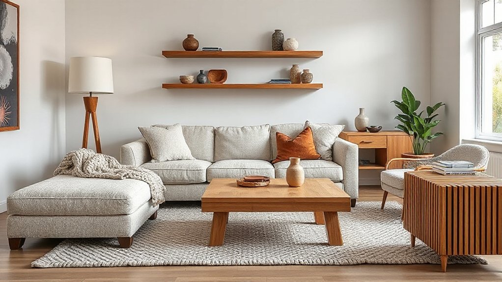
If you want a layered scheme to look deliberate rather than cluttered, repeat a few key textures across the room. Choose two or three “anchors” and echo them in at least three places—so the eye reads rhythm, not noise. This is texture psychology in action: repetition signals order, while varied scale keeps it alive.
In UK homes, start with what you already touch daily and build from there, focusing on tactile sensations rather than chasing trends. Try:
- Warmth: repeat a soft wool or brushed cotton on a cushion, throw, and headboard for instant comfort.
- Calm: echo pale oak or ash in a side table, frames, and shelving to steady the space.
- Confidence: repeat matte black metal on handles, a floor lamp, and a mirror to sharpen contrast.
Use Subtle Pattern as Texture (Even in Neutrals)
You can build texture without changing your palette by using tone-on-tone pattern play—think ivory geometrics on cream, or a subtle stripe in warm greige.
In UK homes, neutral prints on cushions, Roman blinds, or rugs add rich texture while keeping the scheme calm and easy to live with.
Layer a few understated motifs at different scales so the mix feels intentional, not busy.
Tone-On-Tone Pattern Play
Although a neutral scheme can read flat at first glance, tone-on-tone pattern play gives it depth by treating subtle pattern as texture. You’ll get Textural contrast without shouting, simply by shifting scale and finish within the same colour family. Think warm greige walls, a slightly darker herringbone rug, and cushions with a barely-there stripe—your eye feels movement, not noise.
Keep Pattern layering disciplined: repeat one motif twice, then introduce a quieter counter-pattern. In UK light, especially north-facing rooms, this approach stops beige from turning dull.
- Swap plain linen curtains for a self-jacquard to add calm richness.
- Choose micro-check upholstery to make seating feel tailored and secure.
- Add a tonal geometric cushion to spark quiet confidence.
Neutral Prints, Rich Texture
Where do neutral rooms find their bite when colour stays quiet? You lean on neutral prints to create a tactile read, not a loud statement. Think oatmeal herringbone on wool cushions, a fine pinstripe on linen curtains, or a chalky geo on a lampshade—patterns that register as texture at arm’s length.
Keep the palette tight (stone, putty, mushroom), then vary the finish: matt wall paint against a softly glazed ceramic, brushed brass, or rattan. In UK light, especially north-facing rooms, choose slightly warmer neutrals so the pattern doesn’t flatten.
Scale matters: use smaller repeats on larger surfaces like blinds, and larger repeats on accents like a throw. That’s how you get rich texture without colour noise.
Layered Subtle Motif Mix
Once you’ve got neutral prints doing the heavy lifting, layer in a subtle motif mix so the room gains depth without tipping into busyness. Think tone-on-tone geometrics, faint herringbone, or a whisper of stripe; these read like texture, not “pattern”. Keep Layered motifs within the same colour family, then use Subtle contrasts in scale and finish to stop everything feeling flat in grey UK light.
- Pair a small check cushion with a wide stripe throw—your sofa instantly feels tailored and calm.
- Add a jacquard blind or Roman shade; it softens daylight and makes mornings feel gentler.
- Ground it with a low-sheen rug in a quiet repeat; it hushes noise and makes the room feel held.
Limit yourself to three motifs per space, and repeat each twice.
Mix Textures in Small Spaces Without Clutter
Because small rooms show every detail, you’ll get the best results by mixing textures with a tight plan rather than piling on more pieces.
Start with one hero surface, like a boucle armchair or ribbed wool throw, then echo it twice elsewhere at smaller scale.
Choose space saving textiles: a flatweave rug, lined linen curtains that stack back neatly, and cushion covers you can swap seasonally.
Keep your palette to three materials—say oak, matte metal, and woven fabric—so the room reads calm.
Aim for clutter free layering by using built-ins, under-bed boxes, and baskets to hide extras, leaving only touchable finishes on show.
In UK rentals, use removable hooks and tension rods to add texture without drilling.
Stick to pieces that earn their footprint.
Avoid These Texture-Mixing Mistakes (and Quick Fixes)
Although texture can make a room feel richer and more lived-in, it’s easy to tip into “busy” when you mix too many finishes without a plan. Keep your scheme calm by choosing one hero texture, then adding supporting layers for Textural contrast, not competition. Check undertones: warm oak, brass, and terracotta sing; cool chrome and grey concrete can jar.
- You’re using too many “rough” surfaces—swap one for a smooth lacquer, glass, or satin paint so your eyes can rest.
- You’ve ignored scale—pair chunky knits with tighter weaves to avoid that itchy, crowded feeling.
- You’ve picked impractical fabrics—prioritise Material durability with washable slipcovers, performance velvet, and hardwearing wool for British homes and muddy paws.
Edit, then repeat your best texture twice for harmony.
Frequently Asked Questions
How Do I Mix Textures if I Have Pets That Shed or Scratch?
You can mix textures by choosing pet friendly fabrics like tight-weave microfibre or leather, and layering washable throws. Use durable surface choices such as wool rugs, textured tiles, and scratch-resistant wood finishes for UK homes.
Which Textures Are Easiest to Clean in High-Traffic Homes?
You’ll clean easiest with wipeable vinyl, leather, or tight-weave microfibre—your castle’s stone. Choose Durable upholstery options, and opt for sealed Textured wall finishes like washable matt; pair with porcelain tiles and low-pile wool.
Can I Mix Textures Successfully on a Tight Budget?
Yes, you can mix textures successfully on a tight budget by focusing on budget friendly layering and affordable texture options like throws, jute rugs, linen-look curtains, and matte paint; shop UK charity shops and clearance.
How Do I Blend Textures When Combining Different Design Styles?
Like a London pub quiz, you’ll win by picking a clear theme: repeat Layered fabrics across styles, then balance with contrasting finishes. Limit materials to three, echo one texture twice, and edit ruthlessly.
What Textures Work Best for Allergy-Sensitive Households?
Choose smooth, tightly woven, washable textures: leather, faux leather, cotton sateen, microfibre, and flatweave wool; avoid deep pile. You’ll get textural contrast and tactile harmony using wipe-clean paints, blinds, and dust-resistant rugs.
Conclusion
When you mix textures well, your room feels layered, not busy. Start with one anchor—maybe a chunky wool rug—then add contrast: smooth glass, matte paint, a glossy tiled splashback. Think of it like making a proper cup of tea: too much milk and it’s flat; the right balance and everything sings. In my last London flat, repeating oak tones and linen kept the look intentional, even in 35m². Keep editing.