
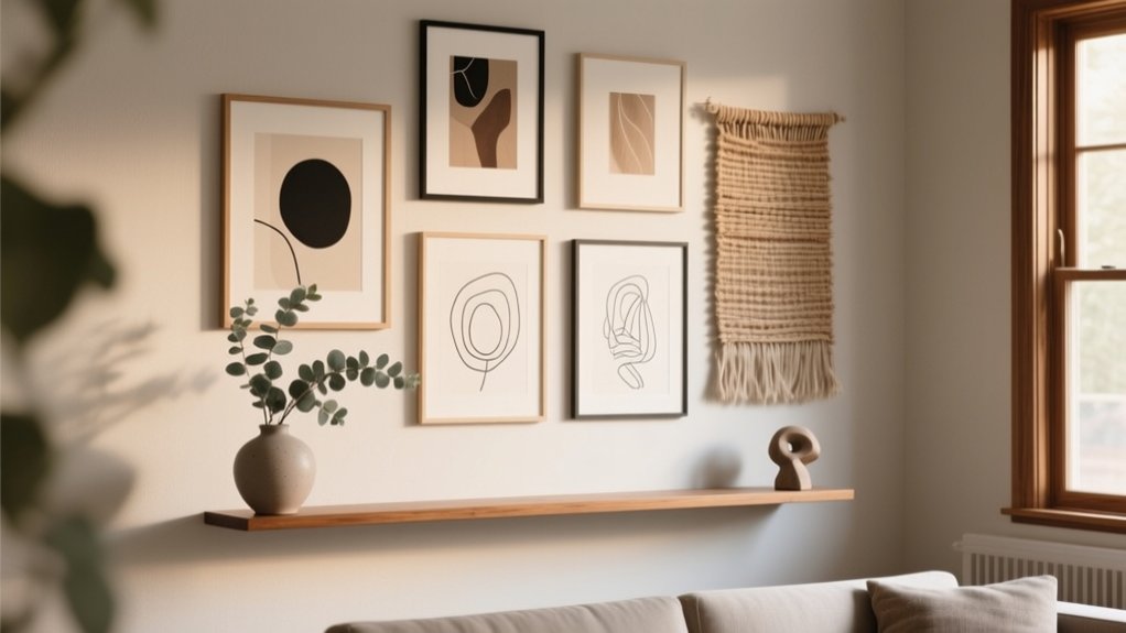
You’ll get pro-looking DIY wall decor by planning like a designer: set a firm budget (add 10% cushion), audit tools, and tape out your layout before hanging anything. Stick to a cohesive three-color palette with one sharp accent, then nail scale—art should span about two-thirds of the furniture width, spaced 2–3 inches apart, centered at 57–60 inches high. Add polish with picture-frame molding, slim ledges, plaster or limewash texture, and warm, dimmable gallery lighting. Keep going for the step-by-step playbook.
Plan DIY Wall Decor: Budget, Tools, Layout
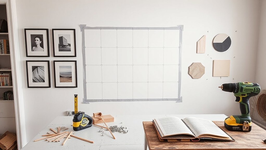
Before you pick up a paintbrush, how do you want your DIY wall decor to look—and what can you realistically spend to get there? Set a firm budget by pricing frames, hardware, primer, and finishing supplies, then reserve 10% for surprises.
Audit your tools: level, stud finder, tape measure, painter’s tape, anchors, and a drill; rent specialty items instead of buying.
Next, map your layout. Measure the wall, note outlets and switch plates, and mark a centerline at eye level. Use paper templates or masking-tape outlines to test spacing, margins, and alignment before you commit.
Finally, choose a direction that matches wall decor trends without feeling temporary—mix clean lines with nods to historical styles through molding profiles, gallery symmetry, or antique-inspired silhouettes.
Choose a Cohesive Color Palette (Fast Method)
To keep your DIY wall decor looking intentional, you’ll choose a tight 3-color scheme: a dominant base, a supporting secondary, and a clean neutral.
Then you’ll commit to one accent hue for high-impact moments—think a single bold line, shape, or frame—so the whole wall reads curated, not chaotic.
With that fast method, you can mix textures and styles while the palette keeps everything on-trend and cohesive.
Pick A 3-Color Scheme
While you can improvise as you go, choosing a tight 3-color scheme upfront makes DIY wall decor look intentional and on-trend instead of accidental. Start by pulling one dominant color from your room (so the art feels anchored), then add a supporting neutral to calm the composition, and finish with a second supporting color for contrast.
For fast Color harmony, use a simple rule: pick three swatches that sit near each other on a paint deck, or borrow a ready-made palette from your rug, pillows, or a favorite print. Keep finishes consistent—either mostly matte or mostly satin—so the palette reads cohesive.
This approach sharpens mood creation: warm tones feel inviting, cool tones feel airy, and balanced neutrals feel modern.
Use One Accent Hue
If you want your DIY wall decor to feel curated in minutes, commit to one accent hue and let everything else stay quiet. Choose a shade that supports your room’s function using Color psychology: sage calms, terracotta energizes, navy grounds, and butter yellow lifts.
Repeat that hue in three to five small hits—matting, a painted frame edge, a vase on a shelf, or a thin stripe in your print—so it reads intentional, not accidental.
Keep neutrals consistent (warm or cool) and limit competing patterns.
If you’ve got an accent wall, let it be the “statement” and match your decor hue to its undertone, not its exact color.
You’ll get cohesion fast, with designer-level restraint and focus.
Use Scale Right: Size, Spacing, Hanging Height
Because even the most beautiful DIY piece can feel “off” when it’s undersized or hung too high, getting scale right should be your first styling checkpoint.
Start with scale proportion: aim for art that fills about two‑thirds the width of the furniture below it, or go larger and let it anchor the wall.
For spacing, keep a tight, gallery-worthy rhythm—2 to 3 inches between frames reads intentional, not scattered.
Hang height matters just as much: place the center of your piece around 57 to 60 inches from the floor, then adjust slightly for sofa backs or headboards.
Step back, photograph it, and tweak until the arrangement reads as one calm rectangle of visual harmony.
Picture-Frame Molding for a Luxe Accent Wall
Once you’ve nailed scale and hang height, you can level up an entire wall with picture-frame molding—an elevated, architectural detail that reads custom and high-end. Map a simple grid with painter’s tape, then mark stud lines and panel spacing with a laser level so every rectangle lands crisp and intentional.
Choose MDF for clean profiles on a budget, or primed pine for better material durability in high-traffic rooms. Cut miters carefully, glue and brad-nail, then fill seams, caulk edges, and sand for that seamless “built-in” look.
Paint everything one tone for modern quiet luxury, or use color contrast—molding in semi-gloss against matte walls—to make the geometry pop. Finish with even sheen and sharp corners, and the wall looks designer-detailed.
Oversized DIY Wall Art With a Drop Cloth Canvas
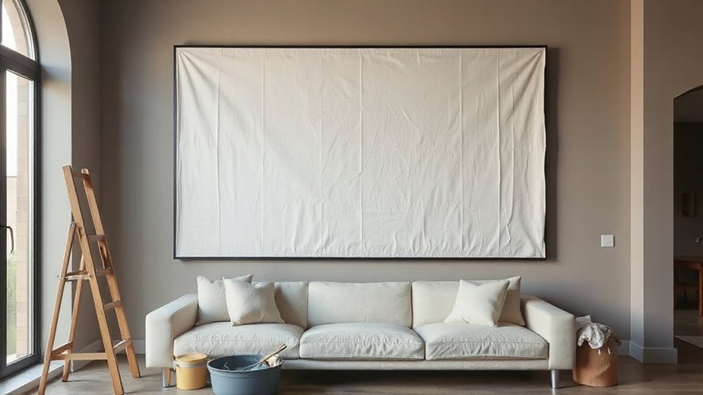
You can get that oversized, gallery-worthy look on a budget by stretching a painter’s drop cloth into a clean, modern canvas.
You’ll start with smart prep—washing, pressing, and priming for an even weave—then use on-trend techniques like color blocking, tonal washes, or loose abstract strokes to build depth fast.
Finish strong with matte or satin sealers, crisp taped edges, and optional texture mediums so the piece reads custom, not crafty.
Drop Cloth Canvas Prep
Before any paint hits the wall, prep your drop cloth canvas like a pro so the finished oversized art looks crisp, not crumpled or blotchy. Start with drop cloth preparation: wash and dry the cloth to remove sizing, then iron or steam it flat for a smooth, gallery-like surface.
Trim stray threads and check for thin spots that could telegraph through later.
Next, stretch it tight over a DIY frame or sturdy stretcher bars, pulling evenly from center to corners so you don’t get ripples. Staple along the back, then fold corners neatly for a clean profile.
For canvas priming, apply a clear gesso or acrylic medium to seal the weave without losing that modern, linen vibe. Let it cure fully, then lightly sand for uniform texture.
Painting Techniques And Finishes
After the gesso cures and the surface feels smooth under your fingertips, the paint stage turns that humble drop cloth into oversized wall art with real presence. Start with a tinted base coat to eliminate stark white; warm greige and clay read current and elevated. Use a wide, flat brush for clean coverage, then switch to intentional brush techniques: dry-brush for linen-like texture, crosshatch for subtle movement, or a soft scumble to blur edges like a minimalist mural.
Keep your palette tight—two tones plus one accent—so scale feels designed, not busy. For depth, glaze a diluted darker tone into corners and wipe back with a rag. Seal with matte finishes to avoid glare and keep the surface gallery-modern. Let each layer dry fully.
Build a Clean Grid Gallery Wall (Templates + Math)
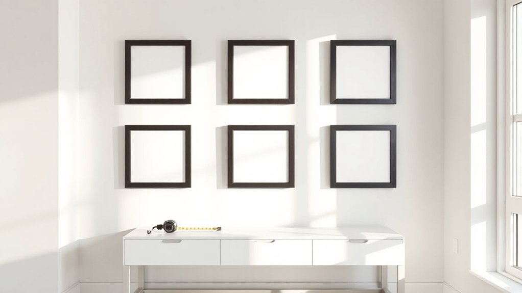
Whether you’re styling a blank hallway or refining a living-room focal point, a clean grid gallery wall delivers that crisp, modern “designed” look—without the visual noise of a salon-style hang. Start by choosing identical frames or a tight two-size mix; your framing techniques should feel intentional, not accidental. Use color contrast (black frames on warm walls, light oak on deep paint) to sharpen the grid’s impact.
Do the math: measure wall width, subtract total outer margins, then divide the remainder by columns to set frame spacing. Repeat for height and rows. Cut kraft-paper templates to each frame size, mark hanger points, and tape them up with a level and painter’s tape. Step back, adjust, then commit with hooks.
DIY Shelf Ledge That Looks Custom-Built
Start by measuring your wall and mapping the exact ledge height and length so it aligns with your furniture lines and reads intentional.
Then you’ll build a crisp, minimal-profile shelf ledge with straight cuts and tight joints that keeps the look modern and tailored.
Finish it like millwork—fill, sand, caulk, and paint (or stain) with care—so it looks fully custom, not DIY.
Measure And Plan Placement
Before you pick up a drill, map out your shelf ledge like it’s built-in: measure the wall span, note nearby trim, outlets, and switches, and decide the exact ledge length and height based on what you’ll style (frames, vinyl covers, ceramics).
Start with a precise wall measurement, then translate it into placement planning that feels intentional, not “tacked on.” Use painter’s tape to outline the ledge, step back, and check sightlines from the doorway and seating.
Keep the top edge level with a laser, and confirm it won’t collide with cabinet doors or curtains. Mark studs, but also mark your visual center—often aligned to a sofa, console, or art grouping.
Finally, pencil in spacing between multiple ledges so your styling reads curated, not crowded.
Build A Clean Ledge
How do you get that crisp, custom-built look without paying for millwork? You build a clean ledge with straight cuts, tight joinery, and a minimalist profile.
Start by cutting a back board and a bottom board to length, then add a front lip for a shadow line that reads intentional.
Keep the wall shelf depth slim (3–5 inches) so it feels architectural, not bulky.
Pre-drill, apply wood glue, and clamp before driving brad nails or screws to avoid drift.
For a seamless ledge design, align edges flush and sand joints smooth so they disappear.
Mount by hitting studs with a level, or use a French cleat if you need flexibility.
You’ll get gallery-worthy display space fast.
Finish Like Millwork
That clean ledge shape only reads truly custom once the finish work hits the same standards as millwork. Start by filling nail holes and seams with a stainable wood filler, then sand flush with 180–220 grit so your profiles look crisp, not DIY.
Caulk the top edge where the ledge meets drywall for seamless wall finishing, and feather the joint compound if the wall’s wavy.
Prime everything, even pre-primed trim, then apply two thin coats of enamel in a modern satin or soft-matte. Use a mini foam roller for flat runs and a quality angled brush to tip off.
For millwork techniques, keep paint lines sharp: tape, burnish, and pull while tacky.
Finally, add a tiny shadow gap or back-bevel for a built-in look.
Add Depth With DIY Wall Panels (Board + Batten)
While paint and prints add personality, DIY wall panels—especially classic board-and-batten—bring instant architectural depth that makes a room feel intentionally finished.
You can mimic custom millwork with simple wood paneling: apply a level ledger, then mount vertical battens at consistent spacing (12–16 inches reads modern). Keep the profile slim for a clean, boutique-hotel look, or cap it with a rail for a more traditional vibe.
Use decorative molding to frame corners, align lines with window casings, and hide small drywall flaws.
Before you nail, map the layout on painter’s tape so seams land symmetrically.
Finish with caulked edges, a satin enamel, and crisp shadow lines that photograph like designer-built detailing.
Try Textured Finishes: Plaster or Limewash
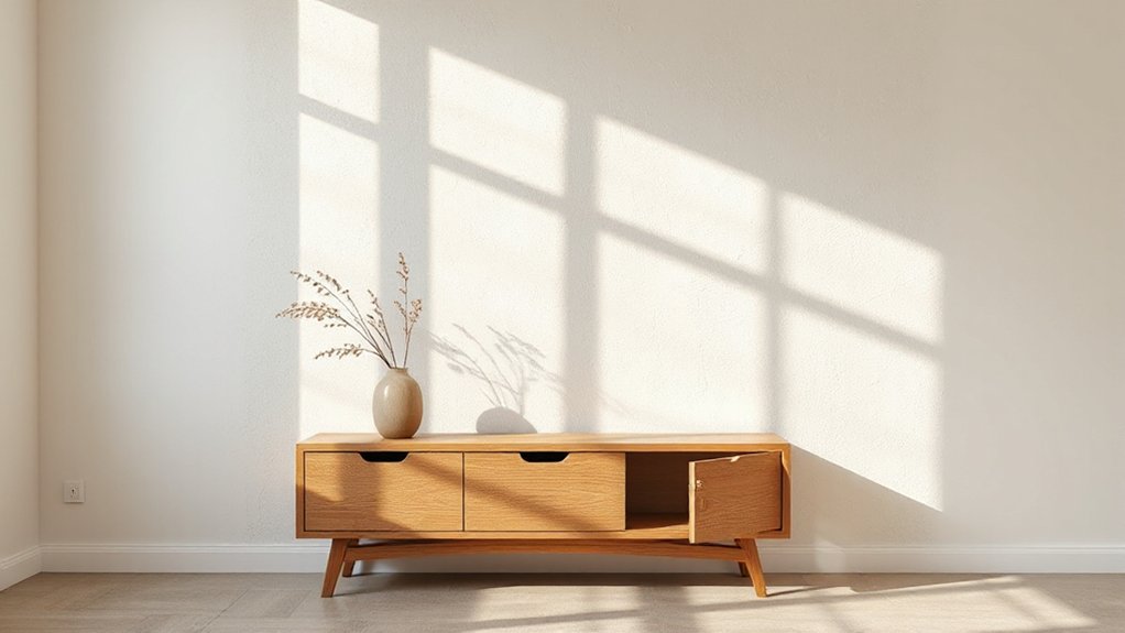
If you want your walls to feel collected rather than just painted, reach for plaster or limewash to add tactile, light-catching movement. These textured finishes read as custom, especially in modern organic or quiet-luxury rooms, and they pair beautifully with board-and-batten’s clean geometry.
Start with solid prep: patch, sand, degloss, and prime so your surface treatments bond evenly.
For plaster, use a wide trowel and work in loose, overlapping passes; keep edges feathered to avoid harsh seams.
For limewash, dampen the wall, brush in X strokes, and embrace slight tonal shifts as it cures.
Choose warm whites, clay, or muted stone to keep the look elevated, not busy.
Seal only if your space needs wipeability.
Light Your DIY Wall Decor Like a Gallery
Because great wall decor deserves the same consideration as the art in a boutique hotel, light it intentionally—then your DIY pieces look curated instead of simply “hung up.” Start by layering lighting the way galleries do: use a picture light or slim LED art bar to wash the surface, add an adjustable spotlight to create gentle dimensional shadows, and keep ambient lighting warm and even so colors stay true.
For modern lighting techniques, aim for glare-free illumination and consistent color rendering; for smart fixture selection, choose low-profile, dimmable options that disappear visually.
- Pick 2700–3000K LEDs for a luxe, flattering glow
- Target CRI 90+ so pigments and textures read accurately
- Angle spotlights 30° to reduce hot spots and reflections
- Put everything on a dimmer to fine-tune mood and contrast
Style and Hang Everything: The Pro Checklist
Once you’ve chosen your pieces, style and hang them with a repeatable checklist that keeps the wall looking intentional, not improvised. Start with color coordination: pull two to three hues from your room and echo them across frames, mats, and small accents to create a curated rhythm.
Next, map the layout on the floor, then tape paper templates to the wall so you can tweak spacing without extra holes. Keep gaps consistent (about 2–3 inches) and align centers at eye level; vary sizes, not chaos.
Use smart Hanging techniques: anchors for heavy work, picture rails or French cleats for oversized pieces, and removable strips for lightweight prints.
Finish by stepping back, photographing, and correcting any tilt immediately.
Frequently Asked Questions
How Do I Remove Wall Decor Without Damaging Paint or Drywall?
Warm adhesive with a hair dryer, then peel slowly at a low angle; use dental floss for frames in a gallery arrangement. For wall decal removal, add heat, lift edges, and clean residue with isopropyl alcohol.
What Are Renter-Friendly DIY Wall Decor Options That Don’T Require Nails?
You’ve got plenty of renter-friendly options: mount framed prints, lightweight shelves, and tapestry hangings using Temporary adhesives and Removable hooks. Lean larger art on consoles, try washi-tape galleries, or hang pegboards for flexible, stylish storage.
How Can I Soundproof a Room While Upgrading the Wall Decor?
Like a hush in a modern gallery, you’ll soften echoes by mounting stylish Acoustic panels as art-grid features and adding luxe Soundproof curtains. You can layer rugs and upholstered headboards, too, for a trend-forward, quieter vibe.
What’s the Best Way to Protect Wall Art From Humidity and Sunlight?
You’ll protect wall art best by framing with UV-filter acrylic for sunlight protection and sealing backing boards. You should maintain humidity control via a dehumidifier, keep pieces off exterior walls, and avoid direct window placement.
How Do I Match DIY Wall Decor to Existing Furniture and Flooring Tones?
Like a tailored suit, you’ll match DIY wall decor by sampling undertones in flooring and key furniture, then echoing them with two accent colors. Prioritize color coordination and furniture harmony, balancing warm/cool metals and wood grains.
Conclusion
You’ve got everything you need to make DIY wall decor look designer-level: a tight palette, correct scale, luxe molding, and elevated texture—then you light it like a gallery. Imagine this: you spend one Saturday adding picture-frame molding and a soft limewash in warm greige, then hang a drop-cloth canvas centered at 57 inches with 2-inch spacing. By Sunday night, your living room reads custom-built, not crafty—and it still fits your budget.