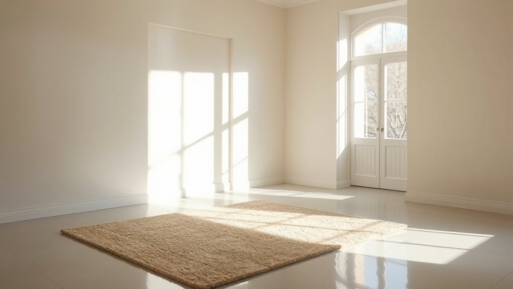
For brightening a dark room, start with light-reflective neutrals that have a higher LRV, balancing cool and warm whites to avoid flatness. Pair soft pastels or airy whites—pale blues, dusty pinks, and soft mint—with room orientation in mind, since natural light shifts color reads. Matte finishes soften glare, while satin adds subtle sheen and durability. Test swatches under multiple lights, apply with quality tools, and pair the hue with decor to reinforce brightness. You’ll uncover more strategies as you continue.
What Makes Brightness Hinge on Undertones and Light
Brightness in a room isn’t just about how much light you have; it hinges on undertones and how light interacts with them. You’ll see that color temperature defines perceived warmth or coolness, shaping brightness alongside pigment.
When you choose paints, consider how natural light shifts hue throughout the day; mornings feel soft and warm, while afternoons skew cooler. Undertones matter: a pale shade with a yellow base can reflect more ambient glow in a dim hall, while a pink or blue lean may mute luminance.
You optimize brightness by balancing undertones with the room’s natural light, selecting hues that harmonize with windows and exposure. In this approach, color temperature and natural light become precision tools, guiding your palette toward brighter, more open perception.
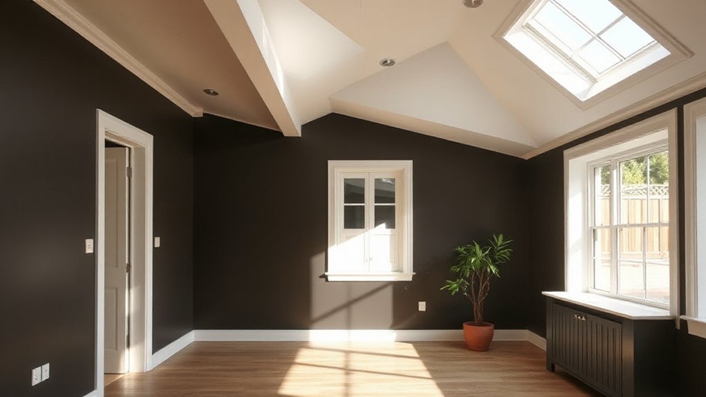
Top Light-Reflective Neutrals for Small or Dark Rooms
When you’re working with small or dark rooms, selecting light-reflective neutrals can dramatically open up the space. Choose shades with higher LRV (light reflectance value) to bounce natural light and avoid flat, dreary walls.
Top neutrals include cool and warm whites designed for balance, not starkness, so you preserve depth without dullness. In practice, test chips in multiple lighting conditions to gauge true reflectivity.
Consider color psychology: softer neutrals can calm and enlarge, while slightly warmer tones evoke coziness without shrinking the room.
For durability, opt for paints formulated for longevity—scuff resistance and cleanability matter in busy areas. Prioritize even coverage and low odor formulas to ease application.
These choices support consistent brightness, long-term paint durability, and a visually expansive feel.
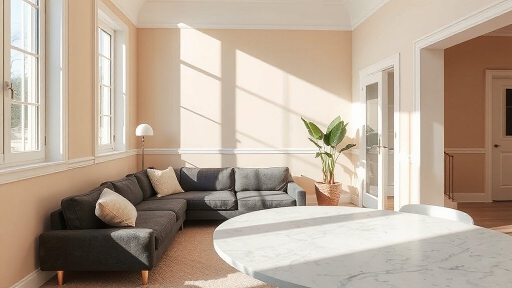
Soft Pastels and Airy Whites That Visually Enlarge Spaces
Soft pastels and airy whites lighten spaces without overpowering them, creating an open, breathable atmosphere that visually expands rooms. You’ll feel calmer with pale blues, dusty pinks, and soft mint greens that reflect natural light rather than absorbing it.
Choose tones that lean toward warm or cool as dictated by your room’s orientation to maintain balance. Color psychology suggests these hues reduce perceived clutter and enhance clarity, helping small spaces feel larger.
Airy whites, including off-whites with subtle warmth, act as neutral canvases that elevate architectural features and textures.
Historical color trends show a cyclical return to soft, luminous palettes, reinforcing timeless versatility. Pair with restrained accents, and you’ll achieve spaciousness without sacrificing personality or depth.
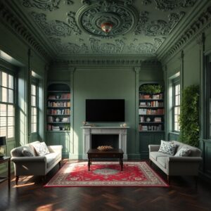
How Room Orientation and Finish Change Color Reads
Room orientation and finish dramatically influence how paint reads in a space, shaping mood, depth, and perceived size. You’ll notice walls reflect or absorb light differently based on ceiling height, window placement, and shade direction, altering color reads from calm to vibrant.
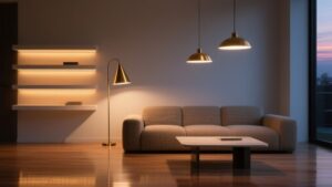
A matte finish softens glare, creating a cozy, intimate feel that can mute intensity in dark rooms, while a satin or eggshell finish adds subtle sheen that enhances color depth without amplified glare.
Orientation toward natural light can lift cooler tones and mute warm ones, and mixed lighting presets shift the same hue’s perceived warmth.
Consider color psychology when selecting hues, and remember finish choice affects paint durability under daily wear, cleaning, and fade resistance.
A Practical 3-Step Workflow: Test, Apply, and Pair With Décor
A practical 3-step workflow starts with testing, moves to application, and ends with décor pairing that reinforces the chosen color.
Begin by testing swatches in various lighting to gauge color psychology effects—notice how warmth or coolness shifts mood and perceived brightness.
Next, apply color on a representative wall section, using consistent, quality tools to guarantee even coverage and paint durability across coats and edges. Allow proper curing, then evaluate under natural and artificial light.
Finally, pair the hue with décor elements that reflect its intent: choose textiles, metals, and furniture silhouettes that amplify contrast or harmony without overpowering the room.
Document results for future tweaks. This approach keeps color decisions deliberate, efficient, and reusable, guiding you toward cohesive, bright spaces.
Frequently Asked Questions
How Often Should I Repaint to Maintain Brightness in Dark Rooms?
You should repaint every 5–7 years to maintain brightness in dark rooms, adjusting with fading you notice. Consider Lighting fixtures and wall textures, since upgrades here can extend the need for repainting and keep the space visually vibrant.
Do Ceiling Colors Affect Perceived Room Brightness?
Yes, ceiling colors affect perceived brightness—lighter ceilings create ceiling color illusions that widen space. Use ceiling paint techniques like matte or satin sheens and pale neutrals to maximize light reflection and airiness in your room.
Can Natural Light Type Alter Paint Color Perception?
Natural light can alter color perception, so you’ll see shifts as the sun moves—like a chameleon changing hue. You’ll notice brighter tones during peak daylight, and cooler undertones at dusk, guiding your color choices and overall aesthetic.
What About Pigment Quality vs. Brand Impact on Brightness?
Pigment depth affects brightness more than brand name, you’ll notice deeper pigments muted by undertones, while Brand consistency guarantees predictable results across coats and lighting. You’ll prioritize high-quality pigments for even, luminous color, avoiding sudden shifts.
Are Metallic or Glossy Finishes Suitable for Brightening Spaces?
Metallic finishes and glossy finishes can brighten spaces, but with caution: they reflect light intensely and reveal imperfections. You’ll notice sparkle from metallic accents, while glossy walls amplify light; use them sparingly for balanced luminosity and polish.
Conclusion
Brighten your space with colors that play to light and undertone, transforming every shadow into a glow. By choosing light-reflective neutrals, soft pastels, and airy whites, you’ll visually enlarge rooms without losing atmosphere. Remember: room orientation and finish shift color reads, so test and pair thoughtfully with décor. With this practical, three-step approach—test, apply, pair—you’ll master brightness effortlessly. Your space will feel luminous, welcoming, and somehow magically bigger than it appears.