
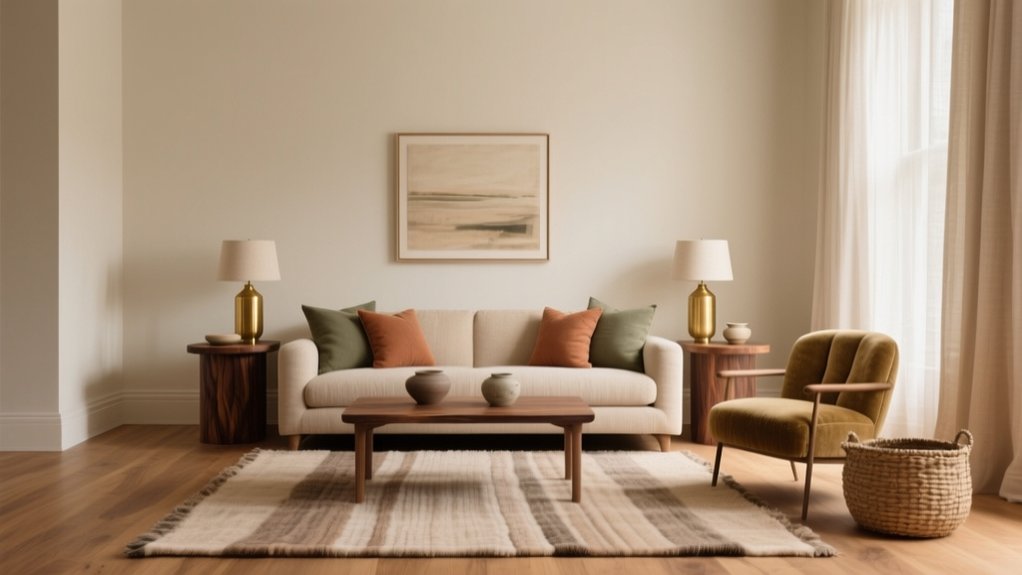
You’ll achieve harmony in interior design by making colour, light, scale, and finishes serve one clear intent, so nothing competes. Start with a style anchor (timber tone, metal finish, or key texture) and repeat it three times across the room and home. Build a 60–30–10 palette, then add contrast with controlled light/dark values and layered 2700K lighting. Keep circulation clear (75–90cm), scale furniture to architecture, and align sightlines and heights. Keep going for deeper, room-by-room guidance.
Define Interior Design Harmony (In One Minute)
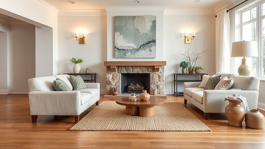
Although every room contains dozens of individual choices, interior design harmony is the deliberate way you make them read as one coherent whole. You achieve it when colour, lighting, proportion, and texture support a single intent, rather than competing for attention.
In UK homes, that often means balancing period features with modern function, so nothing feels bolted on.
Harmony isn’t about matching sets; it’s about controlled relationships. You repeat key tones, align finishes, and scale furniture to the room’s architecture, so the eye moves without interruption. That creates spatial flow, guiding how you enter, pause, and circulate.
It also delivers mood enhancement: calmer bedrooms, brighter kitchens, and living rooms that feel settled. When harmony’s right, you notice comfort first, not the individual items.
The 5 Rules of a Cohesive, Calm Room
If you want a room to feel cohesive and calm, you need a few non-negotiable rules that keep every choice pulling in the same direction. First, limit your palette to three core tones, then repeat them across walls, textiles, and accessories.
Second, control visual noise: conceal cables, close storage, and keep surfaces at least 70% clear.
Third, build consistent lighting layers—warm LEDs (around 2700K) plus task light—so the room stays steady from grey mornings to evenings.
Fourth, apply Feng Shui principles: keep clear walking lines, don’t block door swings, and avoid sharp corners pointing at seating.
Fifth, use Artistic symmetry in key views—matching lamps or balanced artwork—to settle the eye.
Choose a Style Anchor (and Two Supports)
Once you’ve tightened your palette, cleared the clutter, and stabilised the lighting, you need a style framework so every new purchase lands in the right place. Choose one “style anchor” that sets the rules: Georgian symmetry, mid-century modern lines, Japandi restraint, or relaxed British coastal.
Then pick two supports to add nuance without diluting the anchor. Keep them specific: “industrial metalwork” and “Arts and Crafts joinery” works better than vague “eclectic”. Use Style inspiration from local references—London warehouse conversions, Cotswold stone cottages, or Edinburgh tenements—so decisions feel grounded.
Check cultural influences in your own home too: a Persian rug, West African textiles, or Scandinavian ceramics can become a support if you repeat its materials and forms.
Audit each item: does it reinforce the anchor or one support? If not, skip it.
Build a Harmonious Color Palette (60–30–10)
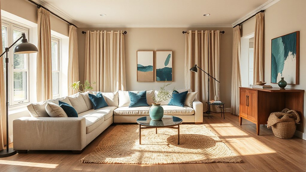
Start with a dominant base colour for roughly 60% of the room—typically walls and key upholstery—so the space reads calm and coherent.
Layer in about 30% secondary tones through curtains, rugs, and larger furniture to balance warmth and contrast without competing.
Finish with 10% bold accent pops in cushions, art, or accessories to sharpen the scheme and give it a distinctly considered UK feel.
Choose Dominant Base Color
Although the 60–30–10 rule balances your palette, the dominant 60% base colour sets the room’s temperature and mood, so choose it first with purpose. Use colour psychology to match function: warm off-whites and clay tones suit sociable living rooms, while cooler greys, blue-greens, or soft sage support focus in a home office.
Test your choice on large sample cards and paint swatches across north- and south-facing walls; UK light shifts dramatically through the day. Anchor the base to fixed elements you won’t change soon—floorboards, carpets, brickwork, or a fitted kitchen.
Pick a finish that suits wear: durable eggshell for busy hallways, matt for calmer bedrooms. Your base should create a consistent backdrop with clear emotional impact.
Balance Secondary Supporting Tones
After you’ve set the 60% base colour, use the 30% secondary tones to shape contrast and structure without breaking the room’s calm.
Choose one to two supporting hues that sit close on the colour wheel or share the same undertone, so your scheme reads intentional in UK light. Apply them to mid-scale elements: sofa upholstery, curtains, a large rug, or painted joinery, keeping finishes consistent across rooms.
Control balance by repeating these secondary tones at least three times, spaced from floor to ceiling, so the eye travels smoothly. If you introduce color accents within this 30%, keep them muted and diluted rather than saturated, and match metals and timbers accordingly.
This creates depth, not noise.
Add Bold Accent Pops
Once your 60% base and 30% supporting tones feel settled, use the final 10% to add bold accent pops that sharpen the scheme without overwhelming it.
In UK homes, keep accents targeted: a rust velvet cushion on a neutral sofa, a cobalt lamp against warm greige, or a mustard artwork pull from the undertone in your wood flooring. Choose one or two accent colours, then repeat them in small doses to create intentional visual pops—think throws, vases, book spines, or a single painted chair.
Control saturation and finish: glossy accents read louder than matte, and metallics (brass, chrome) count as accents too. If the room feels busy, scale back patterns first, not your base palette.
Add Contrast Without Losing Cohesion
To add contrast without losing cohesion, you’ll balance light and dark values so the room keeps a clear hierarchy and doesn’t feel choppy.
You’ll mix textures with purpose—pair matte walls with timber, boucle, or brushed metal—so every finish earns its place and suits everyday UK living.
You’ll use colour accents strategically in repeat points (cushions, art, and a single statement chair) to lift the scheme without breaking your 60–30–10 palette.
Balance Light And Dark
Although a light-filled room can feel effortless, you’ll only achieve true interior harmony when you deliberately balance light and dark. Start by mapping daylight: note where morning sun lands and where corners stay flat, then plan shadow play rather than fighting it.
In UK homes, especially terraces and flats with limited glazing, use contrast techniques such as deeper skirting, charcoal joinery, or a mid-tone feature wall to anchor bright spaces. Keep ceilings and main walls lighter, but introduce darker notes at eye level to prevent glare and visual drift.
Layer lighting in zones: warm LED lamps for evening, focused task lights, and discreet uplights to soften harsh edges. Repeat one dark accent across the room so the contrast feels cohesive, not random.
Mix Textures With Purpose
Balanced light and shade set the mood, but texture gives the room its grip and keeps contrast feeling intentional rather than patchy. You’ll get harmony by choosing finishes that relate, then varying their feel for controlled textural contrast.
Start with one dominant surface—oak boards, wool carpet, or plastered walls—and let everything else support it.
- Pair a matte base with a single sheen: brushed brass, glazed tile, or lacquered joinery for crisp definition.
- Repeat a texture twice: boucle on a chair and a cushion, or ribbed glass in two lamps, to stitch zones together.
- Balance tactile diversity: soften stone with linen, warm metal with leather, and keep pile heights consistent.
Use Color Accents Strategically
When you introduce colour accents with a plan, you add contrast that sharpens the scheme without breaking its logic. Start with your base palette, then choose one or two accent hues that support it through Color psychology: teal calms, ochre warms, and black grounds.
Keep accents to 10–15% of the room so they read as intentional, not scattered.
Prioritise accent placement where the eye naturally lands: cushions on the main sofa, a rug border, artwork at sightline, or a single painted alcove. Repeat the accent at least three times, varied in scale, to create rhythm across open-plan UK spaces.
Balance saturation with neutrals common in British light, and match undertones so the contrast stays cohesive and controlled.
Repeat Shapes and Lines to Unify the Space
If you want a room to feel cohesive rather than cobbled together, repeat key shapes and lines across the scheme so your eye can track a clear visual rhythm. In UK homes, this stops open-plan zones feeling bitty and helps older rooms read as intentional.
Build repetition patterns with furniture silhouettes, joinery details, and lighting profiles, then reinforce them at different scales so nothing looks forced. Maintain line continuity by aligning heights, edges, and sightlines—think skirting to shelving, radiators to console tops, and curtain headings to window frames.
Use these moves:
- Echo one dominant curve or rectangle in three places (sofa, mirror, rug).
- Run a consistent horizontal datum (picture rail, shelf line, headboard).
- Match leg angles or metal profiles across tables, chairs, and lamps.
Layer Textures Without Visual Clutter
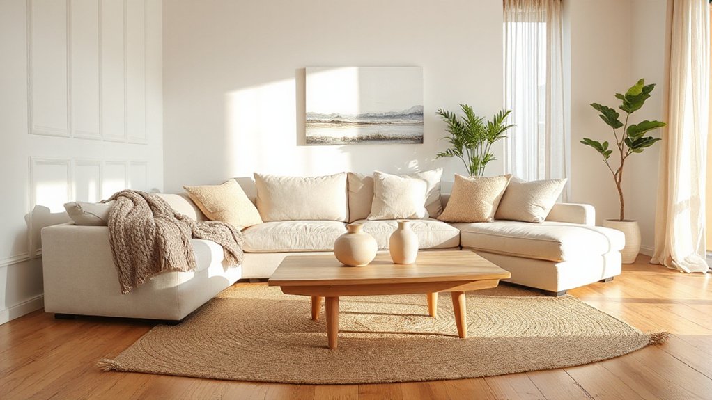
To layer textures without visual clutter, you’ll start with a cohesive material palette that suits your home’s light and finish levels, from oak and wool to brushed brass.
You’ll then control contrast by pairing one or two tactile standouts—like boucle or ribbed glass—with quieter, matte surfaces so the room still reads calm.
Keep repeats consistent across soft furnishings and joinery, and you’ll get depth without the space feeling busy.
Cohesive Material Palette
How do you build a rich, tactile interior without it feeling busy? You do it by committing to a cohesive material palette, then repeating it with discipline across the room.
In UK homes, where light shifts fast, limit your base materials to a tight set and let finish changes carry the interest. Material mixing works when you control undertones and sheen; texture coordination works when you repeat the same “family” of surfaces at different scales.
Use this checklist:
- Pick three anchors: one wood tone, one metal finish, one textile type.
- Repeat each anchor at least three times (furniture, lighting, hardware).
- Keep patterns quiet; rely on weave, grain, and matte-to-satin variance.
You’ll get depth without clutter, and every addition will look intentional.
Balanced Texture Contrast
Because British light can flip from cool grey to warm sun in minutes, you need texture contrast that reads as deliberate, not fussy. Start with one dominant texture—say, a matte painted wall or a wool carpet—then add two supporting layers.
Use textural juxtaposition by pairing smooth oak or lacquered cabinetry with nubby linen, boucle, or ribbed glass. Keep surface variation controlled: repeat each texture at least twice (cushion and curtain, tile and lamp base) so it feels intentional.
Limit your palette to two to three finishes per zone, especially in open-plan UK terraces and flats. Balance scale: mix fine-grain elements with one chunky knit or rattan piece, then leave breathing space on shelves and worktops.
Balance Furniture Scale and Spacing
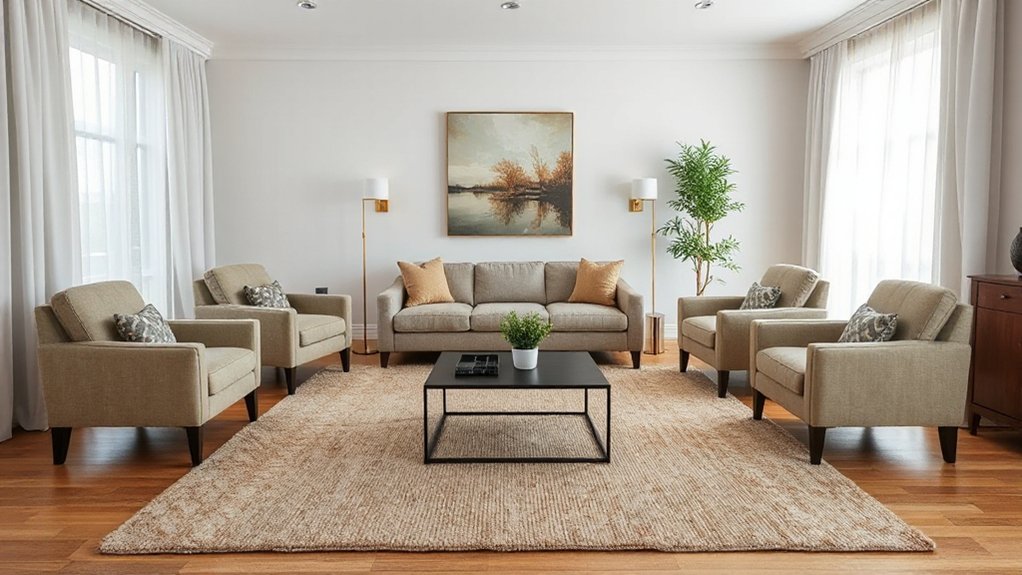
Whether you’re furnishing a compact London flat or a wider suburban lounge, you’ll get a calmer, more coherent room when the furniture’s scale suits the space and you leave deliberate breathing room around it. Aim for scale variation without visual chaos: pair a low, deep sofa with slimmer side tables, and keep bulky pieces off tight routes to doors and radiators.
Protect spacing consistency so circulation feels effortless and safe. Use these checks:
- Leave 75–90cm walkways in main paths; 60cm minimum in secondary routes.
- Keep 40–50cm between sofa and coffee table, and align table height near seat level.
- Float rugs so front legs sit on them, and avoid crowding bay windows.
You’ll read the room faster, and it’ll feel intentionally planned, not wedged.
Layer Lighting: Ambient, Task, Accent
Once you’ve set the furniture scale and kept pathways clear, layer your lighting so the room works from morning to evening without glare or dead corners. Start with ambient lighting: a ceiling pendant, flush fitting, or well-spaced downlights on a dimmer, aiming for even coverage and warm-white LEDs (around 2700K) for UK homes.
Next, add task lighting where you work—reading lamps by the sofa, under-cabinet strips in the kitchen, and a directional light at the dressing table—so you’re not relying on the main fitting.
Finish with accent lighting to shape mood and depth: wall lights, picture lights, and uplighters to graze textured plaster or highlight joinery. Keep switches logical, and group circuits for flexible scenes.
Tie Rooms Together With One Design Thread
How do you make a home feel coherent when each room has a different job? You choose one design thread and repeat it with intent from hallway to bedroom.
In UK homes, where sightlines often run through terraces and open-plan flats, consistency matters more than quantity.
- Pick a signature element: a metal finish, a timber tone, or a specific blue-grey, then echo it in handles, frames, and textiles.
- Use pattern mixing with rules: keep one scale dominant, limit colours to a tight palette, and repeat one motif in two rooms.
- Reinforce with furniture symmetry: pair lamps, align side tables, or mirror artwork placements so spaces read as related.
You’ll get variety, but the house still feels like one story throughout.
Quick Fixes When Harmony Feels “Off”
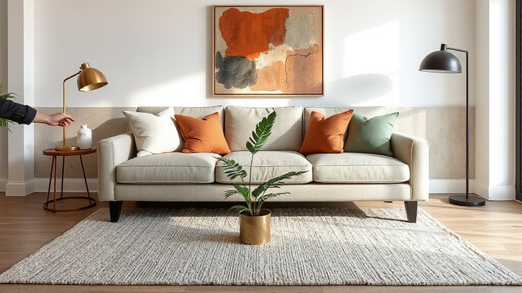
If a room looks “nearly right” but still feels unsettled, treat it like a diagnosis rather than a full redesign.
First, check scale: a rug should anchor the front legs of your sofa and chairs, not float like a doormat.
Next, tighten furniture arrangement: create a clear conversation zone and keep a consistent walkway (about 80–90cm) so the room reads calm and usable.
Then audit colour: use colour psychology to correct mood—cool greens and soft blues for rest, warm terracotta or ochre for sociability—while limiting yourself to one dominant, one secondary, and one accent.
Finally, repeat one material finish twice (brass, oak, black) and align lighting temperatures to avoid visual noise.
Add a mirror to bounce daylight.
Frequently Asked Questions
How Do I Create Harmony in a Small Studio Apartment?
You’ll create harmony by using colour coordination across walls, textiles, and accessories, then refining furniture placement to maintain clear walkways. Choose multipurpose pieces, keep sightlines open, repeat materials, and limit patterns for a calm studio.
What’s the Best Way to Mix Vintage and Modern Pieces Harmoniously?
Mix vintage and modern by anchoring both with tight Color palettes, then build Texture layering across upholstery, woods, and metals. Keep one hero era per room, repeat finishes, and choose UK-scale pieces to suit.
How Can I Make Open-Concept Spaces Feel Cohesive Without Matching Everything?
You’ll make open-plan areas cohere like a well-led orchestra: set a consistent palette for Color coordination, repeat key materials for Texture balance, unify flooring, align sightlines, and zone with rugs, lighting, and considered furniture scale.
Which Materials and Finishes Are Easiest to Maintain While Staying Harmonious?
Choose porcelain tiles, quartz composites, and powder-coated steel; they’re wipe-clean and consistent. Specify sustainable materials like FSC oak with hardwax oil, plus textured finishes in matte paint and microcement to hide wear.
How Do I Design for Harmony When Multiple People Share the Same Space?
You’ll get harmony by agreeing shared priorities, then zoning for individual needs. Use Color coordination via a neutral base plus personal accents, and guarantee Lighting balance with layered task and ambient fittings to suit everyone.
Conclusion
When you aim for harmony, you’re really designing how your home feels, not just how it looks. Start with a clear style anchor, stick to a 60–30–10 palette, and keep scale, spacing, and lighting in balance so nothing fights for attention. In the UK, 77% of homeowners say a comfortable home is their top priority, so cohesion isn’t “nice to have” — it’s essential. If it feels off, edit, repeat, refine.