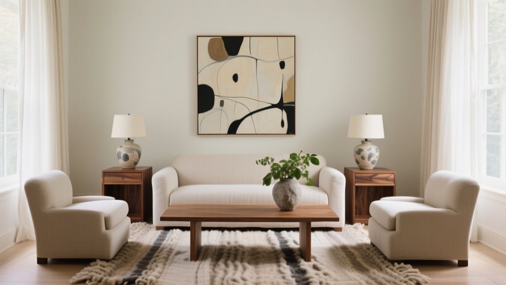
You achieve balance in interior design by distributing visual weight across furniture, color, texture, and light so the room feels steady from every sightline. Start with a correctly sized “hero” piece and anchor it to the focal point, keeping main walkways 30–36 inches clear and 16–18 inches from sofa to coffee table. Mix symmetry for polish or asymmetry for ease, repeat colors and finishes, layer patterns by scale, and use ambient, task, and accent lighting—next you’ll see quick fixes that instantly rebalance any space.
What Is Balance in Interior Design?
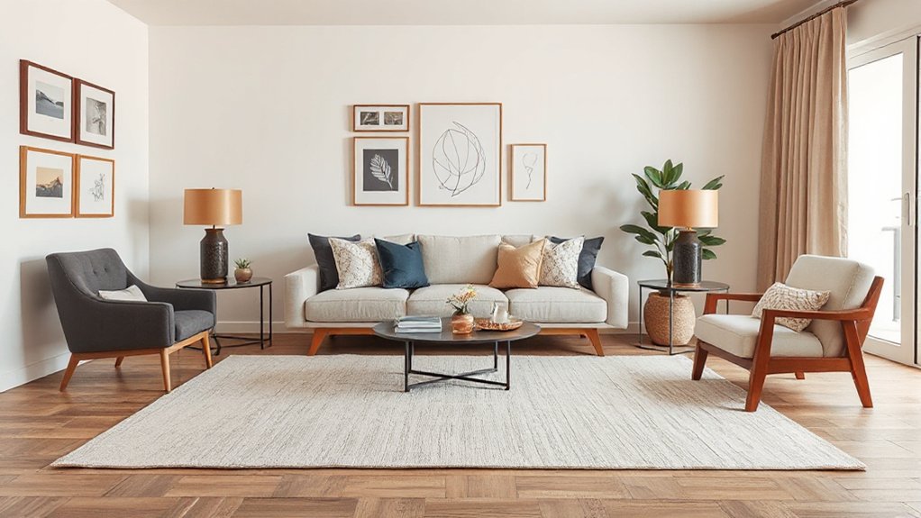
How do you know when a room feels “right”? You sense balance: visual weight spreads evenly, so nothing shouts or disappears.
In interior design, balance means you intentionally distribute size, shape, color, and texture across the space to create calm movement and easy function. You might mirror elements for a classic, symmetrical look, offset them for relaxed asymmetry, or repeat forms for a rhythmic, contemporary vibe.
Color harmony keeps the palette cohesive while still giving contrast—think warm neutrals anchored by a deep accent, or tonal layering with one crisp pop.
Furniture placement does the heavy lifting: you align major pieces to a focal point, keep clear pathways, and scale seating and lighting so the room breathes.
A Quick 3-Step Check for Room Balance
Start by scanning the room for visual weight—large pieces, dark colors, bold patterns, and shiny finishes should feel evenly distributed.
Next, check symmetry where it matters (like the sofa wall or bed setup).
Then confirm the overall flow so you’re not zigzagging around furniture to move through the space.
If those three checks pass, your room’s balance will read polished, current, and intentional.
Assess Visual Weight
Before you buy another “missing piece,” take 60 seconds to assess visual weight—the way size, color depth, texture, and placement make items feel heavier or lighter in a room.
Start by scanning big anchors: sofa, rug, bed, media console. If one side feels loaded, lighten it with slimmer legs, open shelving, or a low-profile piece.
Next, check Color harmony: deep hues and high-contrast patterns read heavier than pale, tonal palettes, so balance a dark sectional with lighter curtains, art mats, or a warm neutral rug.
Then evaluate Material contrast. Glossy lacquer, metal, and glass feel lighter; chunky bouclé, dark wood, and stone feel weighty. Mix them intentionally, and distribute dense textures across the room, not clustered in one corner.
Check Symmetry And Flow
Even if you love an eclectic mix, your room still needs a clear sense of symmetry and an easy path for the eye—and your body—to move through it. Do a fast three-step scan to lock in visual harmony and spatial equilibrium.
Step 1: Pick an anchor line (fireplace, TV wall, rug center) and mirror key heights on both sides—lamps, art tops, or chair backs—so the room reads intentional, not lopsided.
Step 2: Check circulation: keep main walkways 30–36 inches clear, and don’t force detours around coffee tables or floor plants.
Step 3: Track sightlines from the doorway and seating. If one corner feels heavy, swap décor, shift a chair, or add a slim vertical piece to rebalance the flow.
How to Spot (and Measure) Visual Weight
Because balance isn’t about matching furniture sizes, you’ll get better results when you learn to read *visual weight*—how heavy or light something feels at a glance. Start by scanning the room in grayscale: darker values pull harder, so a black lamp “weighs” more than a white one.
Check Color harmony, too; high-saturation accents feel heavier than muted tones, even when they’re small.
Next, rate materials: glossy metal and glass feel lighter, while chunky wood, stone, and boucle add heft through texture contrast. Look at pattern density—tight geometrics weigh more than airy prints.
Finally, measure by squinting: if one side grabs your attention first, add a counterweight by repeating a color, echoing a texture, or using a similar visual “mass” elsewhere. Keep it intentional, not busy.
Start With a Balanced Furniture Layout
Start by anchoring your layout to the room’s focal point—fireplace, media wall, or statement window—and face your main seating toward it to create instant balance.
Then space pieces so you’ve got clear, comfortable walkways (about 36″ main paths, 24″ secondary) without pushing everything against the walls.
You’ll get that current “float the furniture” look while keeping the room easy to move through.
Anchor The Focal Point
Where should your eye land first when you walk into the room? Pick one focal point and let it steady the layout, so every major piece relates to it in size, angle, and spacing. Treat it as artistic expression with cultural influences—maybe a carved mantle, a statement artwork, or a vintage textile—then echo its lines and colors elsewhere for cohesion.
- Place the largest seating piece facing the focal point, not drifting off-axis.
- Scale supporting pieces to match: low media consoles, slimmer chairs, or a taller bookcase.
- Layer lighting to highlight it: picture lights, sconces, or a sculptural floor lamp.
- Add one anchor accessory: an oversized mirror, bold rug motif, or ceramic collection.
You’ll get calm symmetry without feeling rigid.
Maintain Clear Walkways
Even if your room has the perfect focal point, it won’t feel balanced unless you can move through it easily. Start by mapping primary routes from doorways to seating, windows, and key storage. Aim for 30–36 inches of clearance on main paths, and at least 18 inches between a sofa and coffee table for comfortable circulation.
Float furniture only when it still preserves a straight-through lane, and angle chairs inward rather than blocking corners. Choose slimmer-profile pieces or swap a bulky ottoman for nesting tables.
Use Storage solutions like wall-mounted shelves, closed consoles, and baskets to keep floors open. Limit Decorative accents to edges—console lamps, art, and a single statement plant—so visual interest doesn’t become an obstacle.
Use Symmetrical Balance for a Classic Look
- Anchor the center with a focal point, then align matching side tables or chairs.
- Repeat lighting: twin sconces or lamps at equal height for a tailored glow.
- Match visual weight, not just size—pair a bold vase with an equally strong sculpture.
- Finish with balanced art: two frames, or one large piece centered and level.
Use Asymmetrical Balance for Relaxed Rooms
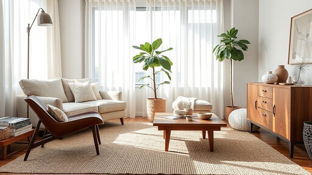
Symmetry gives you that polished, classic order, but asymmetrical balance is what makes a room feel relaxed and lived-in without looking messy.
Start by anchoring one side with a larger piece—like a sectional, tall bookcase, or oversized art—then counter it with several lighter elements on the other side. Mix heights and visual weight: a slim floor lamp, a stack of baskets, and a low console can equal a bulky chair.
Keep spacing intentional, not random, and repeat one finish (black metal, oak, or linen) to create asymmetrical harmony. Use negative space as a design tool, and vary textures—bouclé, matte ceramics, woven throws—for relaxed aesthetics.
Step back, squint, and adjust until the room feels even, not identical.
Use Radial Balance (Round Tables, Chandeliers, Rugs)
You create radial balance by anchoring the room with a centered focal point—think a round table under a statement chandelier or a circular rug that locks the layout in place.
You then let key pieces radiate outward in an even ring, spacing chairs, side tables, and lighting so the sightlines stay calm and cohesive.
You’ll get that current, hospitality-inspired “gather-round” harmony without the room feeling rigid or overly symmetrical.
Centered Focal Point
Where do your eyes land first when you walk into a room? Define that centered focal point, then use radial balance to support it—think a round table beneath a sculptural chandelier or a circular rug anchoring the scene. You’ll get order without stiffness, especially when you pair Color psychology with furniture ergonomics for comfort and mood.
- Place one standout element dead-center: pendant, pedestal table, or statement vase.
- Repeat curves around it with round rugs, drum shades, or arched mirrors.
- Control contrast: warm tones energize, cool tones calm, and neutrals sharpen the centerpiece.
- Tune scale and height: keep sightlines clear, chair heights aligned, and reach zones practical.
Finish with dimmable lighting to spotlight the center.
Circular Layout Harmony
When a room needs better flow, a circular layout creates harmony by pulling movement and attention around a shared center. Start with a round dining table or coffee table, then echo that curve with a chandelier, drum pendant, or globe light directly above.
Anchor the zone using a circular or oval rug that’s large enough for front legs to sit on it, keeping circulation clear. Arrange seating in a gentle arc, leaving consistent gaps so you don’t pinch walkways.
Mix curved silhouettes with a few straight pieces to avoid a theme-park look. For trend-aware polish, choose sculptural lighting and textured rugs in neutral tones.
This builds Circular flow and delivers rotational harmony without feeling rigid.
Get Scale and Proportion Right
A room feels instantly “off” if the furniture doesn’t match its size, so get scale and proportion right before picking colors or décor. Start by measuring wall spans, ceiling height, and walkway widths, then choose pieces that support scale harmony and basic proportion principles—think grounded silhouettes, not random bulk.
- Anchor with one correctly sized “hero” piece (sofa, bed) and build around it.
- Keep clearances: 30–36″ for main paths, 16–18″ between sofa and coffee table.
- Match height layers: low seating, mid tables, tall storage; avoid all-one-level lines.
- Edit accessories: one large statement beats many tiny items in open-plan, trend-forward rooms.
You’ll feel balance immediately, and layouts will read intentional, not crowded.
Balance Color Without Overmatching
Even if you love a tightly coordinated look, you’ll get a more balanced room by repeating colors with intention rather than matching everything. Pick one dominant hue, a supporting hue, and a restrained accent, then distribute them across the space in different materials and finishes. This approach builds Color harmony without looking staged.
For smart Palette coordination, keep undertones consistent: pair warm whites with brass and camel, or cool grays with chrome and ink blue. Vary saturation instead of switching hues—use dusty versions on large surfaces and richer tones on smaller pieces.
Anchor the scheme with a neutral that shows up in flooring, walls, or upholstery, then echo your accent in art, books, or ceramics. If a color feels loud, soften it with texture or a matte finish.
Balance Patterns: Scale, Spacing, and Repeats
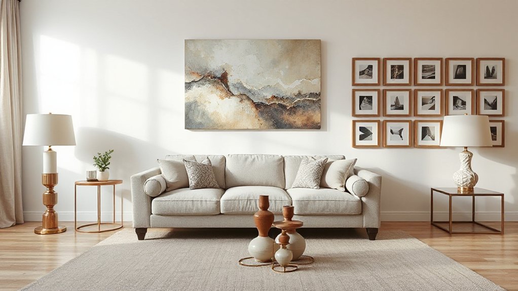
Although mixing prints can feel risky, you’ll keep a room balanced by controlling pattern scale, spacing, and repeats instead of piling on “more.” Start with one large-scale pattern as the lead (rug, drapery, or a statement chair), layer a medium motif for support, then add a small, tight print for detail—this prevents everything from competing at the same visual volume.
Keep the mix current by editing with these checks:
- Repeat one color across patterns to unify without matching sets.
- Use pattern repetition at least three times (pillows, art, vase) so it reads intentional.
- Maintain spacing consistency: similar stripe widths or dot gaps across different prints.
- Reserve one solid “rest” zone, like a sofa or wall, to reset the eye.
Layer Lighting So the Room Feels Even
When you layer lighting instead of relying on a single overhead fixture, you spread brightness evenly and make the room feel balanced from corner to corner.
Start with ambient light: a dimmable ceiling fixture or recessed cans set on separate zones, so you can tune overall glow.
Add task lighting where you work—pendants over a kitchen island, a reading sconce by the sofa, or under-cabinet strips for clean, modern function.
Finish with accent lighting to lift shadows and add depth: picture lights, a slim floor lamp behind a chair, or LED tape in shelving.
Keep bulbs consistent (2700–3000K), mix heights, and aim beams at walls to soften edges.
Layer lighting elevates room ambiance instantly.
Fix the Most Common Balance Mistakes Fast
Layered lighting sets a strong baseline, but a room can still feel “off” if a few common balance mistakes slip in. You can correct them quickly by checking scale, spacing, and repetition before you buy anything new. Start with what your eye hits first, then adjust supporting pieces to restore Color harmony and purposeful Texture contrast.
- Oversized focal point: Shrink the surround—swap bulky side chairs for armless, or add negative space.
- Undersized rug: Move up a size so front legs sit on it; it anchors zones instantly.
- One-sided weight: Mirror mass with a tall plant, floor lamp, or stacked art on the lighter side.
- Flat palette: Keep hues aligned, then layer matte, boucle, wood, and metal for depth.
Frequently Asked Questions
How Do I Balance an Open-Concept Space With Multiple Zones?
You balance an open-concept space by defining zones with rugs, lighting, and furniture placement, then unify them through color coordination. Add texture layering via upholstery, wood, and textiles. Keep sightlines clear, scale consistent, and accents repeated.
Can Balance Be Achieved in Very Small Rooms or Studio Apartments?
Yes, you can achieve balance in very small rooms or studios. You’ll use Color harmony with a tight palette, add Textural contrast via linen, boucle, wood, and layer lighting to define zones. Keep multipurpose furniture streamlined.
How Do I Balance a Room Around a TV or Fireplace Focal Point?
Sure, crown your TV/fireplace as dictator, then stage a design coup: center seating, mirror side tables/lamps, and align Wall art around it. Keep Color schemes consistent, layer textures, and scale décor proportionally.
What Budget-Friendly Upgrades Improve Balance Without Buying New Furniture?
You’ll boost balance cheaply by swapping pillows, throws, and rug for Color harmony; rehanging art and curtains at consistent heights; decluttering surfaces; and using Lighting techniques like layered lamps, warmer bulbs, and dimmers.
How Do I Maintain Balance When Mixing Vintage and Modern Decor Styles?
You’ll maintain balance by repeating Color harmony across eras, anchoring with one dominant silhouette, and using Texture contrast intentionally. Pair a vintage statement with modern basics, keep metal finishes consistent, and scale accessories evenly.
Conclusion
When you check balance, you’re making sure the room’s visual weight feels even—without turning it into a matching set. Start with a furniture layout that anchors the space, then offset heavies with lighter pieces, negative space, and layered lighting. Keep color coordinated, not cloned, and mix patterns by varying scale and repeating one motif. If something feels “off,” tweak height, spacing, or contrast—like adjusting a cassette mixtape until it hits.