To make a room feel bigger, start with pale neutrals on walls and ceilings to create a seamless, expansive field. Use cool or warm whites with low to mid sheens to reflect light while avoiding harsh edges. Add subtle contrast with brighter trim and keep bold colors to sparing accents. Maximize light diffusion with multiple sources and mirrors, and consider color zoning to guide the eye. Want more actionable strategies to apply today?
Lighten the Palette: Best Colors to Open Up a Space
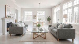
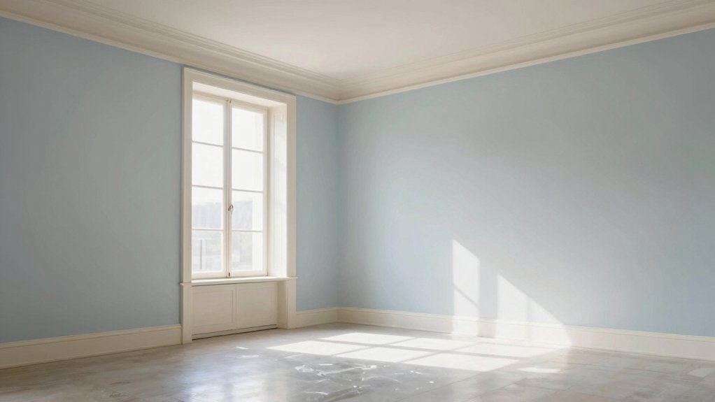
Lighten the palette to create an optical illusion of space. You’ll reduce wall absorbency and bounce more light with pale tones, improving perceived room height. Choose soft whites, cool beiges, and delicate pastels that align with color psychology to evoke openness and calm.
Implement a monochromatic scheme on walls and ceilings to minimize visual disruption and enhance cohesion. Contrast is subtle: use slightly brighter trim to define edges without breaking the airy feel.
Consider paint durability; select formulations with stain resistance and easy washability to sustain the bright effect over time. Avoid heavy saturation near large furniture and windows, since concentrated color absorbs light and shortens perceived depth.
Test samples in natural light to validate openness before committing.
Neutrals That Read as Expansive
Neutrals that read as expansive leverage color psychology and undertone science to maximize perceived space. You choose warm‑toned beiges or cool grays with subtle undertones that recede rather than shout, creating an illusion of airiness.
Use these neutrals to establish a unified field, then introduce contrast only where you want focus. Bold accent walls can anchor a room without overpowering it when they reiterate your neutral’s undertone, reinforcing depth rather than breaking continuity.
Textured finishes—matte plaster, whisper‑slick plaster, or fine graining—add tactile interest without absorbing light, sustaining openness. Pair with high reflectance finishes on ceilings or trim to bounce daylight, further expanding perception.
Keep furnishings streamlined and aligned with the neutral palette to preserve the sense of spaciousness.
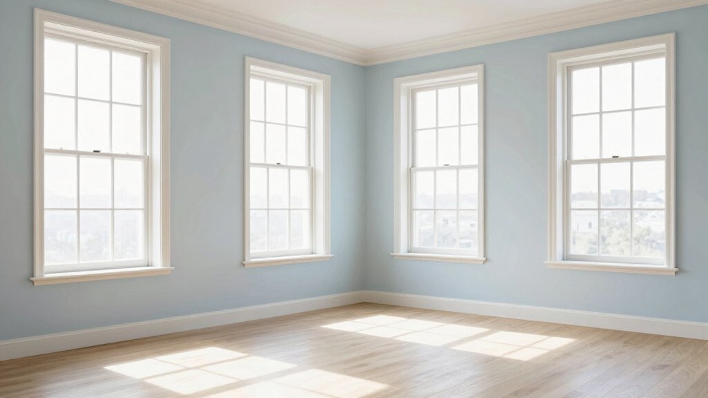
Soft Blues and Greens for Airy Vibes
Soft blues and greens create light, airy spaces by marrying cool tones with natural brightness. Use light, airy tones as the base, add soft blue accents for depth, and incorporate calm green hues to preserve openness.
This combination scales visually larger, improves perceived airflow, and stays precise and uncluttered.
Light, Airy Tones
Soft blues and greens create a breathable backdrop that visually expands a room, especially when paired with ample natural light. You’ll notice these tones read as cool, reflective surfaces, reducing perceived depth and creating a sense of openness.
Apply them on walls to maximize light bounce, then use bright, clean trim to sharpen edges without interrupting flow. In a small space, keep color saturation low to mid, avoiding heavy saturation that can feel boxed in.
For ceilings, use the same light tone or a slightly lighter version to maintain vertical spaciousness. Incorporate bold accent walls sparingly to anchor focal points, but ensure they contrast with the main palette for clarity.
Choose contrasting trim to delineate architectural features without compromise to the airy aesthetic.
Soft Blue Accents
Soft blue accents reinforce the airy vibe by weaving subtle color into focal points without overpowering the room. You’ll use soft blue as a strategic highlight on trim, accessories, or a single feature wall to preserve openness while adding dimension.
This approach leverages color psychology to evoke calm and perceived space, guiding eye movement and reducing perceived boundaries. Apply paint application techniques that maintain crisp edges and even coverage, ensuring the blue reads as a controlled accent rather than a dominant field.
Use low-saturation tones near the ceiling to lift the space, and couple with white or pale neutrals for contrast that amplifies light. Precision in layering, feathered edges, and careful edge sealing prevents bleed-under, preserving the room’s seamless, expansive feel.
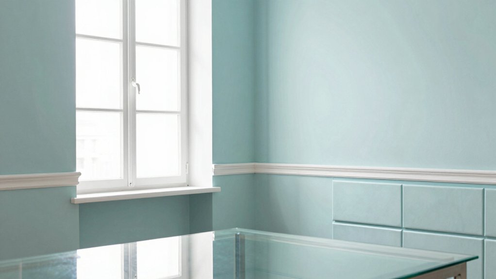
Calm Green Hues
Calm green hues pair the freshness of blues with the grounded serenity of greens to create an airy, inviting atmosphere. You’ll use this palette to soften edges and reflect light, enhancing perceived space without clutter.
In practice, choose soft sage, mint, or pale aqua greens as wall tones, pairing with cool white trim to maximize brightness. Color psychology shows greens reduce visual noise and promote calm, while blues contribute coolness that broadens a room’s feel.
For furniture and accents, apply a restrained approach: select a single dominant green and 1–2 complementary blues for contrast. This minimizes depth ambiguity, supporting a larger appearance.
Paint psychology supports subtle saturation, avoiding heavy tones that compress space, while maintaining cohesion and purposeful contrast.
Warm Whites vs. Bright Whites: Finding the Right White
Warm whites and bright whites serve different roles in a room, and choosing the right balance hinges on lighting, size, and mood. You’ll pick warm whites to soften edges and add coziness in smaller spaces with cooler natural light, but you risk appearing muddy if overused.
Bright whites illuminate, create perceived space, and read modern in rooms with ample daylight or strong artificial lighting; they reveal architectural details and keep surfaces crisp. The key is color temperature: test swatches at multiple times of day and with your lighting plan.
Consider paint finish: matte reduces glare but can look flat, satin or eggshell balances sheen with reflection, and semi-gloss offers durability in high-traffic areas while maintaining brightness. Balance temperature, space, and finish to optimize perceived size.
The Role of Light and Reflection in Perceived Space
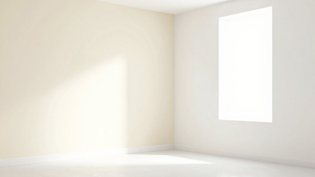
Light diffusion softens shadows and expands perceived space, making walls feel farther away without changing color.
Reflective surfaces amplify brightness and can visually enlarge a room by bouncing light to hard-to-reach corners.
Understand how brightness perception tricks, coupled with surface quality, shapes depth and spatial clarity.
Light Diffusion Effects
In rooms, how light diffuses and reflects shapes perceived space more than color alone. You’ll notice diffusion softens edges, minimizing harsh shadows that compress depth. Subtle scattering from walls, ceilings, and furnishings brightens corners without glare, making spaces feel taller and more open.
You should prioritize even illumination, using multiple light sources and appropriate fixtures to avoid hot spots. Diffusion also alters color perception; uniform bounce preserves color temperature consistency, preventing yellows or cool shifts that skew size cues.
Natural light remains a powerful amplifier of perceived space, but its direction and diffusion change by time of day. Control artificial color temperature to align with daylight, maintaining a harmonious balance that expands the room’s feel while preserving realism and depth.
Reflective Surface Advantage
Reflective surfaces expand perceived space by bouncing and directing light across a room, smoothing shifts between planes and reducing depth ambiguity. You leverage this by careful mirror placement to extend sightlines without crowding, and by selecting glass finishes that minimize glare while preserving clarity.
Position mirrors opposite light sources or windows to multiply daylight and create the illusion of depth; avoid placing them where you actually stand, which can fracture perspective. Use high-gloss or satin glass finishes sparingly on cabinetry or partitions to reflect ambient color without overpowering structural cues.
Consistency matters: match metallic or neutral frame tones to your palette to prevent visual noise. Overall, controlled reflectivity subtly enlarges the room, elevates perceived airiness, and complements color strategy without demanding more space.
Brightness Perception Tricks
Even with a fixed color palette, how you manage brightness shapes perceived space more than you might expect; subtle shifts in illumination can dramatically alter depth and openness. You optimize perception by aligning light sources with viewing angles to emphasize verticality and minimize clutter shadows.
Use high-reflectance finishes on ceilings and adjacent trim to bounce ambient light into corners, widening the room’s perceived footprint. Contrast is your ally when controlled; bright surfaces adjacent to darker accents create a sense of depth without increasing actual scale.
Consider color psychology when selecting luminance values to evoke airiness and calm, not harsh glare. Track historical color trends to anticipate how daylight changes will feel across seasons.
Implement layered lighting—ambient, task, accent—and test in real time to confirm the room reads larger.
Finish Matters: How Sheen Affects Room Size
Sheen level matters: choosing the right finish can visually expand a room by controlling light reflection and perceived depth. You’ll maximize space by selecting finishes with low to mid shine on walls and ceilings, which soften glare and create uniform light distribution.
Higher sheens reflect more light and can make surfaces pop, but often exaggerate shadows and surface irregularities, reducing a sense of airiness. The finish sheen you pick directly influences perceived size: matte and satin finishes tend to recede slightly, while gloss highlights edges and creates contrast that can shrink perceived space.
Consider environmental lighting, room function, and washability when balancing finish sheen with color. Finish decisions impact sheen impact while maintaining durability and ease of cleaning in high-traffic areas.
Accent Strategy: When to Use Bolder Hues
After establishing how subtle finishes can expand space, you can leverage bolder hues to punch up depth where it’s most needed. You use bold accent walls strategically, not randomly, to emphasize architectural lines, sightlines, and focal points. Reserve bold color for areas that benefit from visual punch: a recessed niche, a doorway, or an end wall that draws the eye toward the room’s purpose.
Balance remains essential; pair bolds with lighter neutrals to prevent saturation from overwhelming proportions. Color blocking techniques can create perceived texture and dimensionality without shrinking floor space. Apply consistent lighting to ensure true color reads; avoid underlit corners that distort contrast.
Employ a disciplined palette, testing samples at multiple times of day to confirm the intended spatial impact.
Color Zoning: Visual Flow Across Rooms
Color zoning guides visual flow between spaces by aligning color progressions with movement and function. You design progressions that mirror how you move through a home, using lighter tones near entryways and darker accents toward activity zones to subtly guide spatial perception.
Think of color psychology as a set of cues: cool neutrals in hallways make spaces recede, warmer midtones energize living areas, and concentrated accents anchor focal points without feeling heavy. Maintain continuity with shared undertones, so rooms feel connected rather than compartmentalized.
Define a coherent scheme across adjacent rooms, then vary saturation and value to mark shifts in use. This approach preserves perceived openness while creating purpose, helping you manage scale and flow. Precisely executed color zoning reduces clutter and enhances overall spatial accuracy.
Practical Tips for Testing Color in Your Space
Testing color in your space is a practical, repeatable process you can trust. Start with large swatches on poster boards, not small chips, to gauge true shade under lighting changes. Apply samples to walls at multiple height points and observe at different times of day.
Track color psychology effects by noting how hues alter perceived room weight, warmth, and brightness; document reactions to each candidate. Create a controlled test zone free from nearby bold elements to isolate impact.
Use paint durability as a selection lens: examine coverage, drying time, and stain resistance during a week of use. Finally, confirm with a second round of testing after furniture rearrangement or lighting updates to ensure consistent, confident decisions.
Conclusion
As you choose colors, you feel the space breathe—awake, alive, almost teasing. You’ll lighten walls, gloss through light, and let neutrals whisper spaciousness while soft blues keep the air taut with calm. But the truth hides in the edges: finish and reflection can amplify size or steal it away. Use restraint, test boldly, and observe. The final shade won’t just color the room; it reveals how you inhabit it, and that revelation changes everything you think a room can be.