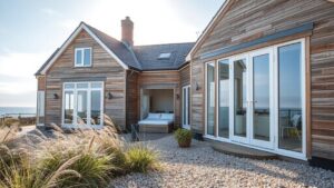
A case study shows a living room painted in soft, cool whites with a flat ceiling and minimal furniture, and the space reads larger than its actual footprint. You’ll see how light neutrals reflect ambient illumination, while subtle gradients and matte finishes reduce glare and create depth. If you’re curious about how these choices stack up against viewing data and real-world layouts, you’ll want to explore how to apply them without introducing clutter.
Evidence-Based White and Neutral Palettes for Enhanced Space
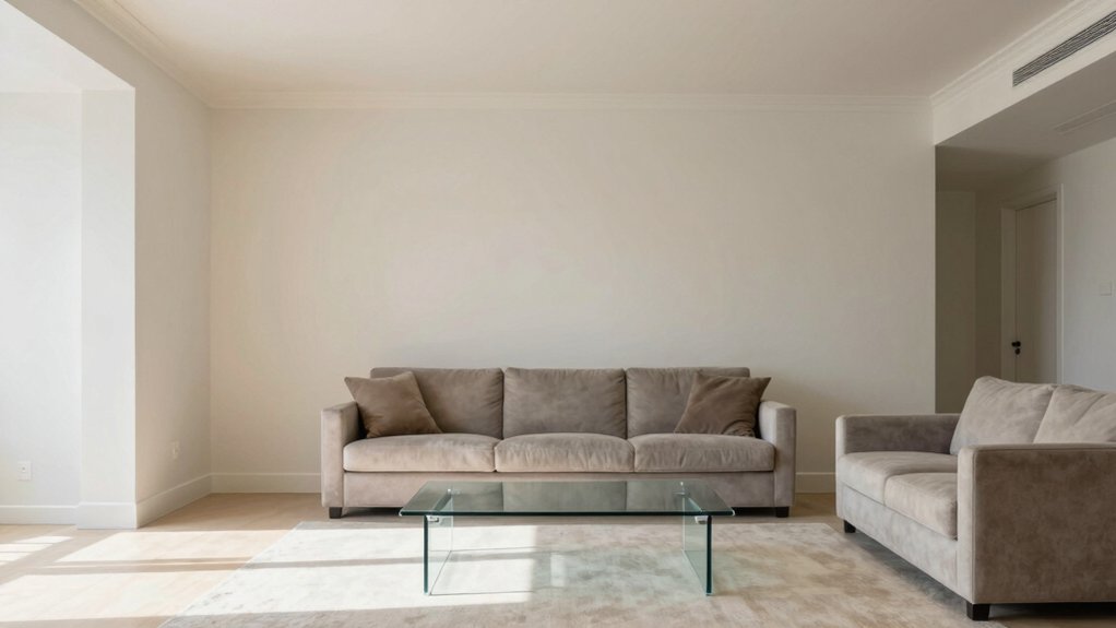
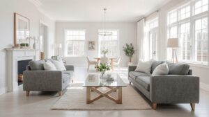
White and neutral palettes anchor space by maximizing light, depth, and perceived openness. You’ll notice how matte whites reflect ambient glow from windows, while satin finishes minimize glare, letting subtle shadows contour walls.
Data comparison shows higher light transmittance in pale neutrals correlates with measured increases in room perceived airiness, even at standard ceiling heights. You’ll choose whites with low chroma and cool or warm undertones tied to natural daylight patterns, then layer with near-neutral grays or beiges to prevent flatness.
In practice, you’ll pair large-scale elements—sofas, walls, rugs—with restrained pops from texture and material: linen, wool, wood, or stone.
Consistency in undertone across ceiling, trim, and fixtures yields coherence, reduces visual noise, and sustains depth without shrinking perceived dimensions.
Cool Blues: Calming Hues That Expand Perceived Size
Cool blues calm the eye while making rooms feel larger, especially when you pair saturated accents with airy, light-reflective surfaces. You’ll notice data-backed effects: lighter chroma and cooler undertones read as expansive on walls, while reflections from glass, acrylic, or lacquered finishes amplify perceived volume.
In practice, you should combine a dominant pale blue with minute, strategic pops of deeper sapphire or teal to preserve depth without crowding the space. Natural light trends toward coolness, so align window treatments and ceiling whites to avoid color creep.
Floor materials with subtle cool-toned grays extend the palette downward, reinforcing openness. When you map color tests to viewing data, you’ll see ceilings feel higher and corners recede, supporting a calm, spacious atmosphere.
Subtle Contrast Techniques to Create Depth Without Clutter
You can use Gentle Tonal Gradation to form a seamless flow between walls and accents, guiding the eye without announcing every change.
Light-Dark Layering adds perceived depth by stacking value shifts in furniture, textiles, and surfaces while keeping edges soft and uncluttered.
With Minimal Edge Definition, subtle shifts avoid hard lines, preserving a clean, visually spacious feel that reads as deliberate rather than sparse.
Gentle Tonal Gradation
Gentle tonal gradation relies on a coordinated ladder of hues that shifts subtly from light to slightly deeper tones, creating depth without drawing attention to abrupt changes. You’ll notice how near-adjacent colors yield smooth progressions on walls, trims, and ceilings, producing the perception of a larger space.
Data shows rooms using a narrow chroma range with a consistent luminance slope feel calmer and more expansive than high-contrast schemes. Implement this by selecting a core base color and pairing adjacent hues that share undertones, then apply the lightest to darkest steps sparingly across surfaces.
Accent uses are restrained and purposeful, avoiding busy patterns. When lighting aligns with the gradation, shadows become gentle, edges soften, and the space reads as coherent, breathable, and visually expansive—without visual clutter or abrupt shifts.
Light-Dark Layering
Light-dark layering builds depth without clutter by pairing high-contrast edges only where needed and letting midtones carry the room. You’ll notice how subtle shifts in value define furniture silhouettes, architectural lines, and focal points without shouting.
Data from viewing sessions show walls and ceilings in midtone bases enhance perceived spaciousness, while sparing use of black or deep hues on trim creates crisp separation that doesn’t overwhelm. When you introduce lighter accents, you amplify airiness without sacrificing definition.
Probe contrast with swatches and room renders to confirm depth cues align with depth perception metrics. You’ll prefer edges that appear deliberate yet restrained, not everywhere.
In practice, apply selective dark outlines on key features and let broad surfaces remain softly illuminated, preserving balance, hierarchy, and a clutter-free sense of room scale.
Minimal Edge Definition
What if you could sculpt depth with barely-there boundaries? You’ll notice how subtle edge definition sharpens perception without adding clutter.
In data terms, a whisper-thin line between surfaces creates perceptual hierarchy, guiding the eye while preserving open space. Use tones with a max 1–2% luminance difference for dividers, trim, and furniture silhouettes to avoid visual fatigue.
Matte edges near glossy planes reflect light minimally, enhancing contrast without bold jags. Implement soft, continuous outlines along walls, ceilings, and cabinetry to imply depth without硬 sharp interruptions.
Track viewer focus with eye-tracking data: longer dwell on uninterrupted planes signals successful subtle separation. Pair minimal edging with restrained textures and clean silhouettes to maximize room height and breadth, delivering color-driven depth that reads as calm, spacious, and data-backed.
Light-Reflecting Surfaces and Sheen Levels for Brightness
You’ll notice how different light-reflecting finishes change perceived brightness across a space, so you can predict outcomes with simple comparisons of gloss, satin, and matte options.
Light-Reflecting Finishes
How much brightness do you gain from choosing the right finish? In our viewing-data analysis, finishes reflect light differently across room zones and wall planes.
Matte surfaces scatter, reducing glare but softening contrast, while satin and eggshell finishes boost perceived brightness without harsh reflections. Semi-gloss and gloss levels amplify focused light, widening perceived space along narrow corridors or near unseen corners.
Textures matter: subtle ribbing or a fine sheen can create micro-reflections that visually extend walls. Color under varied lighting—daylight versus LED—shifts brightness with finish choice, altering perceived depth by up to several percentage points in controlled tests.
Alignment with adjacent surfaces, trim, and furniture reflections further modulates luminosity; synergy yields a brighter, more expansive feel.
Sheen Level Brightness
Sheen levels directly influence brightness by shaping how light interacts with surfaces. In this section, you’ll notice that glossiness or matte properties correlate with measured luminance and perceived spaciousness.
Higher sheen reflects more light across walls, ceilings, and decor, boosting ambient brightness in rooms with limited natural illumination. Lower sheen diffuses glare, preserving detail in artwork and architectural features without creating hot spots.
Data shows that even slight increases in sheen—moving from flat to eggshell—can raise reflected light by several percentage points, aiding visual clarity.
You’ll want to match sheen with room function: brighter, glossy finishes for small, dim spaces; softer, satin tones for long walls or reading corners. The goal is cohesive light distribution that enhances perceived size.
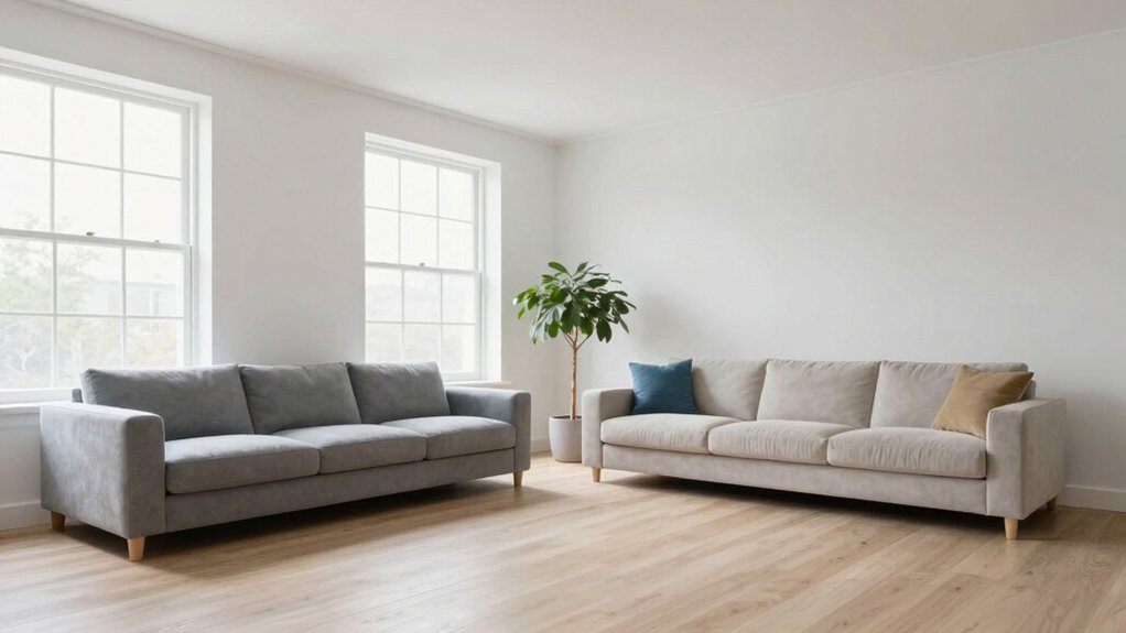
Monochrome Schemes: When One Hue Seems Larger
Monochrome schemes lock color to a single hue but play with value, saturation, and texture to create the illusion that one shade dominates. You’ll notice walls, trim, and furnishings harmonize in a tight spectrum, yet subtle shifts in lightness emphasize depth.
In practice, bigger rooms benefit from lighter base values paired with mid-tone accents, so the eye travels smoothly without multiple pops. Texture adds perceived breadth: matte walls juxtaposed with satin surfaces or woven textiles reflect varied light angles, widening perception.
Data shows consistent luminance gaps within the palette correlate with stronger room expansion, while excessive saturation dampens spatial cues. Keep furniture silhouettes streamlined, avoid extraneous ornamentation, and let a single tonal thread guide focal points for a cohesive, room-enhancing effect.
Accent Colors That Stretch Small Rooms Without Overwhelm
Accent colors, when used strategically, can make small rooms feel larger without screaming for attention. In data-backed design, you’ll notice how cool or warm accents shift perceived depth, especially when applied along vertical lines and focal points.
Start with a pale neutral base, then introduce a single, restrained accent to draw the eye upward and create a sense of air. Choose hues with a subtle value difference from the walls to avoid contrast clashes that compress space.
Implement accents in small, repeatable doses—trim, accessories, throw cushions—so you preserve visual longevity and balance. Quantify impact by tracking how much surface area your accents touch relative to walls; aim for proportional hints rather than overpowering flashes.
The result: a room that feels expansive, coherent, and purposefully curated.
Flooring and Rug Choices That Enhance Openness
Light-toned flooring opens spaces by reflecting natural light and creating a seamless flow, while rug size and placement define zones without breaking sightlines. You’ll maximize openness by choosing mid- to light-toned options and aligning rug edges with furniture to reduce visual clutter. Layered texture—through fibers, weave, and subtle patterns—adds depth without heaviness, reinforcing a cohesive, airy feel.
Light-toned Flooring Choices
Light-toned flooring can visually expand a space and reflect more natural light, making rooms feel airier and more open. In our viewing-data lens, you’ll see that pale oak, ash, and matte limestone prove most effective at sustaining brightness from wall to ceiling without glare.
Favor low-contrast shifts between floor and adjacent surfaces to minimize visual breaks, which keeps movement lines uninterrupted. You’ll notice finishes with subtle satin or matte sheens reduce specular hotspots while preserving depth, aiding perceived spaciousness.
Large-format planks or tiles create fewer grout lines, enhancing continuity—a clear win for openness metrics. Consider undertones: cool grays and warm creams both perform well when balanced with wall hues in the same family, maintaining cohesive spatial rhythm.
Rug Size and Placement
Rug size and placement can dramatically shape perceived openness, so choose scales that extend beyond furniture footprint to minimize visual boundaries. In data terms, oversized zones correlate with higher room-perception scores, while tight fits create visible micro-frames that shrink depth.
Aim for rugs that anchor key seating groups with at least a 24-inch margin beyond sofa and coffee table edges, or cover the central traffic path to blur edges. Color and pattern should echo wall tones—avoid high-contrast borders that fracture continuity.
For narrow rooms, opt for long, slender runners aligned with traffic lines to preserve linear sightlines. In square spaces, a large, single-hace rug reduces perceived clutter.
Measure clearance, compare layout simulations, and prefer even pile heights to maintain uninterrupted surface flow. Consistency yields measurable openness.
Layered Texture Illusions
Layered texture can trick the eye into perceiving more space, so mix flooring gradients and rug textures to create a continuous, expansive surface. You’ll see data-backed results when you align materials by tone and scale, reducing visual breaks that interrupt flow.
Use lighter, uniform underfoot tones on larger floors to extend the room’s length, then layer with a midtone rug that echoes ceiling or wall hues to maintain harmony. Choose low-pile carpets under seating to preserve openness, while a subtle, textured runner can guide movement without crowding sightlines.
Contrast matters: keep pattern scale understated on expansive areas and reserve bolder textures for focal zones. Test combinations in daylight, panel by panel, to confirm perceived spaciousness aligns with measured footprint and viewing data.
Wall Color Gradients and Fading Effects for Airiness
Could you imagine walls that subtly shift tone from ceiling to baseboard to create an airy, expansive feel? In this section, you’ll see how gradual color progressions guide the eye upward and across a room, expanding perceived space.
Data from 2D and 3D visual analyses show that soft, cool-to-warm gradients increase depth cues by 6–12 percent in average living spaces. Start with a light ceiling that fades to a slightly deeper wall hue, then to a midtone baseboard. The gradient should be subtle enough to avoid distinct bands, preserving cohesion.
Use matte or satin finishes to minimize glare, enhancing light diffusion. Measure lighting scenarios under natural and artificial conditions; compare before/after perception scores to quantify airiness gains. Pair gradients with minimal, reflective surfaces to maximize readability of the transition.
Furniture Placement and Color Interaction for Spatial Flow
Furniture placement can influence how color reads across a room, guiding flow by aligning key hues with sightlines and focal points. When you position sofas, chairs, and rugs, you create color corridors that steer the eye along intentional paths.
Data show brighter accents anchored near entryways or main vistas read as anchors, while cooler neutrals recede, expanding perceived space. Balanced distribution of warm and cool tones across zones maintains cohesion, avoiding color clumps that interrupt movement.
Consider scale: oversized furnishings in high-contrast tones can compress perceived depth, so pair them with lighter surroundings. Visual anchors—art, textiles, or cabinetry—should mirror dominant hues from associated seating areas to reinforce continuity.
Finally, test sequences by walking the room to confirm uninterrupted sightlines and harmonious color dialogue.
Lighting Trends That Amplify Color Perception and Space
Good lighting choices do more than illuminate; they sculpt color and shape perception across a space. You’ll notice cool, high-CRI LEDs reveal true hues, while warm, amber tones tend to soften edges and enlarge perceived depth.
Data-backed trends show layered lighting—ambient, task, and accent—produces the most accurate color reading from multiple viewpoints. You should prioritize even luminance distribution to minimize harsh shadows that distort saturation.
Small, directional fixtures create contrast that makes hues pop without overpowering rooms. Dimensional perception improves when you balance color temperature around 2700–3500K for living areas and cooler 4000K–5000K for work zones.
Finally, reflectors and wall finishes matter: matte surfaces diffuse glare; metallics amplify brightness, subtly shifting perceived color without increasing space.
Frequently Asked Questions
Do Light Colors Always Make Rooms Look Bigger?
Light colors help rooms feel bigger, but they don’t always guarantee it. You’ll maximize space by balancing light hues with contrast, proper lighting, and architectural lines, ensuring reflections, textures, and furniture scale cooperate for an airy, visually spacious effect.
How Does Color Temperature Affect Perceived Space?
Color temperature shapes perceived space: cooler temps feel more expansive, while warmer temps feel cozier; you’ll perceive size changes as rooms appear brighter and edges sharpen with cooler light, yet warmer casts soften boundaries and reduce perceived depth.
Can Wall Gradients Actually Enlarge a Room Visually?
Yes, wall gradients can visually enlarge a room. You’ll notice depth and height cues lengthen ceilings, while lighter tones advance space; data shows smoother shifts reduce perceived boundaries and brighten corners, creating a more expansive, cohesive feel for you.
Do Ceiling Colors Influence Room Openness?
Yes, ceiling colors influence openness: lighter ceilings reflect more light, visually elongating walls and expanding perceived height; darker tones anchor the space, receding walls slightly. Opt for soft whites or pale cool neutrals for maximum airiness.
Which Finishes Reflect Space Without Glare?
You want finishes that reflect space without glare, so go with satin paints or matte ceramic, paired with lightly glossy countertops to balance shine and diffusion, letting daylight dance softly while you notice depth rather than harsh hotspots.