Soft neutrals or greiges are your best allies with white kitchen cabinets. Choose warm or cool undertones that subtly shift with daylight, letting architectural details glow rather than compete. Think soft taupe in morning light and cooler stone tones by evening, with matte or eggshell finishes for a refined backdrop. Add a touch of warmth with creamy creams or light pastels to keep the space airy. If you want deeper nuance, you’ll discover how to sculpt interest through accents as you continue.
Exploring Soft Neutrals to Complement White Cabinets
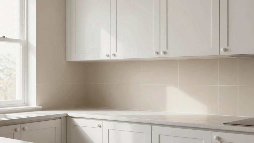
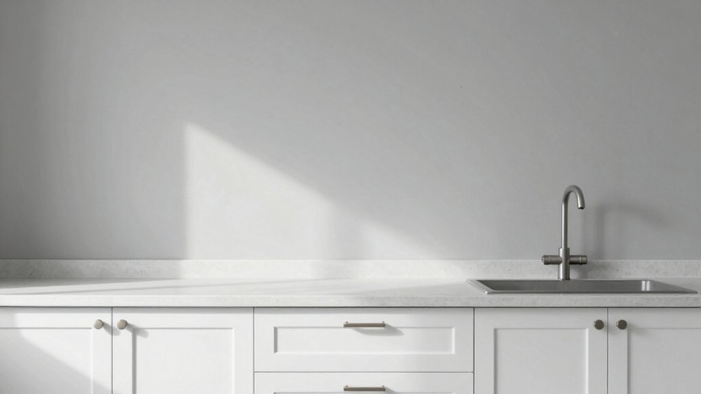
Soft neutrals are a timeless partner for white cabinets, offering warmth without compete. You’ll notice how delicate creams and greiges soften edges, letting architectural lines shine.
In this palette, you emphasize elegant specificity: a wall color that reads subtle rather than shouting, so decorative trim remains the focal texture. Choose warm undertones that harmonize with natural light, avoiding stark contrasts that fight the cabinetry’s brightness.
You’ll enjoy practical aesthetics, like a finish that resists fingerprints while aging gracefully. For character, introduce wall murals in interiors where the decor allows, ensuring the artwork doesn’t overpower the cabinets.
The goal is cohesion—soft neutrals that unify surfaces, textures, and furnishings into a calm, refined kitchen about subtle luxury.
Light Pastels for a Airy, Refreshing Kitchen
Soft tinted whites set a crisp baseline, letting your light pastels read as gentle, sunlit breath in the room.
Breezy pastel accents introduce warmth without overpowering the clean lines of white cabinets, while subtle color contrasts keep the palette lively yet refined.
You’ll notice how these choices sharpen depth and texture, preserving airiness while adding quiet sophistication.
Soft Tinted Whites
To keep your kitchen feeling airy and invigorating, choose soft tinted whites that lean into light pastels, such as blush, biscotti, or pale sage accents that subtly warm or cool the space. Soft whites render rooms buoyant without shouting color, letting natural light mingle with interior lighting for a calm glow.
You’ll notice that these tones preserve depth when paired with white cabinetry, avoiding sterile vibes while maintaining clarity. Pay attention to wall texture: a matte or satin finish minimizes glare, enhancing the gentle tint without washing detail.
Use subtle undertones to harmonize cabinetry, countertops, and trim, so shadows play softly across surfaces. The result is a refined, versatile backdrop that supports varied textures and fabrics, inviting effortless, everyday cohesion.
Breezy Pastel Accents
Breezy pastel accents introduce a light, invigorating energy without competing with white cabinetry, letting soft colors dance with the natural and ambient light. You’ll notice how airy blues, pale greens, and delicate pinks elevate the field of view without overpowering details.
Choose hues with low saturation for cohesion, then anchor with a crisp white trim to preserve clarity. Decorative crown molding adds architectural polish, guiding the eye along ceilings and panels while reinforcing an airy vibe.
For durability and focal interest, pair these shades with a statement backsplash in pebble gray or ivory glass, so texture remains tactile yet refined. Keep surfaces cool-toned and lightly satin, ensuring the palette remains timeless, practical, and quietly sophisticated.
Subtle Color Contrasts
Subtle color contrasts quietly elevate an airy kitchen with white cabinets by weaving in light pastels that read as breath rather than bold statements. You’ll notice how the gentlest pinks, blues, or greens skim the walls, creating depth without shouting. Aim for low-saturation hues near the cabinet tone to preserve luminosity while introducing character.
In practice, apply these pastels in larger surfaces first, then tuck in mini accents through accessories to maintain balance. Consider decorative wall textures that catch light—matte plaster, whisper-thin beadboard, or a soft glare of linen—so the color reads alive at different times of day.
Plan wall art placement with restraint, keeping centers clear and illustrations complementary to cabinetry. The result is a refined, breathable palette that remains timeless and purposeful.
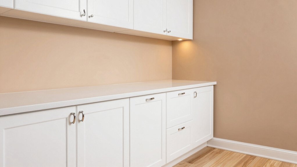
Warm Tones That Add Coziness Without Overpowering White
You’ll find warmth that supports white cabinets without stealing the show, balancing Cozy Neutral with a light touch. Consider tones that glow subtly, creating a Subtle Glow Tones that feel inviting yet restrained.
This is where Warmth Without Overshadow, Cozy Neutral Balance, and your curated palette converge to practical, elegant results.
Warmth Without Overshadow
To add warmth without overpowering white cabinets, lean into soft, amber-tinted neutrals and honeyed woods that read as inviting rather than bold. You’ll notice that color psychology guides how you feel in the kitchen, with warm neutrals softening the air and inviting lingering moments at the counter.
Choose subtle undertones—cream, biscuit, latte—paired with pale oak or maple accents to avoid visual competition with white surfaces. Lighting effects matter just as much as pigment: diffuse, warm LEDs or fixtures that cast a gentle glow reduce harsh contrasts and enhance depth.
Keep sheen low to medium; matte or satin finishes minimize glare and preserve coziness. The result is a refined warmth that supports culinary activity without dominating your white cabinetry.
Cozy Neutral Balance
Cozy neutral tones strike a careful balance: warm, inviting shades that soften white cabinetry without competing with it. You’ll find hue choices that wrap the room in comfort while preserving brightness, so everyday tasks feel effortless.
Choose wall color with subtle depth—think eggshells, creams, or warm beiges that read clean at a distance yet reveal nuance up close. The goal is coziness without heaviness, so lean into tones that pair gracefully with stainless or brushed-metal fixtures and natural wood accents.
Consider how wall texture adds character: a gentle stipple or fine plaster gives dimension without visual noise. Also weigh ceiling colors, keeping them slightly lighter to preserve airiness while grounding the palette.
This balance yields a welcoming, refined kitchen that remains distinctly white-centered.
Subtle Glow Tones
Subtle glow tones warm a white kitchen without glare, choosing hues that deepen the backdrop just enough to feel intimate. You’ll favor soft amber, mushroom, and clay—colors that whisper warmth without competing with cabinetry. These tones create a gentle stage for natural light to linger, enhancing texture in tile and wood.
Your Lighting choices matter: install dimmable fixtures and consider warm LEDs that render these hues faithfully, avoiding harsh white extremes.
Pair the walls with Furniture styles that echo the palette—low-profile benches, tapered legs, and lacquered surfaces in ivory or warm oak. Let the color chemistry stay refined, not loud: the goal is coziness that never overwhelms white.
With measured contrast and thoughtful placement, the room feels inviting, polished, and serenely cohesive.
Bold Contrast Colors for a Modern Look
Bold contrast colors turn white kitchen cabinets into a modern focal point, pairing crisp neutrals with saturated hues to define zones and mood. You’ll lean into bold contrast to carve character: a charcoal or deep navy wall creates architectural depth, while accents of emerald or burnt orange punctuate accessories and artwork.
This approach embraces modern aesthetics with curated restraint—choose one dominant hue and two supporting tones to avoid noise. Consider satin or matte finishes for walls to preserve the cabinet clarity, and apply the lighter shade to ceilings to elevate perceived height.
Balance is essential; let natural light glow against the bold backdrop, then anchor with metallic hardware or wood elements. The result feels intentional, contemporary, and unmistakably refined. bold contrast, modern aesthetics.
Subtle Greys and Greiges for Elegant Balance
Greige and soft gray walls offer a quietly elevated backdrop that complements white kitchen cabinets without competing for attention. You’ll notice how subtle undertones shift with lighting, guiding the eye toward architectural details rather than color noise.
Choose greiges with warm or cool leanings to align with your cabinets’ undertones; this creates a cohesive, serene palette that feels refined rather than sterile. In practice, lean into nuanced contrast: a whisper of taupe in dawn light, a cooler stone hue by evening.
Consider wall paint textures—matte hides imperfections, eggshell adds gentle sheen for depth. If sustainability matters, opt for eco-friendly paint options that deliver durable, low-VOC performance without sacrificing finish.
The result is balanced elegance, easy upkeep, and a timeless, inviting kitchen.
Creating Sculpted Interest With Accent Walls
Accent walls, when done with intention, sculpt the room by drawing the eye to architectural details without shouting for attention. You select a tone that enhances white cabinetry, then layer texture and contrast to create depth. Consider a restrained palette—musk, charcoal, or soft olive—that echoes your flooring and hardware without overpowering light.
Apply decorative molding sparingly to frame color shifts, producing architectural rhythm rather than distraction. Wall art should appear as deliberate punctuation, not clutter; choose a singular piece or a small trio with cohesive framing to anchor sightlines. Use paint with a subtle satin or eggshell finish to reflect ambient kitchen light while preserving polish.
In this approach, sculpted interest emerges through measured contrast, refined lines, and purposeful placements that elevate everyday routines.
Conclusion
As your white cabinets gleam, the room holds its breath, awaiting the color you’ll crown them with. A soft neutral nudges the space into calm, while a pale pastel hints at morning light creeping across planks. Warm tones whisper coziness without shouting, and bold contrast dares the eye to linger at the edge of a shadowed wall. Subtle greys steady the pulse, then an accent wall arcs in, promising a sculpted finale you’ll only discover when doors are opened.