

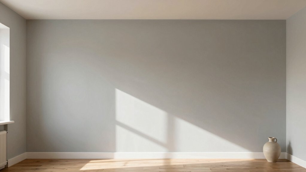
For a north-facing room, you’ll want warm neutrals with depth and light-reflecting finishes to brighten the space without washing it out. Choose soft whites or creamy beiges, think greiges or taupes with golden or apricot undertones. Use satin or eggshell on walls and ceilings to bounce light, and add texture with linen or wood. Test large samples in daylight and artificial light, then balance with subtle accents; you’ll uncover more tweaks that can transform the mood.
Why North-Facing Rooms Feel Cooler and How Color Helps
North-facing rooms often feel cooler because they receive less direct sunlight throughout the day. To counteract this, you adjust color strategically and align your space with practical layout choices.
First, choose paints with cool undertones that reflect light without absorbing heat, and pair them with brighter accents to brighten perceived warmth.
Second, apply window treatments that maximize daylight while controlling glare; sheer curtains or light blinds help you modulate sun exposure without dulling the room.
Third, plan furniture placement to keep heavier pieces away from windows, preserving open sightlines and air flow, which enhances room brightness.
Finally, test swatches on different walls at various times to confirm the color’s true behavior from morning to afternoon.
Warm Neutral Hues That Brighten a North-Facing Space
You can brighten a north-facing space by embracing warm neutrals that reflect more light. Use warm tones for depth and contrast.
Then choose light-reflecting finishes to enhance brightness. Together, these choices support a clearer, more inviting room without sacrificing coziness.
Brighten With Neutrals
Brighten a north-facing room with warm neutrals that reflect light without washing out depth. You’ll choose lighter warm beige, creamy off-whites, and soft greiges to expand the sense of air while preserving dimensional shadows.
Use a consistent base to prevent contrast gaps that dull the space. In interior design terms, opt for paints with subtle warmth and slight undertones that read as reflective rather than flat. Apply color evenly across walls, ceilings, and trim to maximize light diffusion.
When you’re ready for paint application, prime surfaces to minimize sheen variability and achieve uniform coverage. Pair neutrals with cool metallic accents and natural textures to amplify brightness without glare.
Keep progressions clean, and test swatches in multiple lighting moments.
Warm Tones for Depth
To add depth without sacrificing light, lean into warm neutral hues that read as softly dimensional. You’ll pick colors with beige, taupe, or greige bases and an undertone leaning golden or apricot to counter North-facing dims.
Apply these tones on walls and trim for a cohesive, enveloping feel that still reads bright at key times of day. Balance depth with subtle contrast—slightly lighter ceilings keeps airiness intact.
Consider cultural influences and historical color trends to guide your choices; mid-century warm neutrals, French-inspired creams, or earthy taupes can anchor the room without muting light.
Test swatches in multiple lighting moments, noting how warmth shifts from morning to late afternoon. Select hues that maintain legibility of artwork and furniture while enhancing perceived space.
Light-Reflecting Finishes Boost
By selecting light-reflecting finishes, you can boost the brightness of a north-facing space without sacrificing warmth. Choose sheens like satin or eggshell to bounce light without glare, and apply the finish consistently on walls, ceilings, and cabinetry.
Pair warm neutrals—creamy whites, soft beiges, and gentle taupes—with subtle color accents to maintain a cohesive, inviting atmosphere. In interior design terms, reflectivity matters as much as hue; higher reflectance paints can noticeably widen the perceived space.
Test color under daylight and artificial light to verify daytime brightness and evening glow. Consider color psychology principles: soothing tones reduce perceived coolness, while brighter neutrals enhance focus and mood.
Use strategically placed mirrors and light fixtures to amplify the effect without overpowering the room.
Soft Whites With a Welcoming Warmth
Soft whites with a welcoming warmth balance North-facing light by leaning into creamy undertones and subtle depth. You’ll choose whites that read softly, not stark, so the space feels inviting from morning to evening.
Prioritize color psychology: warm undertones trigger a cozy vibe without skewing yellow, maintaining true brightness. Select paint finish options that stabilize reflections—matte or eggshell minimizes glare while preserving depth, while satin adds a touch of sheen for architectural detail.
Test swatches on walls at different times of day to confirm mood shifts, ensuring the warmth remains consistent under indirect light. For practical results, aim for a base white with a gentle cream cast, then layer with trim in a slightly brighter shade to define edges cleanly.
Maintain balance and clarity throughout the room.
The Role of Undertones: Balancing Cool Light
Undertones determine how cool light reads in North-facing spaces, so match undertones to tone down or amplify the effect. You’ll assess your base color’s undertone first, then compare against swatches under neutral, daylight-balanced lighting.
If cool light makes a swatch feel sterile, shift toward a subtler warm undertone to restore warmth without yellowness. Conversely, if the room reads too cool, lean into a blue-leaning or green-leaning undertone to maintain clarity without dulling significance.
Undertone importance lies in consistency; don’t mix undertones within a single room without a deliberate plan. Aim for color undertone balance across walls, trim, and accents to avoid abrupt shifts.
Test large samples, observe at different times, and prioritize harmony that preserves daylight clarity without washing out depth.
Lighting Strategies to Maximize Daylight
To maximize daylight in north-facing rooms, prioritize reflective surfaces and strategic lighting placement that amplifies natural light without introducing glare.
You’ll choose high-luminosity fixtures and diffuse sources that soften shadows while avoiding cold, harsh tones. Use wall and ceiling finishes with low-sheen reflectivity to bounce daylight deeper into the space.
Position pendant lights and floor lamps to supplement, not compete with, window light, keeping glare off work surfaces.
Favor layered lighting: ambient, task, and accent, but ensure each layer remains dimmable for mood and balance.
Consider interior decor and furniture placement that directs light toward focal points and avoids blocking windows.
Align lamps with seating zones so every area benefits from daylight without overburning it.
Accent Colors That Add Coziness Without Overpowering
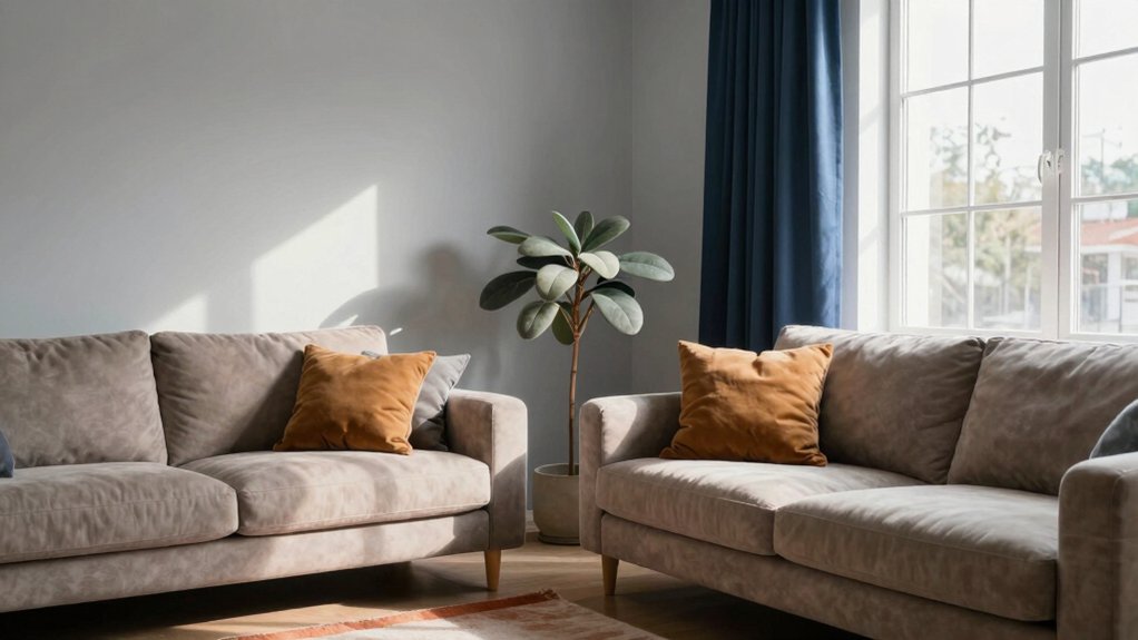
Choose cozy accent hues that feel inviting, then balance them with soft neutrals to keep North-facing light from feeling cold.
Use small doses of warmer tones—terra cotta, dusty rose, or olive—paired with airy, light neutrals to preserve brightness.
Keep the emphasis on comfort without crowding the room, so the accents enhance rather than overpower.
Cozy Accent Hues
Cozy accent hues should feel warm and inviting without competing with a north-facing room’s natural light. Choose muted, earthy tones or soft, velvety blues to create depth while preserving brightness. Use color psychology to guide selections: warm neutrals can soothe, while subdued greens invite calm.
Apply accents sparingly, focusing on a single statement piece or small architectural details to avoid overwhelming the space. For walls, keep a light base and reserve bolder tones for textiles, furniture, pillows, or a single accent wall.
When planning paint application, test swatches on different wall areas and under multiple lighting conditions. Balance contrast with natural light by pairing warm accents with cool whites.
Maintain cohesion through consistent undertones and purposeful placement.
Balance With Soft Neutrals
Soft neutrals balance warmth and light by softening contrast without dulling energy. You achieve this by selecting muted base tones and pairing them with gentle accent colors that cozy a north-facing room.
Rely on interior design principles that emphasize harmony, proportion, and natural light. Then introduce textures—linen, wood, or woven textiles—to amplify warmth without overpowering.
Use paint application techniques that keep edges soft: thin, even coats; avoid stark color blocks; blend transitions where walls meet ceilings. For accents, choose warm whites, taupe, or blush with subtle depth, so you maintain brightness while inviting intimacy.
Test swatches in multiple exposures, adjust saturation sparingly, and balance with dark wood or metal details. This disciplined approach preserves clarity, depth, and comfort.
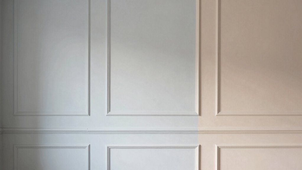
Testing and Applying Paint: Samples, Lighting, and Final Choices
Testing paint on North-facing walls starts with samples that reflect how the space actually looks under light. You’ll compare swatches on large boards and near the ceiling, avoiding small chips that misrepresent color.
Focus on paint sample placement to capture how walls interact with windows and fixtures at different times of day. Use paint testing techniques such as applying multiple coats, rotating samples, and evaluating both daylight and artificial lighting.
Check for undertones under your room’s glow, and note consistency across surfaces. Once you identify a few contenders, test them in a full wall area before committing.
Consider sheen options that suit the room’s activity level, then choose a final color. Document observations for a confident, informed final choice.
Conclusion
North-facing rooms sip the day with cool light, so you don’t have to fight it—you guide it. Pick warm neutrals that invite rather than glare, and embrace soft whites with friendly undertones to keep the space from feeling clinical. Use strategic lighting to mimic sunshine, and introduce accents that cozily anchor the room without shouting. Test swatches in the actual light, commit to a final choice, and let color behave like a warm glow, not a cold gaze.