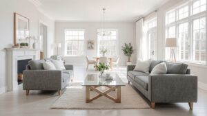
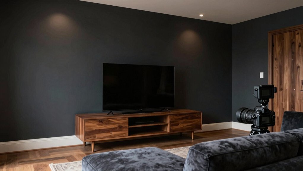
For a media room, start with a neutral base like midtone gray, taupe, or greige to balance artificial lighting, reduce glare, and preserve on‑screen detail. Rich blues and charcoals absorb ambient light, lowering eye strain while maintaining depth. Aim for matte or eggshell finishes to minimize reflections, and match room lighting with dimmable, warm lamps to keep blacks true. Pair with a single, controlled accent if you want personality. If you keep exploring, you’ll uncover more practical setup tips.
Understanding How Light Affects Media Room Colors
Light conditions dramatically influence how colors read in a media room. You evaluate color choices by considering both ambient lighting and wall texture, since each factor shifts perception. In brighter settings, colors appear lighter and more neutral, so you might select cooler neutrals to prevent glare.
Dimmer environments intensify saturation, making deeper hues feel richer but potentially overwhelming if not moderated. Your wall texture also affects outcomes: smooth surfaces reflect light evenly, while textured finishes break up color with subtle specks and shadows.
When planning, simulate typical viewing scenarios and observe samples under varied illumination. Prioritize hues that maintain the intended mood across light levels, ensuring contrast remains legible for on-screen content and that color integrity endures from daytime to evening use.
The Psychology of Color for Movie Night Atmospheres
Color choices for a movie night shape mood, pace, and engagement, guiding viewers toward immersion or calm focus. You influence atmosphere by pairing color psychology with room lighting to support the on-screen narrative.
Dim, warm tones can cultivate coziness and retrospection, while cooler hues encourage alertness during suspenseful sequences. High-contrast accents reveal architectural details without distracting from the screen, yet keep the space visually engaging.
Saturation matters: moderate color depth avoids glare and sustains viewer comfort over long sessions. Consider wall color as a backdrop that either softens or sharpens perceptual depth; textiles and furnishings should reinforce the intended mood without competing for attention.
Ultimately, the goal is coherence between illumination, color, and content to enhance cinematic immersion.
Best Neutral Bases for Theaters: Grays, Taupes, and Greiges
You’ll explore how grayscale lighting balance shapes your theater’s mood, ensuring shadows stay soft and visuals stay true.
Consider hue depth in rooms to prevent flatness, so grays, taupes, and greiges read as intentional, not washed out.
This discussion lays the groundwork for selecting neutral bases that support image quality and comfort.
Grayscale Lighting Balance
Grayscale tones provide a neutral, versatile foundation for a media room, balancing light control with color accuracy and reducing visual fatigue. You’ll want a backdrop that minimizes color bias under varied illumination, so grayscale bases stay consistent as you switch between content and ambient scenes.
In practice, this means selecting midtone grays, taupes, or greiges that read solidly under artificial lighting without washing out contrast. Prioritize uniform reflectance across walls to prevent hot or cold spots that distort image perception.
Consider how color temperature interacts with your display: cooler whites can sharpen details, while warmer tones may soften glare. Achieve balance with controlled lighting layers, avoiding strong color casts from lamps or screens, and verify daylight exposure to maintain steady grayscale fidelity.
Hue Depth in Rooms
Hue depth matters because it defines how a theater room reads on screen and in daylight. It guides choice toward neutrals that stay balanced under varying lighting. In rooms designed for media viewing, you’ll favor color depth that preserves contrast without shifting hue under different intensities.
Deep neutrals, such as grays and greiges, can maintain stable color saturation when lamps and screens shift from warm to cool tones. Light-control considerations improve perceptual depth, so you’ll want paints that resist bleaching with exposure to projector glare.
Evaluate color saturation across swatches in both daylight and lamp-lit scenes before committing. Also assess paint durability; durable finishes minimize washout from humidity, heat, and frequent cleaning.
The right hue depth supports accurate skin tones, sharper detail, and lasting visual cohesion.
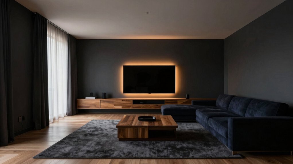
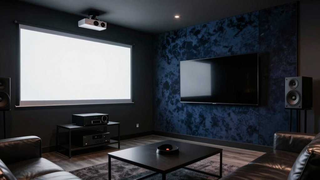
Rich Blues and Charcoals That Reduce Glare
Rich blues and charcoals reduce glare by absorbing ambient light rather than reflecting it. When you choose these hues, you reinforce a calm viewing environment, lowering eye strain during long sessions. You’ll notice that deep blues and near-black neutrals discipline brightness without creating harsh contrast, which helps preserve on-screen detail.
Color psychology suggests cooler tones can prompt focus and perceived sharpness, while charcoal adds depth without heaviness, keeping a room balanced for varied lighting.
Paint durability matters here: select matte or low-sheen finishes to minimize reflections on wall surfaces and preserve color integrity over time.
Pair these tones with controlled lighting and seating placement to maximize comfort and readability, ensuring your media space remains welcoming, functional, and visually cohesive for diverse viewing setups.
How to Enhance Contrast for TVs and Projectors
To maximize contrast on TVs and projectors, start by controlling ambient light and screen brightness.
You optimize contrast by selecting paints with low reflectivity, aiming for a matte or satin finish to minimize glare without washing out colors. Consider wall colors that absorb light rather than reflect it, but avoid overly dark tones that hamper room brightness.
Artificial lighting should be positioned to avoid direct reflections on screens, using dimmable fixtures and warm temperatures to reduce blue spill.
Balance room luminance with screen brightness for consistent blacks and whites.
Durable, low-odor paint improves paint durability in media spaces prone to heat and traffic.
Finally, choose finishes that resist scuffing and washing cycles, preserving contrast over time without frequent repainting.
Tone Mapping: Matching Wall Color to Screen Brightness
Tone mapping requires aligning wall color with the screen’s brightness to preserve perceived detail and color accuracy. You should select wall tones that neither wash out nor overpower on-screen images, aiming for mid-range luminance that reflects light evenly.
For brighter rooms, choose neutral or slightly cool hues to maintain contrast without increasing glare. In darker spaces, opt for warm neutrals that prevent color bias during viewing.
Consider how wall texture influences light diffusion. A smooth finish reduces dust reflections and preserves color fidelity, while a subtle texture can soften glare without sacrificing clarity.
Paint durability matters in media rooms, so pick finishes that resist fingerprints and abrasion.
Balance the palette to sustain consistent brightness across scenes, avoiding abrupt shifts that distract from the viewing experience.
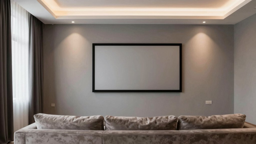
Accent Colors That Pop Without Brightening the Room
Accent colors can pop without brightening the room by using saturated hues sparingly as accents, such as on a feature pillow, trim, or art frame, while the walls stay in neutral, mid-tones. In this approach, you preserve a calm backdrop that supports high-contrast viewing and reduces glare.
Choose one or two accent tones and repeat them through themed decor and discreet furniture choices to create cohesion. Opt for colors that complement the neutral base and the screen’s color temperature, avoiding busyness.
Statement pieces should remain restrained yet purposeful, guiding the eye without overwhelming the space. This strategy balances visual interest with restraint, supporting a refined, media-friendly environment.
Paint Finishes and Their Impact on Comfort and Acoustics
Paint finishes influence comfort and acoustics through their inherent reflectivity, texture, and material density. These properties affect both lighting distribution and sound behavior within a space.
You’ll notice how higher-sheen options reflect more light and can create brighter rooms. Conversely, matte finishes absorb glare and influence perceived noise levels.
Consider how finish choices interact with room size, lighting, and acoustic needs to balance mood, visibility, and sound clarity.
Finish Options Impact
Finish options for a media room can subtly shape both comfort and acoustics. The finish you choose affects sound diffusion, absorption, and perceptual warmth, so select with purpose.
Matte or flat sheens minimize glare and echo, aiding dialogue clarity, while eggshell or satin offer a small glow that can soften reflections without amplifying noise. Avoid ultra-glossy surfaces; they reflect sound and light unevenly, complicating the space’s atmosphere.
When planning application, consider surface texture and room geometry, as these influence how sound travels. For efficient work, know your tools: paint roller types determine coverage and texture; primer selection sets a stable base and enhances finish adhesion.
Choose coatings aligned with your room’s usage to maintain comfort and acoustic balance.
Reflectivity and Lighting
As you refine the room’s look and feel, consider how reflectivity and lighting interact with paint finishes to shape comfort and acoustics. The finish you choose affects glare, shadows, and perceived warmth, so select options that balance brightness with control. Matte or eggshell surfaces absorb more light, reducing interruptions in viewing, while satin and semi-gloss elevate illumination and highlight architectural details.
In a media room, lower-gloss finishes often improve comfort by dampening reflections off screens, yet you should verify their durability in frequent use. Balance wall texture with paint durability to maintain a cohesive appearance over time.
Consider how subtle sheen differences interact with fixtures and drapery, ensuring consistent ambiance without sacrificing clarity or acoustic intent.
Acoustic Interaction Effects
While finishes with different sheens influence visual comfort, they also affect acoustic behavior by altering surface absorption and diffusion. In a media room, you should evaluate how sheen level interacts with room geometry to shape sound quality.
Matte finishes absorb more high frequencies, reducing glare and excessive brightness, while still permitting balanced reverberation times suitable for dialogue and music. Midgloss surfaces offer modest diffusion, potentially smoothing flutter echoes when paired with appropriate layout.
Remember that color choice alone won’t guarantee acoustical comfort; finishing strategy matters. Consider soundproofing techniques for leakage and acoustic paneling options to control reflections at key surfaces, particularly walls behind seating and near sources.
Combine thoughtful paint selection with targeted panels to optimize clarity, intelligibility, and overall acoustic experience.
Practical Palette Pairings for Different Room Sizes
Choosing palette pairings that suit the room size guarantees both cohesion and practicality: small media rooms benefit from light, unsaturated neutrals with a single accent color to avoid crowding, while larger spaces can handle deeper hues and more varied contrasts to create depth. For compact rooms, pair warm neutrals with a subtle cool accent to enhance perceived space, and keep furnishings minimally contrasting to maintain flow. In medium rooms, introduce a restrained secondary color for furniture or trim, ensuring it complements rather than competes with the primary tone. In expansive spaces, employ layered contrasts and richer tones to delineate zones and add drama. Consider wall textures and paint primer as foundational steps to make certain of color accuracy and durability.
Practical Prep Tips for a Pro-Level Paint Job
To get a pro-level finish, start with meticulous prep that sets a flawless canvas for your chosen media-room palette. Begin with a thorough assessment of surfaces and repair any imperfections with suitable filler, sanding smooth between coats.
Guarantee walls are clean, dry, and dust-free before applying primer; this is essential for even color and adhesion. Choose a high-quality primer appropriate for the substrate and anticipated artificial lighting to prevent sheen shifts.
Measure and cover nonpainted areas precisely to protect trim, ceilings, and electronics. During paint preparation, mix cans to achieve uniform color and viscosity, and test a small area under the room’s lighting to verify consistency.
Maintain controlled temps and airflow, and allow adequate drying time between coats for a durable, professional finish.
Conclusion
In the grand theater of your living room, you’ll finally grasp the “best” paint color is the one you already own, right under the glare of your TV. You’ll pretend the shade choice somehow shapes your listening and viewing fortunes, while blinds and curtains do the real work. So, choose a neutral map, dodge the glare, and praise yourself for a pro-level finish—because, obviously, the wall did all the heavy lifting. Irony, meet your media room.