
You’ll want a calm, mid-toned palette that supports focus and immersion. Think warm grays, blues, or greens in matte finishes to cut glare and keep HUDs legible while boosting depth. Use accent zones for contrast, and lighten ceilings to enlarge space without stealing attention from screens. Balance texture with controlled lighting to prevent clutter and enhance color pop. If you stay on this track, you’ll uncover more nuanced color strategies and application tips.
Deep Neutral Tones for Focus
Deep neutral tones create a focused backdrop that minimizes visual noise without feeling dull. You choose subtle grays or warm beiges to anchor your gaming setup, letting LEDs and art stand out without competing for attention. This approach emphasizes wall texture and paint durability, since a calm surface reveals fine surface details rather than amplifying distraction.
In practice, you’ll notice that matte or eggshell finishes reduce glare while preserving depth, aiding sustained concentration during long sessions. You assess color balances by testing swatches under your primary lighting, ensuring contrast supports legibility of on-screen HUDs.
The goal is a cohesive field that buffers eye fatigue and enhances perception of game depth. Precision in hue and finish translates to steadier focus and a cleaner overall aesthetic.
Calming Blues to Reduce Eye Strain
Calming blues can ease eye strain by moderating ambient contrast without washing out game visuals. You’ll notice subtler highlights and deeper shadows, which helps your eyes adapt during long sessions. In color psychology terms, blues promote serenity and focus, reducing cognitive load while you track fast-paced action.
Choose mid-tone blues rather than icy or navy extremes to preserve detail without glare. Consider matte or eggshell finishes to minimize reflections that disrupt perception, then test under your typical lighting to confirm comfort.
Paint durability matters; select high-quality, low-VOC formulas that resist scuffing and maintain consistent hue over time. With these choices, you’ll sustain visual comfort and a cohesive aesthetic, aligning gaming performance with room atmosphere.
Subtle Greens for Balance and Comfort
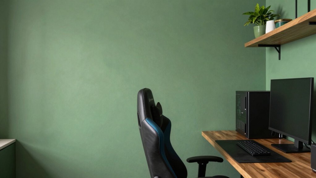
Subtle greens create a calming baseline that supports long gaming sessions without visual fatigue. Consider calming green tones that balance saturation with softer neutrals.
This way, your environment remains focused rather than distracting. Pair these hues with soft accent neutrals to maintain cohesion and highlight key areas like desks and seating.
Calming Green Tones
In calming green tones, subtle greens create a balanced backdrop that reduces visual fatigue while keeping the room inviting. You’ll sense confidence in color without overstatement, and the hue supports long sessions with steady focus.
A mid-range green blends well with neutrals, letting screens glow without competing for attention. Consider undertones that lean toward olive or sage to signal warmth and reduce glare, while maintaining clarity across lighting conditions.
The palette works with varied textures—matte walls, soft fabrics, and a subtle sheen in trims—to preserve depth. Pairing this with intentional contrast keeps the space visually engaging.
Integrate gaming chair ergonomics and soundproof wall panels to optimize comfort, posture, and acoustics, ensuring immersion without sensory fatigue.
Balanced Hue Options
Balanced Hue Options: Subtle greens offer a measured path to comfort and focus, delivering calm without closing in on the room’s energy. You’ll find balance through tonal moderation, where pale sage, muted olive, and desaturated emerald create depth without fatigue.
Analytical layering matters: pair greens with cool whites or warm woods to sustain contrast that supports game sessions and long study blocks. Lighting options matter; opt for fixtures with adjustable warmth to shift the mood as you switch between intense gaming and casual browsing.
Furniture coordination remains essential, aligning desk finishes, seating, and storage with the wall hue to prevent visual clutter. The result is a serene, intentional environment that supports extended concentration.
Soft Accent Neutrals
Soft accent neutrals soften the greens, weaving balance into the room without overpowering the display of gear. You choose subtle greens with warm undertones to avoid competing with screens, creating a calm backdrop for focus.
In practice, these tones read as neutrals under artificial lighting, shifting softly between sessions and daylight. You’ll notice that wall textures matter: a matte finish minimizes glare, while a delicate velvet or plaster texture adds depth without visual noise.
Use soft greens alongside cool grays or warm beiges to control temperature and mood, keeping contrast intentional rather than loud. The goal is perceptual harmony, where accents support clarity, not distraction.
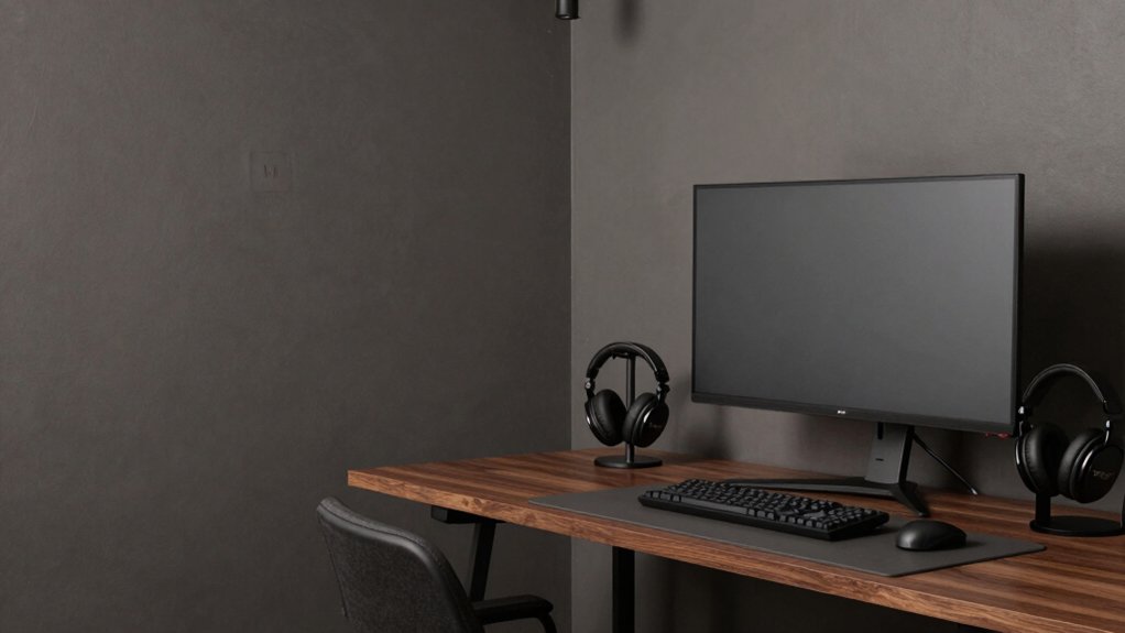
Rich Charcoals and Plums for Cinematic Vibes
Rich charcoals and plums anchor cinematic gaming rooms by balancing depth with restrained color pops. You transform a space by pairing saturated charcoal walls with plum accents, creating a theater-like backdrop that enhances screen focus without overwhelming it.
In an analytical sense, the mood shifts from clinical to immersive as you modulate contrast: deep hues recede, brighter trim or furniture cues advance just enough to maintain visual hierarchy. Your gaming setup benefits from careful lighting that respects these tones, avoiding color clashes and glare.
Consider the paint durability of matte or satin sheens for reduced reflections and easier maintenance. The result is a cohesive palette that supports long sessions, minimizes distractions, and reinforces cinematic intent without sacrificing practicality or comfort.
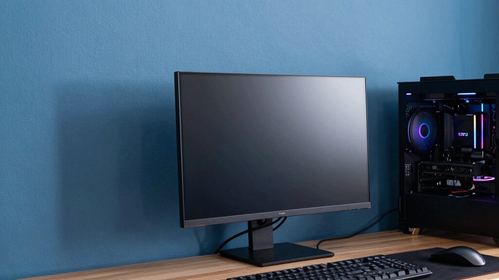
Warm Grays to Enhance Screen Color Pop
Warm grays offer a practical bridge from the cinematic depth of charcoals to a brighter, more screen-focused room. You’ll notice how these tones pull in ambient lighting without washed-out glare, preserving contrast while still feeling comfortable for long sessions.
Choose grays with subtle warmth to avoid fighting color accuracy on your display, letting screen whites stay true without casting color casts on walls. Wall texture matters: a fine, matte surface minimizes reflections that can distort HDR highlights and create eye fatigue.
Pairing warm gray walls with controlled lighting zones lets you boost color pop on-screen while keeping peripheral tones neutral. This approach yields a balanced, modern aesthetic that supports sharp image fidelity and a cohesive gaming environment.
Matte Finishes vs. Satin: Which Weathers the Setup
Matte finishes edge toward practicality by reducing glare and hiding fingerprints, but satin offers a subtle sheen that can enhance depth without sacrificing legibility. You weigh these choices by how you experience the space during long sessions and quick bursts of play, not just how they look on a swatch.
Matte amplifies wall texture, making you notice subtle surface irregularities, while satin smooths the field, giving a cleaner backdrop that reads well under varied lighting. In terms of paint durability, both finishes resist typical gaming wear, yet satin forgives fingerprints more visibly and cleans up easier without dulling.
Consider your cabinet and trim contrast as part of the same decision, since finish choice influences perceived color warmth, contrast, and overall mood without introducing distraction.
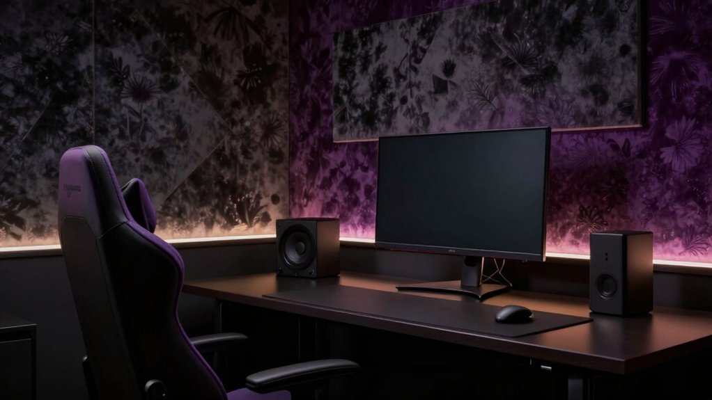
Accent Walls, Lighting, and Color Zoning
Accent walls, lighting, and color zoning shape how you perceive your gaming room’s rhythm after settling on finishes. You analyze how contrasts guide focus: a bold accent wall anchors the scene, while softer surrounding tones keep motion smooth.
Lighting matters more than hue alone, with cool grey tones reading differently under RGB glow versus daylight. Color zoning helps you choreograph zones for play, study, and relaxation without clutter.
Use wall decals sparingly to define a feature without overpowering space; they should echo the accent hue and not compete with screens. Ceiling paint can lighten ceilings and extend perceived height, improving immersion.
Aim for balance, where texture, shade, and light work together to refine atmosphere rather than overwhelm it.
Practical Tips for Paint Selection and Application
When selecting paint for a gaming room, start by identifying how the space will be used across sessions and how lighting interacts with color throughout the day. You’ll prioritize low-glare finishes and mid-tones that reduce eye strain while preserving contrast. Consider lighting considerations: mix natural and artificial light, test swatches at different times, and avoid ultra-saturated hues that wash out under bright bulbs.
Choose durable paints or finishes with easy cleaning to maintain a pristine look after long sessions. For color selection, map zones for focus versus relaxation, then select complementary tones that enhance depth without overwhelming screens. Pay attention to paint durability in high-traffic walls and wear-prone corners.
Finally, apply multiple thin coats, allow proper drying, and use edge-saving painter’s tape to ensure sharp, professional lines.
Conclusion
You train your room like a cockpit, each shade a instrument tuning for focus. Deep neutrals are your quiet hull, blues calm the engine, greens steady the keel, and charcoals cradle the cinematic horizon. Warm grays pop colors without shouting, while finishes weather the flux of light and sweat. Accent walls steer mood, lighting assigns tempo, color zoning maps your quests. In this palette, your setup becomes a disciplined constellation—functional, beautiful, ready for the next level.