To brighten a beige tile living room, lean into warm neutrals and soft accents that echo the tile’s coziness. Think creamy whites, warm grays, and taupe with gentle undertones, then layer in textures like linen or wicker for depth. Add pastel hints—mint, blush, or pale lavender—or keep it serene with ivory, greige, or soft taupe for a calm, cohesive look. Bold navy or charcoal can highlight architectural features in small doses. Curious how to fine‑tune it further?
Understanding Undertones in Beige Tile
Undertones in beige tile aren’t just a background detail—they determine which colors read as warm or cool in your living room. You’ll notice undertones shift with lighting, grout, and surrounding materials, shaping how color temperature reads in reality—not just on swatches.
When you assess your space, compare tiles beside whites, creams, and grays to see if you lean toward creamy warmth or cool linen. Tile sheen matters too: matte minimizes reflects, while glossy surfaces amplify light and mood.
With this awareness, you’ll predict how paint interacts with the tile, avoiding clashes or muted pairings. Remember, undertones aren’t fixed rules; they’re clues guiding your palette.
Observe, test patches, and choose hues that harmonize the tile’s real, evolving character.
Warm Neutral Palettes That Complement Beige
Warmth with beige creates an inviting canvas, so you’ll lean into soft creams and warm grays to keep the room cozy. Use a Neutral Pairings Guide to balance sunlit tones with cooler accents without stealing beige’s glow.
Add Subtle Contrast Tips, like a deeper accent or textured finishes, to keep depth without overpowering the space.
Warmth With Beige
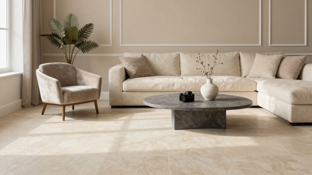
If you want beige to feel welcoming rather than flat, lean into warm neutrals that pair naturally with it. You’ll find warmth most effectively in beige-tinted off-whites, soft apricot, and honeyed taupe, creating a cozy foundation without overpowering textures.
Embrace depth with low-contrast contrasts: pair a warm base with slightly richer accents to preserve calm in living spaces. In this zone, interior design trends favor breathable palettes, so choose colors with subtle undertones you won’t tire of.
Consider paint brand comparisons to ensure finish consistency and longevity, since sheen and base undertone matter as much as hue. Use warm neutrals to highlight wood, textiles, and art, letting daylight reveal their gentle glow rather than competing with it.
This approach guarantees inviting, timeless warmth.
Neutral Pairings Guide
Neutral palettes that complement beige lean warm and breathable, balancing subtle contrast with rich texture. You’ll pair beige with soft taupe, ivory, and greige for serene rooms that feel both current and timeless.
Use warm neutrals as your backdrop, then layer depth with deeper accents to create dimension without heaviness. Decorative accessories in brass, wood, or matte black add tactile sparkle and focal points.
Textiles in linen and wool reinforce that breathable vibe. For furniture styles, choose clean-lined pieces in oak or warm maple to preserve unity, or mix mid-century silhouettes with soft curves for contrast.
Keep trim and cabinetry lighter to maintain airiness, and let natural light swim through the space, highlighting the palette’s understated sophistication.
Subtle Contrast Tips
Subtle contrast in warm neutral palettes comes to life by layering depth without overpowering beige. You’ll lean into monochrome schemes that keep the room cohesive while adding visual interest.
Use slightly cooler beige undertones or creamy whites for edges and trim to carve subtle separation without sharp lines. Introduce texture with matte and satin finishes, or woven fabrics, to create depth that reads as color without shouting.
For accent wall ideas, pick a soft taupe or warm gray that echoes your base without duplicating it, then keep surrounding walls lighter. Add small, purposeful accents—wood tones, ceramic, or brass—to anchor the space.
The result feels balanced, inviting, and timeless, with understated contrast that enhances beige rather than competing with it.
Soft Pastels to Pair With Beige Tile
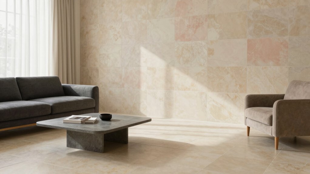
Soft pastels bring a gentle contrast to beige tile, offering understated color pairings that elevate warmth without overpowering the room.
Think mint, blush, and powder lavender as quiet accents, with beige tile acting as a calm backbone to these soft hues. Use these pastel pairings as subtle color accents to spark interest while keeping the space cohesive.
Soft Pastel Pairings
Soft pastels add a gentle lift to beige tile by creating a calm backdrop that lets furniture and art pop. You’ll want soft pinks, airy blues, and muted greens to breathe life without overpowering the room.
Pair these hues with varied tones from the color wheel to maintain balance, using complementary accents to prevent monotony. For walls, choose flat or matte paint sheen to minimize glare and emphasize texture in fabrics and woodwork.
If you prefer a touch more polish, go satin on cabinetry or trim to catch subtle light without shouting. Layer with neutral textiles—linen, cotton, or wool—in lighter shades to preserve cohesion.
Test swatches in daylight, then adjust intensity until the pastel palette feels intentional, not sandy, and your space sings.
Beige Tile Complements
Beige tile sets a calm stage, but soft pastels can lift the room without competing with the tile’s warmth. You’ll notice pale pinks, blush, mint, and powder blue read as gentle accents, not noise, when kept at moderate saturations. Use these tones as a backdrop while you introduce decorative accessories that echo the palette: ceramic bowls, woven baskets, and light-framed art that don’t overwhelm the floor’s neutrality.
For furniture styles, choose low, matte-finish pieces in taupe or antique white to maintain cohesion; avoid heavy, glossy contrasts that shout. Balance is key: place a pastel rug or throw where traffic gathers, then anchor with natural textures—jute, linen, and wood—that reinforce calm without fading the tile’s warmth.
Subtle Color Accents
Pastel accents can elevate beige tile without stealing its warmth. You’ll find soft pastels quietly lift the room when used as subtle accents. Think powder blues, muted pinks, and pale greens in small doses—pillows, a throw, or a single artwork piece. Keep the palette restrained to preserve the tile’s calm base.
In monochrome schemes, lean into variations of the same hue for cohesion without competition. For example, a series of light gray-blue cushions or a soft olive rug can unify space while maintaining brightness.
Color blocking works well in a restrained way: pair a pale pastel wall with a slightly deeper accent furniture tone, then ground with natural textures. Avoid high-contrast pairs; aim for harmony, not fashion.
Bold Accent Colors for Contrast and Depth
Bold accents instantly sharpen the beige tile backdrop by adding depth and personality. You can harness bold accent colors to create a dynamic focal point without overpowering the room. Choose one dominant bold hue and pair it with contrasting shades to sustain balance, not chaos.
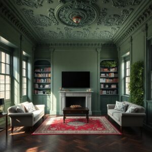
Think deep navy or charcoal on an accent wall, then add pillows or art in emerald, burgundy, or mustard to echo that palette. In small doses, bold colors read as sophistication; in larger swaths, they read as drama. Keep surfaces neutral elsewhere to prevent visual noise.
Use texture—matte walls with glossy frames or velvet cushions—to amplify contrast. The goal: color that feels intentional, not volatile, so your beige tile benefits from deliberate, vivid energy.
Lighting’s Role in Color Perception
Lighting shapes how beige tile reads in real time. When you move light sources, your eye shifts color perception, and that changes how walls feel beside the tile.
Bright, cool lighting can make beige lean gray or ivory, while warm, soft tones warm the undertone toward caramel. You’ll notice color shifts across the day with natural daylight, then again at night under incandescent or LED blends.
These lighting effects influence mood as much as hue, nudging a room toward calm or energy. Consider color psychology: cooler temps elevate crisp, modern vibes; warmer temps invite coziness.
To balance the palette, test swatches under your primary fixtures, observe adjacent fabrics, and adjust brightness to keep beige tile harmoniously true.
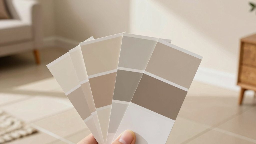
Testing Colors: How to Visualize Before Painting
To visualize how colors will look before you paint, start with swatches applied to large test patches on your walls rather than tiny chips. This technique reveals subtle shifts under your lighting and in real-room context. Place patches where you’ll spend time, and observe at different times of day.
Use a color wheel to compare undertones and harmony, identifying warm versus cool leanings that complement beige tile. Gather paint samples on medium-sized boards or drywall sections, then photograph the samples alongside furniture for reference.
Evaluate saturation, contrast, and mood; you want a coherent flow from room to tile. Narrow choices to two or three finalists, then test full-surface panels. Finalize with a decisive, representative sample that mirrors actual wall conditions.
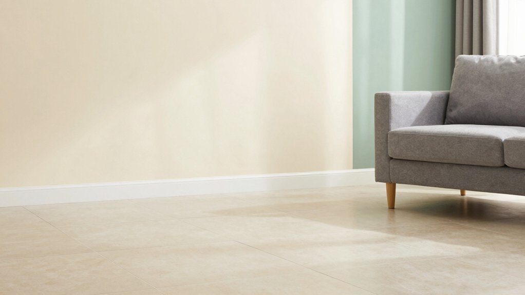
Practical Tips for Coordinating Wall and Tile Shades
When coordinating wall tones with beige tile, start by defining the room’s dominant mood and then pick shades that support it. You’ll balance color temperature to keep the space warm or cool, avoiding clashes with the tile’s undertones.
Begin with a neutral base; five- to seven-point gradient helps depth without distraction. Pair lower-saturation hues with subtle accent colors to prevent busy contrast.
Consider paint sheen: matte or eggshell minimizes reflections, while satin adds tolerance for busy families and traffic.
Test large swatches at different times of day to observe lighting shifts, and compare under natural light to artificial bulbs.
Use a restrained palette: one primary and two supporting tones, plus an accent for focal walls. Document exact shades to preserve consistency across rooms.
Conclusion
Here’s the truth: theory often underestimates how your beige tile’s undertone shifts with light and surrounding colors. When you test swatches in real walls, you’ll notice warm beiges lean toward soft creams and golds, while cooler tiles invite crisp whites and gentle grays. So, trust observation over charted rules. You’ll uncover a color that feels inevitable, not chosen. Your room will glow with harmony, not homework, once you duel the undertone and win.