For a basement with no natural light, start with bright whites or soft off-whites to bounce what you do have. Warm neutrals like taupe or greige keep things cozy without dulling the space, while light-reflecting blues add a gentle lift. Aim for matte or eggshell walls and semi-gloss trim for durability. Test swatches at eye level under artificial light, and pair with lighting that renders colors well. Curious how to pair textures and finishes for lasting brightness?
Embracing Bright Whites and Soft Off-Whites
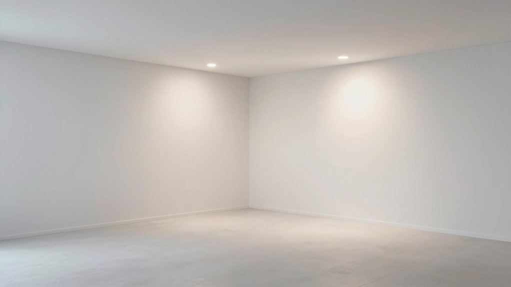
Choosing bright whites and soft off-whites can transform a basement from damp and dreary to open and inviting; start with a clean, balanced foundation. You’ll notice brighter walls reflect limited light, making the space feel larger without harsh glare. Pick undertones that harmonize with existing fixtures; cool whites with a touch of gray read modern, while warm whites skew inviting.
For practical durability, choose matte or eggshell finishes on walls and semi-gloss for trim, doors, and cabinetry. When planning exterior paint options, extend the palette to exterior doors or adjacent walls to create continuity when you view the basement from the outside.
Pair with outdoor lighting ideas that cast soft, layered illumination, reducing shadowed corners. Keep color shifts subtle, and let natural textures or a single accent piece anchor the look.
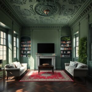
Warm Neutral Hues for Cozy Basements
Warm neutral hues create a cozy, inviting basement without sacrificing brightness. You’ll notice how warm taupes, soft beiges, and greiges reflect artificial light so the space feels larger and more welcoming. Choose hues with subtle undertones to avoid muddy results in low-light corners, and pair them with lighter ceilings to lift the room.
In practice, test swatches at multiple times of day, under your lighting, and across wall areas that receive different reflections. Consider cultural influences when selecting accents—earthy clay tones or charcoal trims can nod to regional craft traditions without overpowering the base neutrals.
Historical palette trends favor balanced contrasts and depth, so vary texture and finish to keep surfaces interesting while preserving calm. Finish with matte or eggshell for a refined, cohesive look.
Light-Reflecting Blues to Open the Space
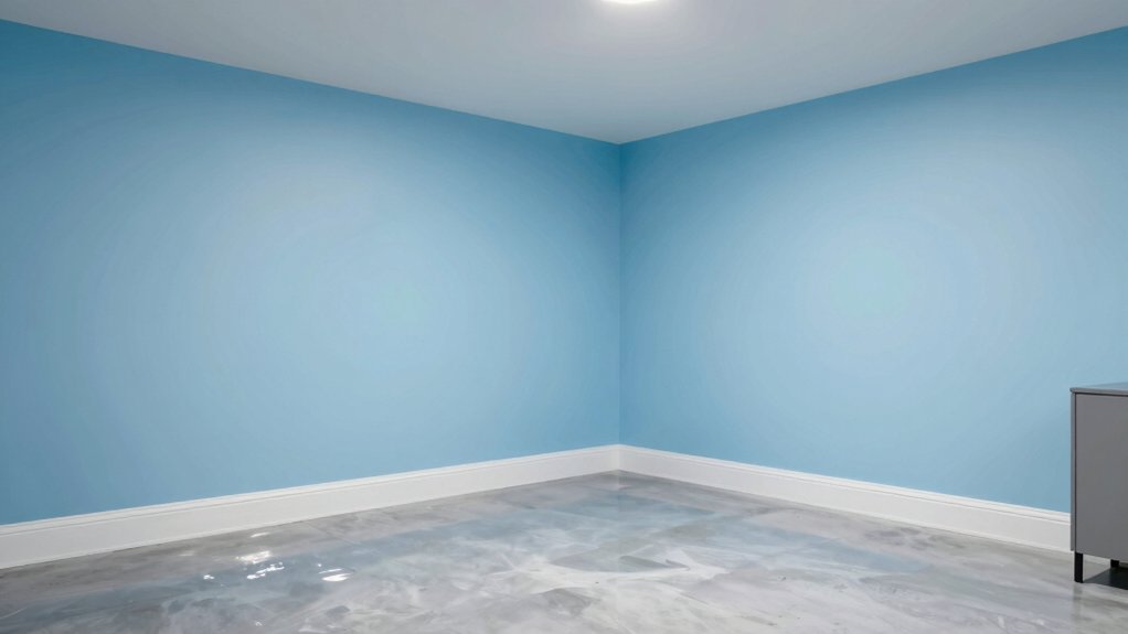
Blue hues can brighten a basement by reflecting more light and feeling airy. Consider a satin or eggshell finish to maximize shine without glare. Pair this with lighting that enhances cool tones.
We’ll explore how blue glow, reflective finishes, and smart lighting choices work together to open the space.
Blue Hues for Glow
When you want a brighter basement, light-reflecting blues can open the space without feeling chilly. Choose airy, mid-tone blues with slight gray undertones to prevent cold vibes while maximizing light bounce.
Pair these hues with soft whites or warm neutrals on ceilings and trim to maintain balance. Consider an eggshell or satin finish to reduce glare yet preserve depth.
To support long-term glow, guarantee basement ventilation stays steady and unobstructed, preventing musty shadows from damp corners. Use moisture control measures—proper vapor barriers, dehumidification, and occasional inspection—as blues brighten when air is dry and stable.
Avoid heavy saturation in small rooms; instead, layer accents—pillows, rugs, art—to deepen the cool-blue glow without overpowering the space.
Reflective Finish Ideas
Start with a light-reflecting palette that leans on airy blues and soft whites, then layer finishes to maximize glow. In this reflective finish idea, you’ll pair alabaster walls with a satin or eggshell base to bounce light without glare.
Use a semi-gloss trim in a cooler white to create crisp edges that read as luminous daylight. For depth, introduce a subtle glaze on selected walls to catch movement as you pass, ensuring color shifts stay soft.
Consider paint texture to add interest: a low-sheen stucco or whispery pebbled texture can reflect refracted light without shouting. Wall patterns should stay simple—think wide stripes or a gentle, grassy lattice—to maintain openness and avoid clutter.
Lighting Pairings Tips
Pair light-reflecting blues with your airy whites to amplify the sense of space without glare. You’ll maximize brightness by pairing cool blue tints with soft, neutral whites, then balance with warm accents for contrast. Choose flatter, matte or satin finishes to reduce glare and keep reflections gentle on the eye.
Use lighting layers: overhead, task, and ambient sources to avoid harsh hotspots while enhancing depth. Consider cultural influences that favor serene, breathable palettes; blues echo coastal and Scandinavian aesthetics, while subtle greys ground the scheme.
Track historical color trends to guide your choices—mid-century blues and traditional whites can coexist with modern LED warmth. Test swatches at different times of day, then fine-tune based on how the space feels under the fixtures you select.
Subtle Greiges for Modern Depth
Subtle greiges strike the perfect balance between warmth and modernity, giving basement walls depth without feeling heavy. You’ll find that these tones read sophisticated rather than flat, especially when you pair them with crisp whites and charcoal accents.
Choose contemporary greige palettes that lean cooler in undertone for a contemporary vibe. Then deepen the effect with subtle color layering: a lighter veil near lighting fixtures, a midtone wash on larger planes, and a slightly richer trim to define edges.
In practice, test swatches on different days and lighting, adjusting until the balance feels intentional. Avoid stark contrasts; instead, let warmth emerge through texture, fabrics, and furniture.
The result is a refined, versatile backdrop perfect for modern basement living.
Pale Yellows for Warmth Without Saturation
Pale yellows can warm a basement without tipping into brightness overload, offering a soft glow that stays grounded. You’ll notice color read as inviting, not punchy, so you preserve depth even when light is scarce.
Choose pale yellows with a touch of gray or cream to avoid yellow-green cast in artificial lighting. Pair with cool accents to keep cohesion, and test samples on a large wall area to confirm under your bulbs.
For ceiling paint options, pick a slightly lighter or dingier shade than walls to create perceived height without glare.
Moisture resistant finishes matter in basements, so opt paints labeled for damp spaces and seal edges against moisture intrusion.
Apply with a smooth roller for even coverage and minimal texture.
Taupe-Tinted Whites for Cozy Balance
Taupe-tinted whites strike a cozy balance in a basement by softening harsher neutrals without stealing light. You’ll create a welcoming, versatile backdrop that doesn’t compete with your furniture or artwork. Choose whites with a touch of taupe in their undertone to add warmth while preserving brightness from artificial sources.
In color psychology, this subtle warmth reduces perceived confinement, encouraging a calmer, more inviting mood. Historically, color trends have favored creamy, neutral bases that adapt across seasons and lighting, and taupe-tinted whites continue that lineage with modern clarity.
Pair these hues with cool accents or natural textures to maintain contrast without harshness. Practically, test samples at multiple times of day, then commit to a tone that remains balanced under basement lighting.
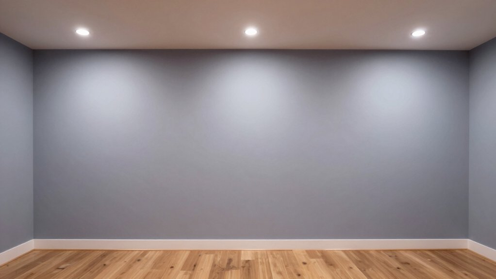
Bounced Light: Sheen and Finish Guide
As you move from a warm, taupe-tinted white backdrop, the way light bounces around your basement matters as much as the color itself. Bounced light is influenced by sheen and finish, so choose thoughtfully.
For dim spaces, a mid-gloss level often balances brightness without creating harsh reflections, while high gloss can exaggerate wall texture and imperfections. If you prefer a softer glow, satin or eggshell provides a subtle lift with less glare.
Consider how paint texture interacts with light: smoother finishes reflect more evenly, textured surfaces scatter light, reducing hotspots. Test swatches on your walls and observe at different times of day.
Track gloss levels and note how each finish changes perception of color in the room, then select the combination that yields coherent, inviting illumination.
Undertones to Watch in Low-Light Rooms
Undertones matter even more in low-light spaces, where subtle shifts can make walls feel warmer or cooler than they look in brighter rooms. In this context, you’ll notice that yellows can skew toward creamy or honey in dim corners, while greens may read as olive or sage depending on nearby surfaces.
When you’re selecting paint, test chips at eye level and observe after several hours of artificial light. Cool undertones can help a basement feel more airless, but balanced warmth prevents it from feeling dungeon-like.
Consider undertones that harmonize with existing fixtures and flooring, rather than fighting them. This approach supports interior design goals and enhances paint durability, ensuring a cohesive, timeless mood that stays practical and attractive over time.
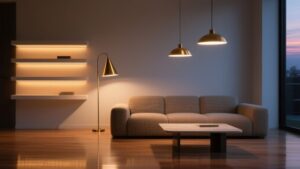
Pairing Paint With Lighting and Decor
Lighting can shift the mood of your paint, so choose hues that stay true under each bulb and fixture.
Let your decor’s textures and accents echo the color’s warmth or coolness to create a cohesive look.
When you plan, consider how lamps, windows, and furniture interact to reinforce the hue you want.
Lighting Influences Color
Color looks different under every light, so the way you pair paint with lighting can make or break a basement’s mood. You’ll notice color shifts under cool LEDs, warm incandescent, and daylight lamps, so choose hues that stay true to intent across sources.
For limited natural light, lean toward mid-tones with subtle warmth to avoid a hollow feel. Test swatches at different times and set lamps to typical usage to preview results.
Contrast matters: a crisp white ceiling can brighten shadows, while a muted wall color can reveal texture without dominating space.
Plan for paint longevity by selecting durable finishes on walls and choosing bulbs with steady color rendering. In sum, balance light temperature, intensity, and sheen to preserve the room’s character.
Decor Complements Hue
Pairing paint with lighting and decor starts by choosing a hue that anchors the room’s mood while supporting your furnishings. You’ll balance tone with your fixtures, textiles, and art, so the space reads cohesive rather than competing.
In a basement with limited natural light, lean into warm, soft neutrals or rich, muted colors that reflect artificial light warmly. Use lighting with color-rendering quality to enhance the hue, avoiding stark contrasts that feel harsh.
Decor complements hue through textures and pieces; add artistic murals or sculptural elements to create focal interest without overwhelming the palette. Textured finishes, like plaster or subtle faux stone, give depth under artificial glow.
Keep the tempo calm: let light sources and furnishings guide where color breathes.
Conclusion
So you can turn a basement with no natural light into a welcoming, bright retreat. Pick bright whites or soft off-whites, add warm neutrals, and consider light-reflecting blues or pale yellows to keep the space open. Remember the finish matters too—higher sheens bounce light better, while subtle undertones keep things cohesive. Pair your paint with smart lighting and décor choices. Ready to rewrite the mood of your basement, or will you let darkness define you?