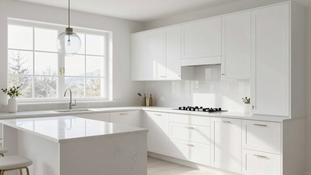
Choosing the best color for white kitchen cabinets starts with your undertone. If you want a crisp, contemporary feel, lean cool with soft grays that read fresh under varying light. For warmth, opt warm neutrals or creamy ivories, which soften edges and brighten natural light. If you crave drama, consider bold, saturated contrasts with dark hues kept matte to avoid glare. Subtle metallics and wood textures add depth without overpowering white. You’ll discover more ways to coordinate this look as you explore further.
Choosing the Right White Cabinet Undertone
Choosing the right white cabinet undertone starts with how light and space interact in your kitchen. You’ll notice undertones shift with room lighting, so test swatches at different times of day.
Use color theory to categorize whites beyond “pure white.” Cool undertones tend toward blue or gray, warmer whites lean creamy or beige, and balanced whites sit in between.
Consider how cabinetry reflects adjacent surfaces—countertops, backsplashes, and flooring—to avoid clashes. Decide on a goal for ambience: crisp and contemporary or warm and inviting.
Also evaluate paint finishes; matte hides imperfections, satin offers subtle sheen, and semi-gloss resists moisture in kitchens.
Narrow your selection to a few options, compare in real lighting, and choose a white that harmonizes with your overall palette and hardware.
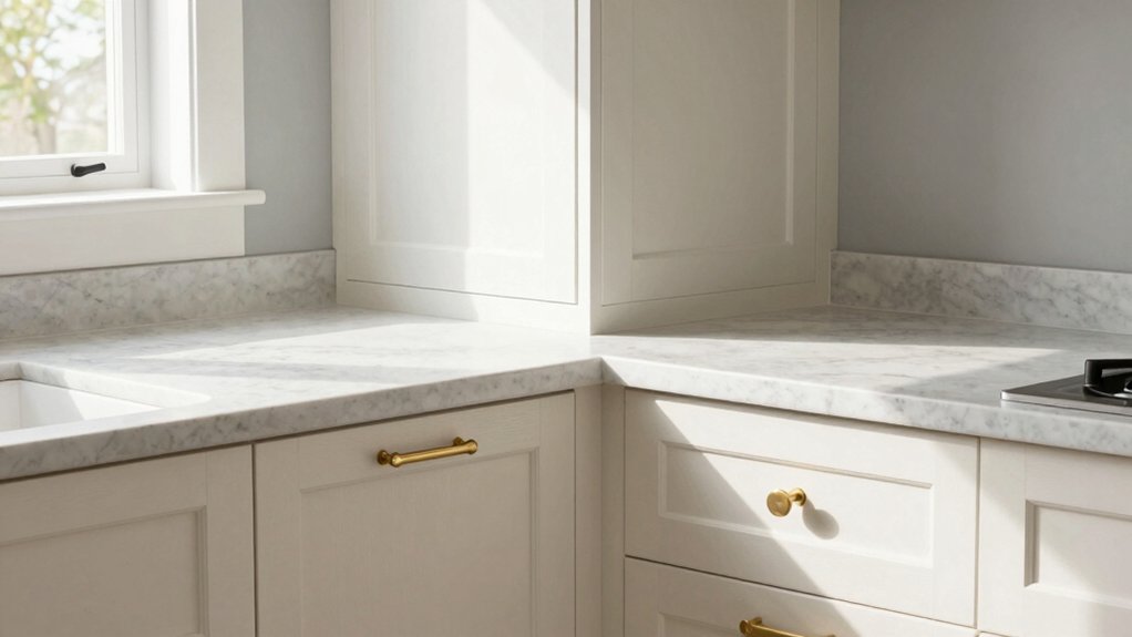
Soft Grays That Complement White Cabinets
Soft grays offer a versatile bridge between white cabinets and the rest of your kitchen palette. You’ll find these shades pair cleanly with both cool and warm undertones, creating a cohesive backdrop for your design vision.
Choose grays with low to mid saturation to prevent a sterile feel and to maintain warmth. In practice, test at multiple times of day to gauge how natural and artificial lighting shift the tone.
Consider how appliance finishes influence the overall impression—stainless, matte black, or brushed nickel each create distinct contrasts with soft gray hues.
For countertop colors, opt for cooler stone or quartz tones to reinforce clarity, or introduce subtle veining for depth. These choices keep the space bright without competing with white cabinetry.
Warm Neutrals and Creamy Ivories
Warm neutrals and creamy ivory tones bring warmth without overpowering white cabinets. You’ll notice how these hues soften edges, enhance natural light, and create a cohesive design mood.
Use these tones to introduce subtle depth and a welcoming, timeless backdrop for hardware, textures, and accents.
Warmth of Neutrals
Neutral tones anchored by warm neutrals and creamy ivories create an inviting backdrop for white kitchen cabinets. You’ll notice warmth comes from undertones rather than loud color, so the space feels cohesive and timeless.
In practice, you pair these neutrals with subtle contrast—think softer whites, alabaster, or greige—to avoid sterility while preserving brightness.
When selecting paint finish options, opt for matte or satin sheens on walls to reduce glare and emphasize texture without shouting color.
For cabinetry, a semi-gloss or high-luster finish can enhance durability and highlight details.
Finally, cabinet hardware styles matter: understated pulls or ready-to-install handles keep the look refined, while brass or brushed nickel accents add a touch of sophistication without overpowering the neutral palette.
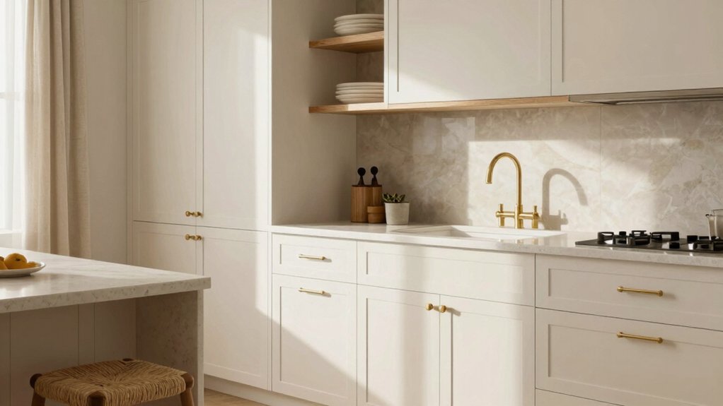
Creamy Ivory Tones
Creamy ivory tones blend warmth with brightness, grounding white cabinetry in a welcoming, timeless backdrop. You’ll find these warm neutrals pair well with natural textures and matte finishes, creating a refined, durable kitchen foundation.
In practice, creamy ivories serve as a versatile canvas that supports diverse color palettes without overpowering fixtures or stone countertops. Choose undertones that harmonize with your room’s lighting: soft yellows for daylight, or cooler hints for fluorescent setups, ensuring the result stays balanced.
When planning finishes, lean into understated contrasts—warm wood, satin brass, or charcoal accents—to sharpen the design without crowding it. Focus on kitchen accessory choices that reinforce cohesion, like coordinating lids, utensil organizers, and textiles, to maintain a cohesive, timeless environment.
Bold Contrasts: Dark Hues With White Cabinets
Dark hues create a striking, modern counterpoint to white cabinetry, grounding the space and adding depth. You’ll see bold contrasts work when you select a hue with clear saturation and a matte or satin finish, so light remains controlled rather than bounced indiscriminately.
Use the Color wheel to guide choices—choose complementary or triadic tones that respect the room’s natural light and architectural lines. Dark cabinets pair best with bright countertops and reflective surfaces to balance weight and prevent heaviness.
Consider lighting as a design tool: evenly distributed task lighting reduces harsh shadows and enhances color accuracy through light reflection. In small kitchens, limit the swath of dark to avoid shrinking the feel; in larger spaces, embrace drama with confidence.
Subtle Accents: Metals and Wood Tittings
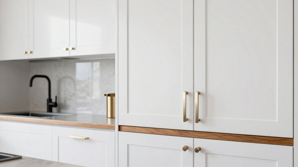
Subtle accents in metals and wood tinctures bring warmth and texture to white kitchen cabinets without competing with their clean silhouette. You’ll introduce depth through restrained metal finishes and varied wood textures, preserving the cabinets’ brightness while adding character.
Choose brushed nickel or warm brass for hardware and lighting fixtures to yield a cohesive glow that feels timeless. Pair with natural wood veneers or lightly veined panels to evoke tactile contrast without visual noise.
Consider matte or satin metal surfaces to minimize reflections and keep focus on cabinetry form. Wood textures should be subtle, not busy, ensuring legibility of cabinetry lines.
Practical Tips for Coordinating Color Schemes
To coordinate your white kitchen cabinets, start by pairing them with neutral tones to create a timeless base.
Use contrasting accents—such as a bold backsplash or hardware—to add visual interest without overwhelming the space.
Consider natural light to guide how bright or muted your colors read, balancing warmth with clarity.
Coordinate With Neutrals
When coordinating colors with neutrals, start by identifying your base neutrals—white, cream, gray, or taupe—and build your palette around their undertones. You’ll create cohesion by pairing these neutrals with complementary hues that reinforce the room’s mood.
Consider color psychology: cooler neutrals feel calm and modern, while warmer neutrals invite warmth and coziness. Use a restrained color plan, introducing one or two accent shades to avoid clutter.
For finishes, explore paint finish options that align with your kitchen’s use and lighting—matte for soft, forgiving walls; satin or eggshell for ease of cleaning; semi-gloss on trim for durability.
Test samples under varied lighting, and log reactions over a week to confirm you’ve achieved balanced, lasting harmony.
Contrast With Accents
A well-balanced color scheme relies on personality-infusing accents that contrast with your base neutrals. You’ll pull interest from deliberate contrasts, not overpowering pairs, so pick accents that read distinct but cohesive.
Start with decorative hardware in finishes that echo your cabinet shade while offering a subtle shift—matte black, brass, or aged nickel can anchor white cabinetry without shouting.
For color accents, choose one or two hues that appear in small doses through accessories, rugs, or art.
Consider backsplash options that introduce texture or depth; a cool veined marble or a warm geometric tile creates dimension without dominating the palette.
Maintain balance by repeating accents sparingly across the room, ensuring light, air, and function stay central to the design.
Consider Natural Light
Natural light is your best ally when coordinating color in a white kitchen, shaping how tones read at different times of day. You’ll see warm neutrals skew toward creamy hues in morning sun and cooler grays in late afternoon. To balance shifts, pair white cabinetry with midtones that hold steady under varying illumination.
Consider artificial lighting as a controllable tool: choose a mix of warm and cool LEDs, and place fixtures to minimize glare on glossy surfaces. Use dimmers to adjust mood and ensure cabinets don’t wash out under bright overheads.
Test swatches on different days and light conditions, then commit to a palette that remains cohesive from dawn to dusk. This approach preserves clarity, depth, and a timeless white kitchen feel.
Conclusion
When you choose white cabinets, you’re starting a design conversation, not a final statement. Embrace undertones that echo your space—soft grays for serenity, warm creams for coziness, or bold contrasts for drama. Pair with metals and wood accents to add texture, then layer neutrals to keep the look cohesive. Stay guided by lighting and scale, not rules. Your kitchen will feel refreshed, timeless, and endlessly invite-worthy—a style revolution, one glance away from a crush-worthy wow.