To make oak cabinets sing, start with warm neutral foundations—think soft beige, greige, or warm taupe—applied smoothly with a controlled, streak-free finish. Pair creamy whites with a touch of cream in satin or low-sheen sheens to keep brightness plus depth. Add subtle contrast with soft greens or greige-leaning charcoals, then ground the space with taupe tones. Use warm LEDs and layered lighting to enhance grain. If you want more guidance, you’ll discover how to refine the palette beyond basics.
Warm Neutral Foundations
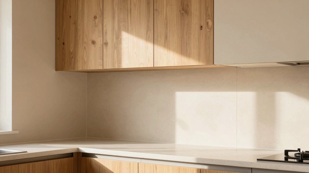
Warm neutral foundations set the tone for oak cabinets by balancing warmth with versatility. You’ll begin with subtle, timeless hues that let natural grain read as texture, not distraction, while keeping walls cohesive with surrounding finishes. Choose tones that read soft beige, greige, or warm taupe, then layer decorative accents to refine mood without overpowering wood character.
Your approach centers on even color density, avoiding high-contrast trims that fight oak’s warmth. When applying paint, emphasize smooth, streak-free surfaces through meticulous prep and controlled application techniques to preserve grain depth. Test samples in your space at different times of day, adjusting saturation for consistent outcome.
Final touches matter: select decorative accents that echo warm undertones, and trust paint application techniques to secure lasting, refined harmony.
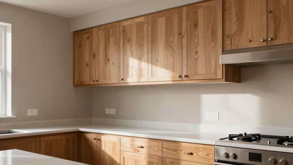
Creamy Whites That Complement Oak
Creamy whites that complement oak strike the right balance between brightness and warmth, letting grain texture read softly without overpowering the wood. You’ll achieve this by selecting hues with subtle warmth and a touch of cream, then pairing them with clean, precise paint lines.
In practice, opt for low-sheen or satin finishes to preserve tactile depth while reflecting light. Use decorative accents in slightly cooler or grounded tones to anchor the space without competing with the cabinetry.
When applying, apply a consistent base coat, then a second coat for uniform coverage, ensuring no brush marks disrupt the grain. Consider paint application techniques that emphasize evenness, like cutting in with a steady hand and feathering edges.
The result is a cohesive, timeless kitchen language that remains visually calm and refined.
Soft Greiges for Subtle Contrast
Soft greiges create a soft contrast that lets oak grain read with quiet definition.
You’ll notice how subtle oak counterpoints and warm beige balance keep interiors cohesive without shouting color.
This palette stays on trend with restrained sophistication, inviting tactile warmth while maintaining visual clarity.
Soft Greige Contrast
In spaces with oak cabinetry, soft greiges strike a careful balance between warmth and modern edge, delivering subtle contrast without overpowering the grain. You’ll achieve this by choosing greige tones with mid-value brightness and cool undertones that harmonize with oak’s warmth.
Aim for restrained contrast: lighter walls to lift the room, but avoid stark white that fights the wood’s texture. Consider undertones that read as whisper-soft gray or creamy taupe, ensuring the palette remains cohesive across cabinetry and trim.
Paint sheen options matter: satin or eggshell reduce glare while preserving depth. Lighting impact is pivotal—natural daylight softens greiges, while warm artificial light enhances their creamy notes.
Test swatches in multiple lighting moments to confirm a balanced, timeless finish.
Subtle Oak Counterpoints
Subtle oak counterpoints thrive when you pair soft greiges with intent, creating a quiet balance that respects grain without muting it. In practice, you’ll choose hues with restrained saturation to preserve warmth while guiding light across your prep zones.
Soft greige tones offer reliable color psychology cues: they read calm, collected, and modern, helping surfaces recede behind cabinetry and reveal texture. When selecting paint finish options, prefer low-sheen or satin sheens to minimize glare and highlight wood details without competing with oak’s grain.
Test swatches on different days and under varying lighting, then refine with tiny lamp-adjustments rather than drastic color shifts. Aim for cohesive contrast that feels curated, not clinical, ensuring your kitchen reads refined, intentional, and timeless.
Warm Beige Balance
Warm beige offers a grounded counterpoint to oak without washing it out, delivering gentle contrast that still respects grain. You achieve this balance by selecting soft greiges that read warm in natural light and cool in shaded corners, preserving oak’s texture while refining overall mood.
Focus on a cohesive color palette coordination across walls, cabinetry, and accents, avoiding stark white and overly gray tones that tile into cold. Implement paint application techniques that emphasize even field color, feathered edges at crown moldings, and minimal sheen to maintain a matte, sophisticated finish.
Test sample swatches in multiple lighting moments, then commit to a unified approach that highlights wood warmth. This strategy yields timeless sophistication, subtle depth, and a kitchen that feels curated, not matched.
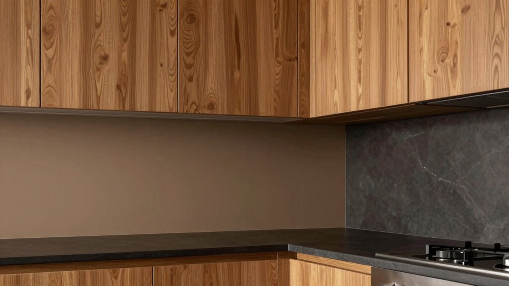
Taupe Tones That Ground the Room
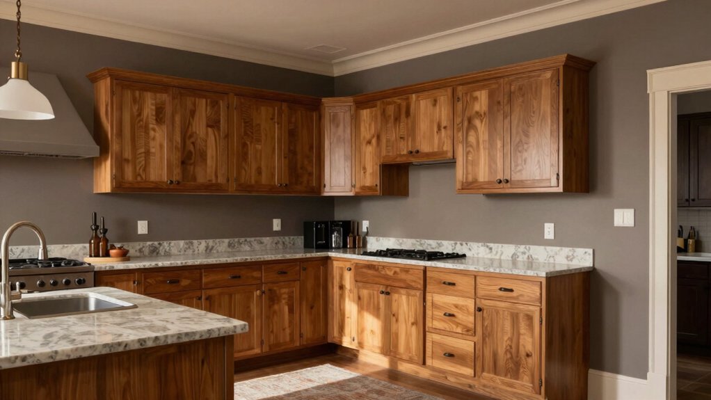
Subtle taupe balance creates a poised contrast that grounds oak cabinets without overpowering their warmth. You’ll notice warm neutral grounding, letting natural wood grain read clearly while the room feels cohesive.
These oak-friendly hues support crisp lighting and modern silhouettes, guiding the eye with calm, refined elegance.
Subtle Taupe Balance
If you want oak cabinets to feel anchored rather than flashy, taupe brings a quiet, refined balance that harmonizes warm wood with cool walls. Subtle taupe acts as a unifying backdrop, letting natural textures breathe while keeping reflections soft.
Opt for taupes with balanced undertones—slightly gray-beige leans read modern, while warmer taupes soften architectural lines. In practice, choose mid-tones that preserve contrast without shouting.
Pair with clean, crisp white ceilings and task lighting that respects the hue’s gravity. Consider artificial lighting that leans daylight spectrum to avoid muddying taupe’s warmth.
For paint finish choices, favor eggshell or satin for walls to maintain depth without glare, and avoid heavy gloss that competes with oak’s grain.
Subtle taupe anchors, elevates, and visually steadies the room.
Warm Neutral Grounding
To anchor oak cabinets with a grounded, welcoming feel, lean into taupe hues that read as warm neutrals rather than stark grays. You’ll find taupe grounds the room without competing with wood grain, creating a versatile backdrop for evolving furniture styles. Choose mid-tones with subtle warmth—undertones of caramel, mushroom, or greige—that harmonize with oak’s honeyed notes.
In practice, apply these shades across walls, ceilings, and cabinetry accents to preserve cohesion while preventing flatness. Pair with clean white trim for definition or deeper taupe for continuity, depending on light. Accent shading through decorative accents adds depth without overwhelming the palette.
Maintain balance by intent, letting warm neutrals guide the room’s hierarchy and letting furniture styles inform accessory decisions.
Oak-Friendly Hues
Oak-friendly taupes ground the room with warmth and clarity, offering a cohesive backdrop that respects honeyed oak grain while letting furniture and art take center stage.
You’ll discover taupe options that read as neutral anchors, yet carry subtle depth to prevent flatness. Choose shades with balanced undertones—warm gray-beige blends that harmonize with brass, nickel, or matte black accents.
In practice, lean toward low-saturation tones that won’t compete with textures like wood, stone, or ceramic. Consider decorative backsplash options that echo taupe’s warmth, such as warm ceramic mosaics or subway tiles with muted gleam.
For cabinet hardware finishes, aim for cohesion: brushed brass or antique bronze often reads sophisticated against oak, while satin nickel offers modern restraint.
Precision in color mapping yields timeless, adaptable results.
Cool Blues to Modernize Oak
Cool blues offer a crisp contrast that modernizes oak without concealing its grain. You’ll see how cool blues sharpen lines, enhance light, and leave warmth intact. Choose mid-tones like periwinkle, steel-blue, or denim with restrained saturation to respect grain texture.
In practice, color psychology guides your choices: calmer hues encourage gathering, while brighter accents energize cooking zones. Apply blue walls with thoughtful trim that mirrors cabinetry, creating cohesion without overwhelm.
For paint application techniques, use a high-quality primer, then two thin coats to prevent sheen pooling and preserve wood detail. Consider a satin or eggshell finish for easy wipeability.
Balance with natural materials—stone, wood, and metal—to reinforce a modern vibe. Preview adjacent greens later, but stay focused on crisp blue contrasts here.
Sage and Soft Greens for Freshness
Sage and soft greens infuse oak with a fresh, airy vibe that feels both timeless and current. You’ll notice these hues soften the wood’s warmth without overwhelming its grain, creating a balanced, breathable kitchen palette.
In practice, choose sage walls or cabinetry accents paired with pale green islands or backsplashes to achieve cohesive contrast. Color psychology supports this approach: greens signal calm, renewal, and focus, helping you feel composed during meal prep.
Historical trends show soft greens repeatedly return after bold shifts, proving their reliability alongside oak’s natural character. To maintain sophistication, limit saturation on larger surfaces and reserve deeper greens for accessories or a focal feature.
Finally, test samples in natural light to confirm harmony with your oak’s undertones.
Greige-leaning Charcoals for Drama
Greige-leaning charcoals introduce immediate drama to oak without overpowering its grain, delivering a sophisticated contrast that feels both modern and timeless. You’ll notice how these tones anchor the space without shouting, letting the wood’s texture remain the focal point.
Choose charcoal-kinked greiges with blue-leaning undertones for cooler kitchens or warmer, nearly taupe variants for cozied, inviting atmospheres.
In practice, color pairing matters: pair with matte black hardware for a refined edge, or with brushed nickel to soften impact while preserving polish.
Finish options matter too—flat or satin sheens minimize glare and heighten depth, while semi-gloss highlights cabinetry lines with subtle sophistication.
Test swatches under both daylight and artificial lighting to confirm contrast, ensuring the oak’s grain reads intentionally rather than merely present.
Pale Yellows to Add Warmth
Pale yellows bring immediate warmth to oak cabinetry without washing out grain, creating a welcoming, sunlit aura that feels both fresh and timeless. You’ll notice how these hues lift space without overwhelming architectural details, preserving texture and depth.
Choose soft, buttery tones with low saturation to maintain visual harmony with rustic or modern oak. Implement decorative accents in complementary neutrals—cream, taupe, and warm whites—to keep contrast subtle yet intentional.
Use wall textures to amplify warmth: a matte plaster or subtle linen wallpaper adds tactile richness that plays with light reflections. For coordination, pair pale yellows with natural woods, brass hardware, and muted greens for a cohesive mood.
Avoid high-gloss finishes on large expanses; favor satin or eggshell for enduring elegance.
Finishes and Light Considerations for Oak Kitchens
Light plays a pivotal role with oak, so consider finishes and lighting from the outset. Your choice of furniture finishes should resonate with natural grain, promoting warmth without overwhelm, and align with your cabinet stain or paint strategy. Matte or satin sheens reduce glare, letting oak’s texture speak and guiding visual harmony across surfaces.
Lighting effects matter: warm LEDs yield amber highlights that sweeten honey tones, while cooler temps sharpen contrast for modern edges. Position task lighting to minimize shadows on work zones, and use ambient layers to maintain depth on cabinetry.
Avoid competing finishes that clash with oak’s character; instead, aim for cohesive tones that elevate architectural lines. Informed hardware and trim choices complete the palette with restrained elegance and contemporary relevance.
Conclusion
To finish, remember: you can’t go wrong pairing oak with warm neutrals and soft greens for a timeless glow. If you fear colors will date the room, lean on greige-leaning charcoals or pale yellows for subtle depth that still stays versatile. The key is balance—allow natural light to breathe, choose finishes that echo oak’s warmth, and preserve contrast where it counts. Your kitchen will feel cohesive, contemporary, and genuinely welcoming.